class: middle, inverse, title-slide .title[ # Single-cell RNA sequencing ~ Session 3 ] .subtitle[ ## <html><br /> <br /> <hr color='#EB811B' size=1px width=796px><br /> </html><br /> Bioinformatics Resource Center - Rockefeller University ] .author[ ### <a href="https://rockefelleruniversity.github.io/SingleCell_Bootcamp/" class="uri">https://rockefelleruniversity.github.io/SingleCell_Bootcamp/</a> ] .author[ ### <a href="mailto:brc@rockefeller.edu" class="email">brc@rockefeller.edu</a> ] --- ## Outlines - Merge multiple data sets - Cell Type Annotation - Differential Analysis - CITE-seq data processing --- ## A more advanced scRNAseq workflow 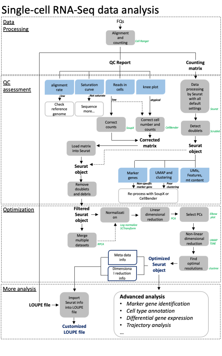 ## A more advanced scRNAseq workflow Full image here of workflow is here: [overview](./imgs/scRNA_workflow_ver001_20231017.png) scRNA seq is a very variable process and each dataset has unique QC problems. Though our simplified approach often works, we also need many more tools in our toolbox to handle more complex datasets. Often it is a case of trial and error to see what approaches work best for your data. --- ## Create some functions We are going to try out a few tools and approaches. We want to wrap some of our analysis steps into a function to simplify rerunning things. Normalization: * Log normalization with scale factor = 10,000 * Find Variable features with vst, select top 2000 variable features ``` r data_proc <- function(seu) { seu <- NormalizeData(seu, normalization.method = "LogNormalize", scale.factor = 10000) seu <- FindVariableFeatures(seu, select.method = "vst", nfeatures = 2000) return(seu) } ``` --- ## Create some functions Make clusters: * Scale data with *ScaleData()* * Principle Component Analysis by using *RunPCA()* with npcs=30 PCs * Make non-linear dimensional reduction in UMAP by using *RunUMAP()* with dims=1:10 * Estimate Neighbors by using *FindNeighbors()* with dims=1:10 * Identify clusters with *FindClusters()* by using resolution=0.5 ``` r quick_clust <- function(seu) { set.seed(42) seu <- ScaleData(seu, verbose = FALSE) seu <- RunPCA(seu, npcs = 30, verbose = FALSE) seu <- RunUMAP(seu, reduction = "pca", dims = 1:10, verbose = FALSE) seu <- FindNeighbors(seu, reduction = "pca", dims = 1:10, verbose = FALSE) seu <- FindClusters(seu, resolution = 0.5, verbose = FALSE) return(seu) } ``` --- class: inverse, center, middle # Merging Datasets <html><div style='float:left'></div><hr color='#EB811B' size=1px width=720px></html> --- ## An advanced scRNAseq workflow 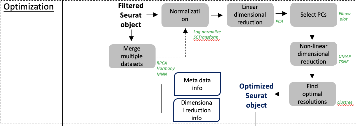 [overview](./imgs/scRNA_workflow_ver001_20231017.png) --- ## Merge multiple datasets We will discuss a number of approaches and methods we may need to use to merge datasets. - No corrections - Reciprocal Principle Component Analysis (rPCA) - Harmony --- ## Example dataset We will be using a dataset containing 4 snRNAseq samples. This is from a [preprint](https://www.biorxiv.org/content/10.1101/2024.12.31.630881v3) studying Alzheimers disease. Though this dataset has 10 samples, we will be using 4 for our example. There are 2 AD samples and 2 Control samples from the entorhinal cortex that have been collected post-mortem. You could access the raw data from [GE0: GSE287652](https://www.ncbi.nlm.nih.gov/gds/?term=GSE287652). But we have it here already loaded into a Seurat object and after some preprocessing. ``` r my_seu_list <- readRDS("data/to_integrate.rds") ``` --- ## Example dataset Each dataset has been individually processed, QC'd and reviewed prior to combining into a list. Storing everything in a list will make our life easier later. 1) Load into Seurat object. 2) Log Normalized and scaled. 3) Filtered based on MT levels (2.5%). 4) Filtered based on doublets (Scrublet). 5) Regressed to MT. 6) PCA. 7) Clusters. 8) UMAP. --- class: inverse, center, middle # Simple Merge <html><div style='float:left'></div><hr color='#EB811B' size=1px width=720px></html> --- ## Concatenate the datasets We can use *merge()* function to integrate multiple data sets, as they are. We need to provide a single seurat object as our first argument, and a list containing the rest of our Seurat objects as the second. We also need to provide *Group* information and a *name* for the project as arguments. ``` r seu_merge <- merge(my_seu_list[[1]], my_seu_list[2:4], add.cell.ids = c("AD2b", "AD4", "C1", "C3"), project = "Merge") head(seu_merge, 4) ``` ``` ## orig.ident nCount_RNA nFeature_RNA percent.mt ## AD2b_AAACCCACAGCTGAAG-1_C1 SeuratProject 763 390 0.39318480 ## AD2b_AAACGAAAGGTCGTAG-1_C1 SeuratProject 1030 501 0.00000000 ## AD2b_AAACGAAGTCTTGAGT-1_C1 SeuratProject 3556 2272 0.61797753 ## AD2b_AAACGAATCACCTCGT-1_C1 SeuratProject 3091 1863 0.03234153 ## scrubletScore sample_id paper_cluster group ## AD2b_AAACCCACAGCTGAAG-1_C1 0.03906250 C1 0 C ## AD2b_AAACGAAAGGTCGTAG-1_C1 0.08771930 C1 0 C ## AD2b_AAACGAAGTCTTGAGT-1_C1 0.06688963 C1 12 C ## AD2b_AAACGAATCACCTCGT-1_C1 0.04857143 C1 29 C ## paper_annot ## AD2b_AAACCCACAGCTGAAG-1_C1 Excitatory Neurons ## AD2b_AAACGAAAGGTCGTAG-1_C1 Excitatory Neurons ## AD2b_AAACGAAGTCTTGAGT-1_C1 Inhibitory Neurons ## AD2b_AAACGAATCACCTCGT-1_C1 Inhibitory Neurons ``` --- ## Process and make clusters Now that our data is merged we need to reprocess it. This ensures nromalization and scaling is done in a globally context. We can use our processing and clustering functions to analyse our merged dataset. ``` r seu_merge <- data_proc(seu_merge) seu_merge <- quick_clust(seu_merge) ``` --- ## UMAP Our UMAP shows our cells are quite similar. Bu there are a few regions that are distinct depending on the condition. ``` r DimPlot(seu_merge, group.by = "sample_id", pt.size = 0.2) ``` <!-- --> --- ## Our samples don't group * This result indicates there is a difference between our 4 samples groups. * Is this a true biological phenomena or is it a batch effect? --- ## Our samples don't group  [(Slowikowski, 2019)](https://github.com/slowkow/harmonypy) --- class: inverse, center, middle # Merge with reciprocal PCA <html><div style='float:left'></div><hr color='#EB811B' size=1px width=720px></html> --- ## Merge with reciprocal PCA Reciprocal PCA minimizes the batch effects while merging different data sets. The steps involved in rPCA: * Each dataset’s PCA embeddings are reciprocally projected onto the other dataset’s principal components. * Then nearest neighbors are found mutually across datasets. * These nearest neighbors serve as anchors, which are used to align datasets. --- ## Merge with reciprocal PCA  [(Stuart et al, 2019)](https://www.cell.com/cell/fulltext/S0092-8674\(19\)30559-8) --- ## Merge with reciprocal PCA  [(Stuart et al, 2019)](https://www.cell.com/cell/fulltext/S0092-8674\(19\)30559-8) --- ## RPCA workflow 1. Normalize data sets. We can use our *data_proc()*. 2. Select features for integration by using *SelectIntegrationFeatures()*. 3. Scale data and process PCA by using the features identified for integration 4. Identify Anchors for integration by using *FindIntegrationAnchors()* 5. Integrate data by using *IntegratedData()* 6. Process *quick_cluster()* and evaluate results with UMAP --- ## Prepare for RPCA merge First we need to identify features for integration. We do this on our list of Seurat objects. This is similar to the VariableFeatures function we ran on a single dataset, but works across all 4 datasets. We will then run scaling and PCA, using these features. ``` r feats <- SelectIntegrationFeatures(my_seu_list) my_seu_list_rpca <- lapply(my_seu_list, function(seu, feats) { seu <- ScaleData(seu, features = feats, verbose = FALSE) seu <- RunPCA(seu, features = feats, verbose = FALSE) return(seu) }, feats) ``` --- ## Integrating data in RPCA merge We can then identify anchors. These are the features through which we will integrate our data. Once we have these features, we can then integrate our data sets together. ``` r anchors <- FindIntegrationAnchors(my_seu_list_rpca, anchor.features = feats, reduction = "rpca") my_seu_merge_rpca <- IntegrateData(anchorset = anchors) my_seu_merge_rpca ``` ``` ## An object of class Seurat ## 28110 features across 10018 samples within 2 assays ## Active assay: integrated (2000 features, 2000 variable features) ## 1 layer present: data ## 1 other assay present: RNA ``` --- ## Evaluating RPCA using clusters To evaluate how well the merge has worked we must check the clustering. Again we must scale, and then use our *quick_clust* function. ``` r my_seu_merge_rpca <- ScaleData(my_seu_merge_rpca) my_seu_merge_rpca <- quick_clust(my_seu_merge_rpca) ``` --- ## Assesing Integration To assess the integration we can use similar metrics to assessing the QC of the datasets in general. - Are there discrete clusters? - Are there distinct markers (and do they make sense)? We also check the overlap of our datasets. Generally we expect most cells between samples to overlap, but this can be very experiment dependent. --- ## Evaluating RPCA using clusters We can see that our data sets overlay with each other. It looks slightly better than before. The dataset looked pretty good before, but now the overlap is tighter. ``` r DimPlot(my_seu_merge_rpca, group.by = "sample_id", pt.size = 0.2) ``` <!-- --> --- ## UMAP - Clusters Our UMAP shows our cell clusters are fairly distinct, though not perfect (and the clustering itself could do with some optimization). ``` r DimPlot(my_seu_merge_rpca, group.by = "seurat_clusters", pt.size = 0.2) ``` <!-- --> --- ## Heatmap - clusters We can check the numbers in each cluster. Broadly, there are similar numbers per cluster now. To do this we make a heatmap and then scale it along the row to account for the different number of cells in each sample. ``` r library(pheatmap) tbl <- table(my_seu_merge_rpca$sample_id, my_seu_merge_rpca$seurat_clusters) pheatmap(tbl, scale = "row") ``` <!-- --> --- ## UMAP - Markers A given cell type should often be clustered together. This means marker genes should be specific. This oligodendrocyte marker has quite specific distribution. ``` r FeaturePlot(my_seu_merge_rpca, "MOBP", pt.size = 0.2) ``` <!-- --> --- ## UMAP - Annotation This dataset also has some annotation in the *paper_annot* slot. We can check the distribution of the labels. Our UMAP shows our cell types are distinct. ``` r DimPlot(my_seu_merge_rpca, group.by = "paper_annot", pt.size = 0.2) ``` <!-- --> --- ## Evaluating RPCA using cell types Using heatmaps we can also check how specific each cluster is to each cell type. ``` r library(pheatmap) tbl <- table(my_seu_merge_rpca$seurat_clusters, my_seu_merge_rpca$paper_annot) pheatmap(tbl, scale = "row") ``` <!-- --> --- class: inverse, center, middle # Merge data with Harmony <html><div style='float:left'></div><hr color='#EB811B' size=1px width=720px></html> --- ## Harmony - Harmony is an R package for single-cell data integration [liike](https://www.nature.com/articles/s41592-019-0619-0). - There is also a python implementation of this [package](https://github.com/slowkow/harmonypy). - Harmony works well with Seurat objects to directly so we can easily add it into our workflow. --- ## Harmony Harmony works in a different way to rPCA. 1) Fuzzy clustering - It will assign clusters, but allow cells to belong to multiple clusters, and calculate the strength of assingment to each cluster. 2) During clustering there is a penalty term, to maintain diversity of groups i.e. a cluster with just one sample is penalized. This means any structure due to a batch effect is not hard. 3) The centroid of each cluster is calculated for all cells and each individual sample, then a correction factor for each sample based on these centroids. 4) Cells are then moved based on the dataset correction factor, weighted by their individual assignment scores for each cluster 5) Repeat iteratively until convergence. --- ## Harmony  [(Korsunksy et al, 2020)](https://pmc.ncbi.nlm.nih.gov/articles/PMC6884693/) --- ## Prepare data for Harmony We can prepare for Harmony in much the same way as we prepare for the simple Seurat merge: merge, normalize, scale, PCA and UMAP. ``` r seu_merge <- merge(my_seu_list[[1]], my_seu_list[2:4], add.cell.ids = c("C1", "C3", "AD2b", "AD4"), project = "Merge") seu_merge <- data_proc(seu_merge) seu_merge <- ScaleData(seu_merge) seu_merge <- RunPCA(seu_merge) seu_merge <- RunUMAP(seu_merge, reduction = "pca", dims = 1:10, reduction.name = "umap") ``` --- ## Prepare data for Harmony As you can see we are back with our completely separate groups. ``` r DimPlot(seu_merge, group.by = "sample_id") ``` <!-- --> --- ## Merge data with Harmony We can use the *RunHarmony()* function to implement the Harmony correction. ``` r library(harmony) seu_merge_harmony <- RunHarmony(seu_merge, group.by.vars = "sample_id", assay.use = "RNA") seu_merge_harmony <- RunUMAP(seu_merge_harmony, reduction = "harmony", dims = 1:10, reduction.name = "umap_harmony") seu_merge_harmony <- FindNeighbors(seu_merge_harmony, reduction = "harmony") seu_merge_harmony <- FindClusters(seu_merge_harmony) ``` ``` ## Modularity Optimizer version 1.3.0 by Ludo Waltman and Nees Jan van Eck ## ## Number of nodes: 10018 ## Number of edges: 338260 ## ## Running Louvain algorithm... ## Maximum modularity in 10 random starts: 0.9148 ## Number of communities: 21 ## Elapsed time: 1 seconds ``` --- ## Evaluating Harmony We can see that our data sets overlay with each other. Again, it looks slightly better than before. ``` r DimPlot(seu_merge_harmony, group.by = "sample_id", reduction = "umap_harmony", pt.size = 0.2) ``` <!-- --> --- ## UMAP - Clusters Our UMAP shows our cell clusters are fairly distinct, though not perfect (and the clustering itself could do with some optimization). ``` r DimPlot(seu_merge_harmony, group.by = "seurat_clusters", reduction = "umap_harmony", pt.size = 0.2) ``` <!-- --> --- ## Heatmap - clusters We can check the numbers in each cluster. Broadly, there are similar numbers per cluster now. To do this we make a heatmap and then scale it along the row to account for the different number of cells in each sample. ``` r library(pheatmap) tbl <- table(seu_merge_harmony$sample_id, seu_merge_harmony$seurat_clusters) pheatmap(tbl, scale = "row") ``` <!-- --> --- ## UMAP - Markers A given cell type should often be clustered together. This means marker genes should be specific. This oligodendrocyte marker has quite specific distribution. ``` r FeaturePlot(seu_merge_harmony, "MOBP", pt.size = 0.2) ``` <!-- --> --- ## UMAP - Annotation This dataset also has some annotation in the *paper_annot* slot. We can check the distribution of the labels. Our UMAP shows our cell types are distinct. ``` r DimPlot(seu_merge_harmony, group.by = "paper_annot", pt.size = 0.2) ``` <!-- --> --- ## Evaluating RPCA using cell types Using heatmaps we can also check how specific each cluster is to each cell type. ``` r tbl <- table(seu_merge_harmony$seurat_clusters, seu_merge_harmony$paper_annot) pheatmap(tbl, scale = "row") ``` <!-- --> --- ## Comparing our results Broadly it seems like rPCA may be the best option in this case. Why?: 1) The integration in general is subtle and rPCA is considered more conservative 2) Sample UMAP looks cleanest 3) The number of cells per cluster seems more equal 4) The annotation seems cleaner --- ## Compare .pull-left[ <!-- --> ] .pull-right[ <!-- --> ] --- ## Compare .pull-left[ 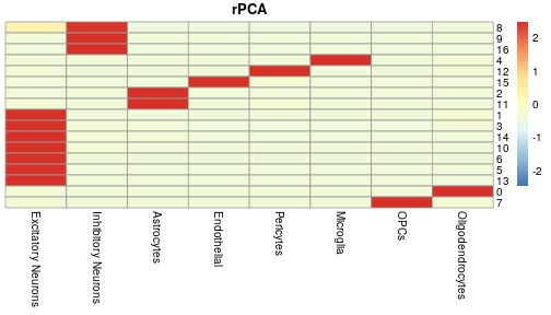<!-- --> ] .pull-right[ 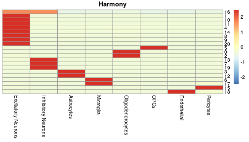<!-- --> ] --- ## Compare .pull-left[ 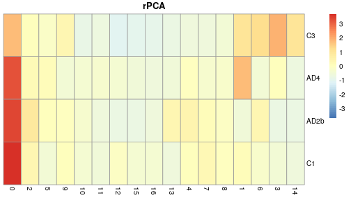<!-- --> ] .pull-right[ <!-- --> ] --- ## Data Integration Compared - Harmony * Works at the cluster level * Iterative nature pushes to convergence so can be a heavy handed * Allows for more complex model terms for batch correction * Fast and scalable - rPCA * Working at the single cell level * Preserves biological structure, by being More lenient and allowing unique groups --- ## Data Integration Compared Though Harmony and rPCA are our main workhorses for integration. There are many other alternatives too. * MNN - Like rPCA it uses MNN across datasets and corrects batch effects while preserving structure (we have code for this in prior version of [course](https://github.com/RockefellerUniversity/SingleCell_Bootcamp/releases/tag/v1.0)) * Liger - Factorizes gene expression into shared and dataset-specific components, so very god at maintaining dataset specific patterns, but it will need some tuning. * Scanorama - Also uses a MNN based approach. Good for datasets with little overlap, but it is computationally expensive. * ComBat (from sva package) Batch Correction - Uses a more traditional linear modeling approach that has been adapted from bulk methods. Good for systematic differences, but less nuanced and tendency to over correct. * BBKNN (Batch-Balanced kNN) - Works on neighbor graphs, not counts/PCA. Simple, fast, good for clustering and visual, but there's no depper integration/correction of data. * scVI (Single-cell Variational Inference) - Uses a deep generative model (VAE) to learn a representation without batch effects. Powerful, scalable, handles missing data but requires GPU for efficiency. For more systematic comparison check out this [paper](https://pmc.ncbi.nlm.nih.gov/articles/PMC9982060/). --- ## An advanced scRNAseq workflow  [overview](./imgs/scRNA_workflow_ver001_20231017.png) --- class: inverse, center, middle # Cell type annotation <html><div style='float:left'></div><hr color='#EB811B' size=1px width=720px></html> --- # Cell type annotation Annotation is a often seen as a key step in generating your final analysis. That said it also still important for QC. If you have mixed identities or surprising cell types this could be grounds to do further filtering. So even after all this work on our dataset we may circle back and reprocess our data. <!-- --> --- ## Manual Annotation As mentioned before this dataset has been manually annotated. ``` r DimPlot(my_seu_merge_rpca, group.by = "paper_annot") ``` <!-- --> --- ## Manual Annotation This was done by careful assessment of the marker genes. Here we are look at Oligodendrocyte markers. ``` r FeaturePlot(my_seu_merge_rpca, c("MOBP", "MAG")) ``` <!-- --> --- ## Automated annotation To annotate the Single-cell data sets, we can evaluate the gene expression pattern of well known cell-type specific marker genes and make a manual annotation. This is time consuming and not systematic. Here, we will introduce two more strategies to make cell type annotations computationally: 1. Mapping and annotating query datasets with Seurat using a reference data set. [link](https://satijalab.org/seurat/articles/integration_mapping.html) 2. Make annotation with SingleR [link](https://bioconductor.org/packages/release/bioc/html/SingleR.html) --- ## Cell type annotation For this we need a reference dataset and a query dataset. Our annotation ends up being only as good as our reference dataset. There are many sources for reference data. * R packages: - [celldex](https://bioconductor.org/packages/release/data/experiment/html/celldex.html) - [ExperimentHub](https://www.bioconductor.org/packages/release/bioc/html/ExperimentHub.html) * Consortium data i.e. [Allen Brain Map](https://portal.brain-map.org) * Papers (though this can be variable) - [Adipose](https://gitlab.com/rosen-lab/white-adipose-atlas) or [Neuronal](https://www.ncbi.nlm.nih.gov/geo/query/acc.cgi?acc=GSE287652) Depending on the format of the data, you may be set to go straightaway, need to do some light processing, or reanalyze the whole thing. --- class: inverse, center, middle # Annotation with SingleR <html><div style='float:left'></div><hr color='#EB811B' size=1px width=720px></html> --- ## Annotation with SingleR [SingleR](https://bioconductor.org/packages/release/bioc/vignettes/SingleR/inst/doc/SingleR.html) is Bioconductor package which can be used to predict annotations of a single-cell dataset. It is maybe the most flexible way of annotating your data, as it will accept a variety of kinds of reference data including bulk and scRNAseq experiments. SingleR works with a very simple method: calculate a spearman rank correlation between reference and test dataset for each label. Despite this simplicity, there is also scope to do more complex annotation with some advanced features i.e. to improve resolution of related labels or using multiple references. You can dig into this further in the [singleR book](https://bioconductor.org/books/release/SingleRBook/). --- ## Annotation with SingleR Lets start out by using the [Human Primary Cell Atlas](https://bmcgenomics.biomedcentral.com/articles/10.1186/1471-2164-14-632). This is a collection of microarray datasets from human primary cells that have been aggregated together. To access this data we will use the *celldex* package. ``` r library(celldex) hpcad <- HumanPrimaryCellAtlasData() ``` --- ## Annotation with SingleR In this case the data is stored as a SummarizedExpriment; a specialized Bioconductor format designed for holding data matrices and their metadata. The reference data for SingleR can either be in this format or as a SingleCellExpriment (another Bioconductor format specific to single cell analysis). ``` r hpcad ``` ``` ## class: SummarizedExperiment ## dim: 19363 713 ## metadata(0): ## assays(1): logcounts ## rownames(19363): A1BG A1BG-AS1 ... ZZEF1 ZZZ3 ## rowData names(0): ## colnames(713): GSM112490 GSM112491 ... GSM92233 GSM92234 ## colData names(3): label.main label.fine label.ont ``` --- ## Annotation with SingleR At the moment our *test* data is a Seurat object which is not Bioconductor friendly. ``` r my_seu_merge_rpca ``` ``` ## An object of class Seurat ## 28110 features across 10018 samples within 2 assays ## Active assay: integrated (2000 features, 2000 variable features) ## 2 layers present: data, scale.data ## 1 other assay present: RNA ## 2 dimensional reductions calculated: pca, umap ``` We can simply extract out a data matrix containing count information. This is good for SingleR. ``` r my_seu_merge_rpca_mat <- GetAssayData(my_seu_merge_rpca) my_seu_merge_rpca_mat[1:5, 1:5] ``` ``` ## 5 x 5 sparse Matrix of class "dgCMatrix" ## AAACCCACAGCTGAAG-1_C1 AAACGAAAGGTCGTAG-1_C1 AAACGAAGTCTTGAGT-1_C1 ## ADAMTSL1 0.39228540 0.37254012 1.11566489 ## THSD7B 0.02286489 0.05190584 -0.01465315 ## IL1RAPL2 -0.01904459 -0.08152581 0.12641628 ## RELN -0.45800974 -0.30815332 -0.64158447 ## AC093607.1 0.06373820 0.06256471 0.01170564 ## AAACGAATCACCTCGT-1_C1 AAACGAATCTCCGAAA-1_C1 ## ADAMTSL1 -0.063393072 -0.05680296 ## THSD7B 0.092400788 -0.02638186 ## IL1RAPL2 -0.172235822 -0.00585319 ## RELN 3.338650923 0.15192283 ## AC093607.1 0.007405319 -0.03035472 ``` --- ## Annotation with SingleR We are almost ready to run SingleR. We have our test and reference data. The last part we need is labels. This can just be a vector containing all the labels. We can grab this easily from our reference dataset. We can see there are several options here. Let's just stick to *label.main*. ``` r colData(hpcad) ``` ``` ## DataFrame with 713 rows and 3 columns ## label.main label.fine label.ont ## <character> <character> <character> ## GSM112490 DC DC:monocyte-derived:.. CL:0000840 ## GSM112491 DC DC:monocyte-derived:.. CL:0000840 ## GSM112540 DC DC:monocyte-derived:.. CL:0000840 ## GSM112541 DC DC:monocyte-derived:.. CL:0000451 ## GSM112661 DC DC:monocyte-derived:.. CL:0000451 ## ... ... ... ... ## GSM556665 Monocyte Monocyte:S._typhimur.. CL:0000576 ## GSM92231 Neurons Neurons:Schwann_cell CL:0002573 ## GSM92232 Neurons Neurons:Schwann_cell CL:0002573 ## GSM92233 Neurons Neurons:Schwann_cell CL:0002573 ## GSM92234 Neurons Neurons:Schwann_cell CL:0002573 ``` ``` r library(SingleR) pred_res <- SingleR(ref = hpcad, test = my_seu_merge_rpca_mat, labels = hpcad$label.main) ``` The score is generated comparing the expression levels of a cell in query dataset and the expression pattern of certain group (eg. cell types) in reference dataset. A cell would be assigned as the cell type which has highest score ``` r head(pred_res, 2) ``` ``` ## DataFrame with 2 rows and 4 columns ## scores labels ## <matrix> <character> ## AAACCCACAGCTGAAG-1_C1 0.0699139:0.0443145: 0.00782103:... Neurons ## AAACGAAAGGTCGTAG-1_C1 0.0605863:0.0201250:-0.00486433:... MSC ## delta.next pruned.labels ## <numeric> <character> ## AAACCCACAGCTGAAG-1_C1 0.01087697 Neurons ## AAACGAAAGGTCGTAG-1_C1 0.00253192 MSC ``` --- ## Annotation with SingleR By converting to a matrix, we can check the cell type scoring using a heatmap. ``` r mat <- as.matrix(pred_res$scores) rownames(mat) <- rownames(pred_res) pheatmap::pheatmap(mat, scale = "row", show_rownames = FALSE, fontsize_col = 5) ``` <!-- --> --- ## Annotation with SingleR We can now add our labels back to our original Seurat object by a quick assignment. This then allows us to start reviewing the annotation in the context of UMAPs and also versus our other annotation. ``` r my_seu_merge_rpca$hpcad_singleR_labels <- pred_res$labels summ_table <- table(my_seu_merge_rpca$hpcad_singleR_labels, my_seu_merge_rpca$paper_annot) pheatmap(summ_table, scale = "column", fontsize_row = 5) ``` <!-- --> --- ## Annotation with SingleR ``` r DimPlot(my_seu_merge_rpca, group.by = "hpcad_singleR_labels") ``` <!-- --> --- ## Annotation with SingleR Lets try an alternative dataset. Often we will have data from other Seurat objects that we want to use as a reference. Here we have a processed version of human data from the [Allen Brain Map](https://portal.brain-map.org/atlases-and-data/rnaseq). This is 10X data from 2020. ``` r abm <- readRDS("data/abm.rds") ``` --- ## Annotation with SingleR There are several interesting labels associated with this data. Lets focus on the *class_label*. ``` r head(abm) ``` ``` ## orig.ident nCount_RNA nFeature_RNA ## AAACCCAAGGATTTCC-LKTX_190129_01_A01 SeuratProject 14396 4815 ## AAACCCAAGTATGGCG-LKTX_190129_01_A01 SeuratProject 12027 4372 ## AAACCCACAAAGTGTA-LKTX_190129_01_A01 SeuratProject 16112 5280 ## AAACCCACACTACTTT-LKTX_190129_01_A01 SeuratProject 2994 1649 ## AAACCCACAGTGAGCA-LKTX_190129_01_A01 SeuratProject 5202 2499 ## AAACCCAGTCACCCTT-LKTX_190129_01_A01 SeuratProject 26504 6381 ## AAACCCAGTGTCCACG-LKTX_190129_01_A01 SeuratProject 21668 5470 ## AAACCCATCATAAGGA-LKTX_190129_01_A01 SeuratProject 30141 7131 ## AAACCCATCTGTCCCA-LKTX_190129_01_A01 SeuratProject 31944 6864 ## AAACGAAGTATGAAGT-LKTX_190129_01_A01 SeuratProject 32476 7328 ## percent.mt class_label ## AAACCCAAGGATTTCC-LKTX_190129_01_A01 0 GABAergic ## AAACCCAAGTATGGCG-LKTX_190129_01_A01 0 Glutamatergic ## AAACCCACAAAGTGTA-LKTX_190129_01_A01 0 Glutamatergic ## AAACCCACACTACTTT-LKTX_190129_01_A01 0 Glutamatergic ## AAACCCACAGTGAGCA-LKTX_190129_01_A01 0 Non-Neuronal ## AAACCCAGTCACCCTT-LKTX_190129_01_A01 0 Glutamatergic ## AAACCCAGTGTCCACG-LKTX_190129_01_A01 0 Glutamatergic ## AAACCCATCATAAGGA-LKTX_190129_01_A01 0 Glutamatergic ## AAACCCATCTGTCCCA-LKTX_190129_01_A01 0 Glutamatergic ## AAACGAAGTATGAAGT-LKTX_190129_01_A01 0 Glutamatergic ## cluster_label subclass_label ## AAACCCAAGGATTTCC-LKTX_190129_01_A01 Inh L1-2 SST CCNJL Sst ## AAACCCAAGTATGGCG-LKTX_190129_01_A01 Exc L5-6 FEZF2 IFNG-AS1 L5/6 NP ## AAACCCACAAAGTGTA-LKTX_190129_01_A01 Exc L3-5 RORB LINC01202 L5 IT ## AAACCCACACTACTTT-LKTX_190129_01_A01 Exc L2 LINC00507 GLRA3 L2/3 IT ## AAACCCACAGTGAGCA-LKTX_190129_01_A01 Oligo L2-6 OPALIN FTH1P3 Oligo ## AAACCCAGTCACCCTT-LKTX_190129_01_A01 Exc L5-6 FEZF2 C9orf135-AS1 L6 CT ## AAACCCAGTGTCCACG-LKTX_190129_01_A01 Exc L3-5 FEZF2 ASGR2 L5 ET ## AAACCCATCATAAGGA-LKTX_190129_01_A01 Exc L3-5 RORB LNX2 L5 IT ## AAACCCATCTGTCCCA-LKTX_190129_01_A01 Exc L3-5 RORB LNX2 L5 IT ## AAACGAAGTATGAAGT-LKTX_190129_01_A01 Exc L5 THEMIS RGPD6 L6 CT ## cell_type_alias_label ## AAACCCAAGGATTTCC-LKTX_190129_01_A01 Inh L1-2 SST CCNJL ## AAACCCAAGTATGGCG-LKTX_190129_01_A01 Exc L5-6 FEZF2 IFNG-AS1 ## AAACCCACAAAGTGTA-LKTX_190129_01_A01 Exc L3-5 RORB LINC01202 ## AAACCCACACTACTTT-LKTX_190129_01_A01 Exc L2 LINC00507 GLRA3 ## AAACCCACAGTGAGCA-LKTX_190129_01_A01 Oligo L2-6 OPALIN FTH1P3 ## AAACCCAGTCACCCTT-LKTX_190129_01_A01 Exc L5-6 FEZF2 C9orf135-AS1 ## AAACCCAGTGTCCACG-LKTX_190129_01_A01 Exc L3-5 FEZF2 ASGR2 ## AAACCCATCATAAGGA-LKTX_190129_01_A01 Exc L3-5 RORB LNX2 ## AAACCCATCTGTCCCA-LKTX_190129_01_A01 Exc L3-5 RORB LNX2 ## AAACGAAGTATGAAGT-LKTX_190129_01_A01 Exc L5 THEMIS RGPD6 ``` --- ## Annotation with SingleR As our reference data is in a Seurat format we can just extract out the data matrix of counts. We also already have our matrix from our test data. ``` r pred_res2 <- SingleR(ref = GetAssayData(abm), test = my_seu_merge_rpca_mat, labels = abm$class_label) ``` ``` r head(pred_res2, 2) ``` ``` ## DataFrame with 2 rows and 4 columns ## scores labels delta.next ## <matrix> <character> <numeric> ## AAACCCACAGCTGAAG-1_C1 0.138210:0.142565:0.0505849 Glutamatergic 0.0050974 ## AAACGAAAGGTCGTAG-1_C1 0.218222:0.253712:0.0876373 Glutamatergic 0.0347486 ## pruned.labels ## <character> ## AAACCCACAGCTGAAG-1_C1 Glutamatergic ## AAACGAAAGGTCGTAG-1_C1 Glutamatergic ``` --- ## Annotation with SingleR By converting to a matrix, we can check the cell type scoring using a heatmap. ``` r mat <- as.matrix(pred_res2$scores) rownames(mat) <- rownames(pred_res2) pheatmap::pheatmap(mat, scale = "row", show_rownames = FALSE, fontsize_col = 5) ``` <!-- --> --- ## Annotation with SingleR We can now add our labels back to our original Seurat object by a quick assignment. This then allows us to start reviewing the annotation in the context of UMAPs and also versus our other annotation. ``` r my_seu_merge_rpca$abm_singleR_labels <- pred_res2$labels ``` ``` r summ_table <- table(my_seu_merge_rpca$abm_singleR_labels, my_seu_merge_rpca$paper_annot) pheatmap(summ_table, scale = "column", fontsize_row = 5) ``` <!-- --> --- ## Annotation with SingleR ``` r DimPlot(my_seu_merge_rpca, group.by = "abm_singleR_labels") ``` <!-- --> --- class: inverse, center, middle # Annotation with Seurat <html><div style='float:left'></div><hr color='#EB811B' size=1px width=720px></html> --- ## Anotation with Seurat Seurat uses a similar approach to integration to be able to find anchors between datasets. It can then use this to transfer label information from a reference to a test dataset. A restriction of this approach is both datasets have to be Seurat objects and therefore single cell datasets. We will use the Allen Brain Map again for this analysis. --- ## Reference and query datasets As with integration, we find integration features in common, then scale and run PCA in the context of these specific features. ``` r transfer_list <- list(ref = abm, query = my_seu_merge_rpca) feats <- SelectIntegrationFeatures(transfer_list) transfer_list <- lapply(transfer_list, function(seu, feats) { seu <- ScaleData(seu, features = feats, verbose = FALSE) seu <- RunPCA(seu, features = feats, verbose = FALSE) return(seu) }, feats) ``` --- ## Predict cell types for query Identify the anchors between reference and query data sets, using *FindTransferAnchors()*. These are essential to transfer information from our reference to our query. We can then transfer the cell type information. For each cell in query dataset, the score for each given cell type was estimated by the gene expression pattern of anchor genes using the *TransferData()* function. ``` r anchors <- FindTransferAnchors(reference = transfer_list$ref, query = transfer_list$query, dims = 1:30, reference.reduction = "pca") pred_res3 <- TransferData(anchorset = anchors, refdata = transfer_list$ref$class_label) ``` ``` r head(pred_res3, 2) ``` ``` ## predicted.id prediction.score.GABAergic ## AAACCCACAGCTGAAG-1_C1 Non-Neuronal 0 ## AAACGAAAGGTCGTAG-1_C1 Non-Neuronal 0 ## prediction.score.Glutamatergic ## AAACCCACAGCTGAAG-1_C1 0.3253133 ## AAACGAAAGGTCGTAG-1_C1 0.1247228 ## prediction.score.Non.Neuronal prediction.score.max ## AAACCCACAGCTGAAG-1_C1 0.6746867 0.6746867 ## AAACGAAAGGTCGTAG-1_C1 0.8752772 0.8752772 ``` --- ## Predict cell types for query The cell type with highest score was assigned to the given cell. We can visualize this score with a heatmap. ``` r mat <- as.matrix(pred_res3[, -c(1, 5)]) colnames(mat) <- gsub("prediction.score.", "", colnames(mat)) pheatmap(mat, scale = "row", show_rownames = FALSE) ``` <!-- --> --- ## Annotation with SingleR We can now add our labels back to our original Seurat object by a quick assignment. This then allows us to start reviewing the annotation in the context of UMAPs and also versus our other annotation. ``` r my_seu_merge_rpca$abm_seurat_labels <- pred_res3$predicted.id ``` ``` r summ_table <- table(my_seu_merge_rpca$abm_seurat_labels, my_seu_merge_rpca$paper_annot) pheatmap(summ_table, scale = "column", fontsize_row = 5) ``` <!-- --> --- ## Annotation with SingleR ``` r DimPlot(my_seu_merge_rpca, group.by = "abm_seurat_labels") ``` <!-- --> --- ## Seurat vs SingleR annotation Next we can compare our two annotations: ``` r table(my_seu_merge_rpca$abm_seurat_labels == my_seu_merge_rpca$abm_singleR_labels) ``` ``` ## ## FALSE TRUE ## 3437 6581 ``` ``` r tbl <- table(my_seu_merge_rpca$abm_seurat_labels, my_seu_merge_rpca$abm_singleR_labels) pheatmap::pheatmap(tbl, scale = "row") ``` <!-- --> --- ## Seurat vs SingleR annotation The results are similar but there is a clear difference in the identification of the OPC group. These are Oligodendrocyte precursor cells, and are considered non-neural. In this case it seems that Seurat has done a better job. But maybe with a different reference, or with the more specific group labels SingleR may perform better. --- ## Seurat vs SingleR annotation This isn't always the case. As a general rule we find: * Seurat: Wins on speed * SingleR: More reliable and consistent --- ## LLM annotation There have also been some interesting efforts to use LLMs or Deep Learning to annotate cells, either with specialized models or generic models like [ChatGPT](https://www.nature.com/articles/s41592-024-02235-4). We have not exhaustively tested these, but the consensus is that they provide a good quick estimate, especially when you do not have a reliable reference dataset. Often domain specific knowledge and good reference datasets will outperform the more general LLM approaches. --- class: inverse, center, middle # Differential expression analysis <html><div style='float:left'></div><hr color='#EB811B' size=1px width=720px></html> --- ## Differential expression analysis We will use the rPCA integrated object from earlier lecture, and you can read it in from dropbox. It is the object called *integrated.rds*. ``` r # downloaded from dropbox seu_obj <- readRDS("~/Downloads/integrated.rds") seu_obj ``` ``` ## An object of class Seurat ## 28110 features across 10018 samples within 2 assays ## Active assay: integrated (2000 features, 2000 variable features) ## 2 layers present: data, scale.data ## 1 other assay present: RNA ## 2 dimensional reductions calculated: pca, umap ``` --- ## Differential expression analysis Compared to bulk analysis, single cell RNAseq data presents several opportunities and challenges when doing differential gene expression. As we've explored so far, we can identify different cell types and then find markers for these cell types within a population of cells. We did this with the Seurat [FindAllMarkers](https://rockefelleruniversity.github.io/SingleCell_Bootcamp/presentations/slides/Session2.html#123) function. ``` r p_all <- DimPlot(seu_obj, reduction = "umap", group.by = "paper_annot", label = T) p_all ``` <!-- --> --- ## Differentials within cell types In this section we will compare conditions *within* important subsets of cells, such as interesting cell types. We will look at gene expression differences between AD and control cells. First, we add metadata columns that will eventually allow us to set up these comparisons. ``` r # metadata column for condition seu_obj$condition <- ifelse(grepl("AD", seu_obj$sample_id), "AD", "CON") # metadata column for condition + cell type seu_obj$celltype_condition <- paste(seu_obj$paper_annot, seu_obj$condition, sep = "_") table(seu_obj$celltype_condition) ``` ``` ## ## Astrocytes_AD Astrocytes_CON Endothelial_AD ## 674 353 70 ## Endothelial_CON Excitatory Neurons_AD Excitatory Neurons_CON ## 51 2338 1295 ## Inhibitory Neurons_AD Inhibitory Neurons_CON Microglia_AD ## 423 461 391 ## Microglia_CON OPCs_AD OPCs_CON ## 180 257 206 ## Oligodendrocytes_AD Oligodendrocytes_CON Pericytes_AD ## 1974 1107 137 ## Pericytes_CON ## 101 ``` --- ## Differentials within cell types It can be useful to visualize these proportions as well. We see that we generally have more AD cells, but every cluster has a reasonable number of both. ``` r plot_percents <- data.frame(table(seu_obj$celltype_condition)) %>% tidyr::separate(Var1, sep = "_", into = c("cell_type", "condition")) %>% group_by(cell_type) %>% mutate(percent = Freq/sum(Freq)) ggplot(plot_percents, aes(x = cell_type, y = percent, fill = condition)) + geom_bar(stat = "identity") + theme(axis.text.x = element_text(angle = 45, hjust = 1)) ``` <!-- --> --- ## Excitatory Neurons We will use these annotations to compare AD vs control within the cluster of **excitatory neurons**. ``` r DimPlot(subset(seu_obj, paper_annot == "Excitatory Neurons"), reduction = "umap", group.by = "condition", label = F) + ggtitle("Excitatory Neurons only - AD vs Control") ``` <!-- --> --- class: inverse, center, middle # Prepare object <html><div style='float:left'></div><hr color='#EB811B' size=1px width=720px></html> --- ## Prep object - set assay to RNA While the integrated data is critical for visualization and clustering samples together, for differential analyses we will use the counts from each individual object. Before we start our analysis, we then need to change the active assay to 'RNA' (instead of 'integrated') ``` r DefaultAssay(seu_obj) ``` [1] "integrated" ``` r DefaultAssay(seu_obj) <- "RNA" DefaultAssay(seu_obj) ``` [1] "RNA" --- ## Prep object - join layers As we learned, a Seurat object (version 5 or later) contains separate layers for each sample within an integrated object. ``` r Layers(seu_obj) ``` [1] "counts.1" "counts.2" "counts.3" "counts.4" "data.1" [6] "scale.data.1" "data.2" "scale.data.2" "data.3" "scale.data.3" [11] "data.4" "scale.data.4" --- ## Prep object - join layers Before doing differential gene expression, we first must join the layers of the Seurat object for get one counts matrix for all samples. ``` r seu_obj <- JoinLayers(seu_obj) Layers(seu_obj) ``` [1] "scale.data" "data" "counts" --- ## Single cell DE considerations Expression data at the single cell level adds another layer of complexity and how we handle this can have huge impacts on identifying differentially expressed genes. --- ## Single cell DE considerations Expression data at the single cell level adds another layer of complexity and how we handle this can have huge impacts on identifying differentially expressed genes. * **How to handle a gene by cell matrix as opposed to gene by replicate?** <img src="./imgs/single_vs_bulk_intro.png"height="350" width="650"> --- ## Single cell DE considerations Expression data at the single cell level adds another layer of complexity and how we handle this can have huge impacts on identifying differentially expressed genes. * How to handle a gene by cell matrix as opposed to gene by replicate? * **How to handle the high dropout rate in single cell RNAseq?** ``` r counts <- GetAssayData(seu_obj, assay = "RNA", layer = "counts") counts_mat <- as.matrix(counts) actin_counts <- counts_mat[rownames(counts_mat) == "ACTB"] hist(actin_counts, breaks = 50) ``` <!-- --> --- class: inverse, center, middle # Wilcoxon Rank Sum Test <html><div style='float:left'></div><hr color='#EB811B' size=1px width=720px></html> --- ## Wilcoxon Rank Sum Test This is a non-parametric test that is used by default in the Seurat *FindMarkers* function. It is very fast and generally works well when finding markers of different and distinct cell types that have been identified through clustering. It can also be used to find differences between conditions, though this is likely not the best choice for this comparison. ``` r library(tibble) library(dplyr) Idents(seu_obj) <- "celltype_condition" de_wilcox <- FindMarkers(seu_obj, ident.1 = "Excitatory Neurons_AD", ident.2 = "Excitatory Neurons_CON", logfc.threshold = 0) %>% tibble::rownames_to_column("geneID") head(de_wilcox, 3) ``` ``` ## geneID p_val avg_log2FC pct.1 pct.2 p_val_adj ## 1 XIST 2.951723e-276 -3.027978 0.132 0.676 7.706949e-272 ## 2 ADARB2 1.653428e-202 -1.727079 0.239 0.720 4.317100e-198 ## 3 CDH13 6.851910e-138 -1.357173 0.201 0.605 1.789034e-133 ``` --- ## Wilcoxon Rank Sum Test These results show a strange volcano plot. There are any genes with no change are called significant and it is not centered on zero. Generally you will not be using this kind of test to identify differentially expressed genes between conditions. We will next discuss parametric tests that are better suited. ``` r de_wilcox$sig <- de_wilcox$p_val_adj < 0.05 ggplot(de_wilcox, aes(x = avg_log2FC, y = -log10(p_val), color = sig)) + geom_point() + scale_color_manual(values = c("grey", "red")) + theme_bw() ``` <!-- --> --- class: inverse, center, middle # DE using parametric methods <html><div style='float:left'></div><hr color='#EB811B' size=1px width=720px></html> --- ## MAST Parametric methods have been developed that attempt to address the added complexities of single cell RNAseq data. For more subtle changes within your data, such as comparing conditions within a cluster or cell type, these more advanced methods often work better. One commonly used example is [MAST](https://www.bioconductor.org/packages/release/bioc/html/MAST.html) (Model-based Analysis of Single-cell Transcriptomics), which uses a two part generalized linear model to account for the zero-inflated, bi-modal nature of single cell RNA seq. --- ## MAST - hurdle model MAST models both the rate of a gene being detected (i.e. expression not zero) and the continuous level of expression (conditional on expression > 0) ``` r counts_seu <- GetAssayData(seu_obj, assay = "RNA", layer = "data") # SNX31 was identified as differentially expressed in excitatory neurons seu_obj$SNX31 <- counts_seu[rownames(counts_seu) == "SNX31", ] exn_toPlot <- seu_obj@meta.data[seu_obj@meta.data$paper_annot == "Excitatory Neurons", ] ggplot(exn_toPlot, aes(x = SNX31, fill = condition)) + geom_density() + ggtitle("SNX31 expression in AD vs CON in Excitatory Neruons") + theme_classic() + xlim(0, 2) ``` <!-- --> --- ## MAST - including covariates Covariate or batch terms can be accounted for in the model formula * For example, the number of genes expressed in a cell, or the cellular detection rate (CDR), is a suggested covariate + CDR is thought to measure unwanted technical and biological factors (e.g. batch, cell size) <img src="./imgs/cdr_from_paper.png"height="250" width="500"> [Finak et. al. Genome Biology, 2015](https://genomebiology.biomedcentral.com/articles/10.1186/s13059-015-0844-5) --- ## Using MAST MAST requires a *SingleCellAssay* object with counts on a log scale and zero counts preserved after normalization. We can use the 'data' layer in the Seurat object. Here we are going to compare AD to control in excitatory neurons. These neurons are extracted from the Seurat object, and then we build the SingleCellAssay object. ``` r library(MAST) seu_exn <- subset(seu_obj, paper_annot == "Excitatory Neurons") seu_exn_data <- GetAssayData(seu_exn, assay = "RNA", layer = "data") # create SingleCellAssay for MAST sca_exn <- MAST::FromMatrix(exprsArray = as.matrix(seu_exn_data), cData = seu_exn@meta.data, fData = data.frame(gene_id = rownames(seu_exn))) sca_exn ``` ``` ## class: SingleCellAssay ## dim: 26110 3633 ## metadata(0): ## assays(1): et ## rownames(26110): AL627309.1 AL627309.5 ... AC022486.1 AC004556.3 ## rowData names(2): gene_id primerid ## colnames(3633): AAACCCACAGCTGAAG-1_C1 AAACGAAAGGTCGTAG-1_C1 ... ## TTTGTTGGTGCGGATA-1_AD4 TTTGTTGGTTCGGCGT-1_AD4 ## colData names(15): orig.ident nCount_RNA ... SNX31 wellKey ## reducedDimNames(0): ## mainExpName: NULL ## altExpNames(0): ``` --- ## Using MAST - calculate CDR The CDR (the number of genes that are detected in each cell) is calculated for each cell, then scaled (z-score). ``` r cdr <- colSums(assay(sca_exn) > 0) cdr_scale <- scale(cdr) head(cdr_scale) ``` ``` ## [,1] ## AAACCCACAGCTGAAG-1_C1 -0.9377860 ## AAACGAAAGGTCGTAG-1_C1 -0.9048629 ## AAACGCTGTGTCCACG-1_C1 -0.8526606 ## AAAGAACAGGTCACCC-1_C1 -0.7360953 ## AAAGAACCAGAAGTTA-1_C1 -0.9271082 ## AAAGGATGTATTGGCT-1_C1 2.0736346 ``` --- ## Using MAST - calculate CDR Add the CDR to the metadata and set up the grouping factor we will use for the differential analysis. ``` r colData(sca_exn)$ngeneson <- cdr_scale cond <- factor(colData(sca_exn)$condition, levels = c("AD", "CON")) cond <- relevel(cond, "CON") colData(sca_exn)$Group <- cond colData(sca_exn)[1:3, c("paper_annot", "ngeneson", "Group")] ``` ``` ## DataFrame with 3 rows and 3 columns ## paper_annot ngeneson Group ## <character> <matrix> <factor> ## AAACCCACAGCTGAAG-1_C1 Excitatory Neurons -0.937786 CON ## AAACGAAAGGTCGTAG-1_C1 Excitatory Neurons -0.904863 CON ## AAACGCTGTGTCCACG-1_C1 Excitatory Neurons -0.852661 CON ``` --- ## Using MAST - plot CDR vs PCA To understand how CDR is contributing to the variance of our data, we can look at correlations between CDR and principal components. We obtain the embeddings from the PCA calculation previously done on the Seurat object. ``` r pca_embed <- data.frame(Embeddings(seu_exn, reduction = "pca")) # get PCA embeddings # divide variance from each PC by total variance to get amount of variance # explained by that PC pca_vars <- Stdev(seu_exn, reduction = "pca")^2 total_var <- sum(pca_vars) pct_var_explained <- pca_vars/total_var * 100 pct_var_explained <- round(pct_var_explained, 1) for_plot <- data.frame(colData(sca_exn)) for_plot <- merge(for_plot, pca_embed, by = 0) ``` --- ## Using MAST - plot CDR vs PCA CDR seems to correlate with PC1 from the data. ``` r library(ggpubr) p1 <- ggplot(for_plot, aes(x = ngeneson, y = PC_1, color = condition)) + geom_point() + ylab(paste0("PC_1 (", pct_var_explained[1], "%)")) p2 <- ggplot(for_plot, aes(x = ngeneson, y = PC_2, color = condition)) + geom_point() + ylab(paste0("PC_2 (", pct_var_explained[2], "%)")) ggarrange(p1, p2, nrow = 1, common.legend = TRUE, legend = "bottom") ``` <!-- --> --- ## Using MAST - fit hurdle model The CDR is included in the model and will be accounted for in determining differentially expressed genes. The *zlm* function can take a long time when you have a high number of cells. It returns a data table with information about the test. Note: This can take a long time to run, the result can be loaded on next slide ``` r zlmCond_exn <- zlm(~ngeneson + Group, sca_exn) sumZLM_exn <- summary(zlmCond_exn, doLRT = paste0("Group", "AD")) sumDT_exn <- sumZLM_exn$datatable ``` --- ## MAST results MAST can take some time to run, so to move forward download the following file from dropbox: *sumDT_exn.rds* ``` r sumDT_exn <- readRDS("~/Downloads/sumDT_exn.rds") ``` --- ## MAST results The table from the *zlm* function contains p-values in the 'Pr(>Chisq)' column. There are three p-values for each gene: * continuous gene expression (component = 'C'): whether the gene expression is changing in cells where it is detected. * gene detection rate (component = 'D'): whether the gene has different rates of being detected in a given cell across groups. * combined p-value for the hurdle method (component = 'H') See table on next slide... --- ## MAST results Reminder: this table holds the p-values for the continuous gene expression (component = 'C') and gene detection rate (component = 'D'), as well as the combined p-value (component = 'H') in the 'Pr(>Chisq)' column. The log2FC is also in this table in the 'coef' column. ``` r sumDT_exn[1:12, c("primerid", "component", "contrast", "Pr(>Chisq)", "coef")] ``` ``` ## primerid component contrast Pr(>Chisq) coef ## <char> <char> <fctr> <num> <num> ## 1: A1BG C GroupAD 0.1082826 -0.063046860 ## 2: A1BG C (Intercept) NA 1.124246862 ## 3: A1BG C ngeneson NA -0.572281229 ## 4: A1BG D GroupAD 0.5100539 0.100513994 ## 5: A1BG D (Intercept) NA -3.662571467 ## 6: A1BG D ngeneson NA 1.342774638 ## 7: A1BG H GroupAD 0.2216773 NA ## 8: A1BG S GroupAD NA NA ## 9: A1BG S (Intercept) NA NA ## 10: A1BG S ngeneson NA NA ## 11: A1BG logFC GroupAD NA 0.001152782 ## 12: A1BG logFC ngeneson NA 0.021265736 ``` --- ## MAST results A data frame with the fold changes and combined hurdle p-values is constructed from this MAST output. ``` r de_mast_exn <- merge(sumDT_exn[sumDT_exn$component == "H" & sumDT_exn$contrast == paste0("Group", "AD"), ], sumDT_exn[sumDT_exn$component == "logFC" & sumDT_exn$contrast == paste0("Group", "AD"), ], by = "primerid") de_mast_exn <- dplyr::select(de_mast_exn, primerid, coef.y, z.y, `Pr(>Chisq).x`) names(de_mast_exn) <- c("geneID", "log2Fc", "z", "pvalue") de_mast_exn$FDR <- p.adjust(de_mast_exn$pvalue, "fdr") de_mast_exn <- de_mast_exn[order(de_mast_exn$FDR), ] head(de_mast_exn, 3) ``` ``` ## geneID log2Fc z pvalue FDR ## <char> <num> <num> <num> <num> ## 1: XIST -1.415323 -35.84507 4.653001e-254 1.214899e-249 ## 2: PLCG2 1.114275 33.01194 4.636187e-233 6.052542e-229 ## 3: ADARB2 -1.142667 -30.08747 6.272292e-183 5.458985e-179 ``` --- ## MAST results The volcano plot from the MAST results looks more balanced than the Wilcoxon test, but we still have many genes that have low p-values paired with very low fold changes. This is because we treat each cell as a replicate. We will try ways to mitigate this later on. ``` r de_mast_exn$sig <- de_mast_exn$FDR < 0.05 ggplot(de_mast_exn, aes(x = log2Fc, y = -log10(pvalue), color = sig)) + geom_point() + scale_color_manual(values = c("grey", "red")) + theme_bw() ``` <!-- --> --- ## Visualize top DE genes Look at the top genes that go down in AD (up in control) in a violin plot. These genes are celarly changing across the conditions. ``` r de_mast_exn_df <- data.frame(de_mast_exn) de_mast_exn_df <- na.omit(de_mast_exn_df) top_down_AD <- head(de_mast_exn_df[de_mast_exn_df$log2Fc < 0, ], 5) VlnPlot(seu_exn, features = top_down_AD$geneID, stack = T, flip = T, pt.size = 1) + scale_x_discrete(labels = c("CON", "AD")) + NoLegend() ``` <!-- --> --- ## Visualize (sorta) DE genes What about genes that barely pass the differential cutoff? ``` r de_mast_exn_sig <- de_mast_exn_df[de_mast_exn_df$FDR < 0.05, ] sorta_down_AD <- tail(de_mast_exn_sig[de_mast_exn_sig$log2Fc < 0, ], 5) sorta_down_AD ``` ``` ## geneID log2Fc z pvalue FDR sig ## 15212 AC105230.1 -0.012419823 -2.377461 0.02896481 0.04971543 TRUE ## 15213 NRIP3 -0.012876226 -1.394409 0.02898560 0.04974785 TRUE ## 15214 CALCR -0.001228994 -1.138183 0.02899530 0.04976123 TRUE ## 15217 LINC00629 -0.003408750 -1.572098 0.02905931 0.04986125 TRUE ## 15223 AL096803.4 -0.007086156 -1.987236 0.02913228 0.04996675 TRUE ``` --- ## Visualize (sorta) DE genes What about genes that barely pass the differential cutoff? ``` r VlnPlot(seu_exn, features = sorta_down_AD$geneID, stack = T, flip = T, pt.size = 1) + scale_x_discrete(labels = c("CON", "AD")) + NoLegend() ``` <!-- --> --- ## XIST is the top gene! We notice that the top DE gene from our analysis is XIST, which has much higher expression in females compared to males. This suggests that sex could be a confounding factor and is potentially a red flag that we should explore. Our samples show a clear pattern of XIST expression that does not overlap with AD vs CON. ``` r FeaturePlot(seu_exn, features = "XIST", split.by = "sample_id") ``` <!-- --> --- ## Sample information We can see from the sample info taken from the publication that C3 and AD2b are female. This could be driving the gene expression changes we are seeing. <img src="./imgs/sample_info_male_female.png"height="125" width="650"> In a bulk experiment these groups would be balanced for sex. However, in this analysis with MAST we treat each cell as a sample, and so an imbalance in cell number for each sex across groups could bias our results. --- ## MAST - sex as covariate If we add sex to the metadata of the SingleCellAssay object, we can see the number of male and female cells in our groups. The AD group has a lower proportion of female cells than CON, explaining the XIST difference. ``` r colData(sca_exn)$sex <- ifelse(colData(sca_exn)$sample_id == "AD2b", "female", ifelse(colData(sca_exn)$sample_id == "AD4", "male", ifelse(colData(sca_exn)$sample_id == "C1", "male", ifelse(colData(sca_exn)$sample_id == "C3", "female", "none!")))) table(colData(sca_exn)$Group, colData(sca_exn)$sex) ``` ``` ## ## female male ## CON 969 326 ## AD 328 2010 ``` --- ## MAST - sex as covariate We seem to have pulled out a sex dependent effect in our data as opposed to changes due to our condition (AD vs CON). Because of this, we will re-run MAST with sex as a covariate Note: This can take a long time to run, the result can be loaded on next slide ``` r zlmCond_exn_sex <- zlm(~ngeneson + sex + Group, sca_exn) sumZLM_exn_sex <- summary(zlmCond_exn_sex, doLRT = paste0("Group", "AD")) sumDT_exn_sex <- sumZLM_exn_sex$datatable ``` --- ## Load MAST results To see results, load the following file from dropbox: *sumDT_exn_sex.rds* ``` r sumDT_exn_sex <- readRDS("~/Downloads/sumDT_exn_sex.rds") ``` --- ## MAST results A data frame with the fold changes and combined hurdle p-values is constructed from this MAST output. ``` r de_mast_exn_sex <- merge(sumDT_exn_sex[sumDT_exn_sex$component == "H" & sumDT_exn_sex$contrast == paste0("Group", "AD"), ], sumDT_exn_sex[sumDT_exn_sex$component == "logFC" & sumDT_exn_sex$contrast == paste0("Group", "AD"), ], by = "primerid") de_mast_exn_sex <- dplyr::select(de_mast_exn_sex, primerid, coef.y, z.y, `Pr(>Chisq).x`) names(de_mast_exn_sex) <- c("geneID", "log2Fc", "z", "pvalue") de_mast_exn_sex$FDR <- p.adjust(de_mast_exn_sex$pvalue, "fdr") de_mast_exn_sex <- de_mast_exn_sex[order(de_mast_exn_sex$FDR), ] head(de_mast_exn_sex, 3) ``` ``` ## geneID log2Fc z pvalue FDR ## <char> <num> <num> <num> <num> ## 1: PLCG2 1.17957273 22.907530 9.150363e-191 2.389160e-186 ## 2: FP236383.3 -0.01912773 -4.251368 3.264977e-177 4.262428e-173 ## 3: PEG3 1.00613240 24.410163 8.852879e-168 7.704956e-164 ``` --- ## MAST results for XIST MAST output with Sex as covarivate: ``` r de_mast_exn_sex[de_mast_exn_sex$geneID == "XIST", ] ``` ``` ## geneID log2Fc z pvalue FDR ## <char> <num> <num> <num> <num> ## 1: XIST -0.3376534 -4.619174 3.986526e-12 5.897348e-11 ``` Previous MAST output: ``` r de_mast_exn[de_mast_exn$geneID == "XIST", ] ``` ``` ## geneID log2Fc z pvalue FDR sig ## <char> <num> <num> <num> <num> <lgcl> ## 1: XIST -1.415323 -35.84507 4.653001e-254 1.214899e-249 TRUE ``` --- ## MAST vs Wilcoxon * MAST can account for covariates * MAST models zeroes separately, Wilcoxon does not + This can lead to more biases where the differences in number of zero values can heavily influence DE calculation for Wilcoxon. + including CDR in MAST can also help with zero dropout biases. * MAST will give more reliable log fold change values as its based on the continuous data + Wilcoxon doesn't use fold change in it's calculation, so often mean expression values are used and dropouts can skew these values * However, Wilcoxon is fast and generally pretty robust, especially for differences between cell types where large differences are expected, and you are only taking the top markers. --- ## MAST vs Wilcoxon * MAST can account for covariates * MAST models zeroes separately, Wilcoxon does not + This can lead to more biases where the differences in number of zero values can heavily influence DE calculation for Wilcoxon. + including CDR in MAST can also help with zero dropout biases. * MAST will give more reliable log fold change values as its based on the continuous data + Wilcoxon doesn't use fold change in it's calculation, so often mean expression values are used and dropouts can skew these values * However, Wilcoxon is fast and generally pretty robust, especially for differences between cell types where large differences are expected, and you are only taking the top markers. **Limitation of both methods:** Cells are treated as independent replicates, even though this is likely not a valid assumption. This is called pseudoreplication and results in many false positive DE genes. --- class: inverse, center, middle # Pseudoreplication bias <html><div style='float:left'></div><hr color='#EB811B' size=1px width=720px></html> --- ## Intra-sample correlation .pull-left[ Methods that don't account for variation that exists between biological replicates can lead to inflated p-values and many false positives, known as the pseudoreplication bias (see [here](https://www.nature.com/articles/s41467-021-25960-2) and [here](https://www.nature.com/articles/s41467-021-21038-1)). Treating each cell as an independent replicate is likely an incorrect assumption as cells from the same sample often correlate better than cells from different samples. ] .pull-right[ <img src="./imgs/pseudoreplication_bis_correlations.png"height="400" width="300"> ] [Zimmerman et al 2015, Nat Communications](https://www.nature.com/articles/s41467-021-21038-1) --- ## Accounting for pseudoreplication bias To help with pseudoreplication bias we can employ either a pseudobulk strategy or a mixed model with a random effect for each individual/sample Various papers (for example, [here](https://www.nature.com/articles/s41467-022-35519-4) and [here](https://pmc.ncbi.nlm.nih.gov/articles/PMC9487674/)) have compared these methods and it's debatable which performs better and likely depends on the context. Currently, the much lighter weight pseudobulk method is more commonly used and we will focus on this method. --- class: inverse, center, middle # Pseudobulk <html><div style='float:left'></div><hr color='#EB811B' size=1px width=720px></html> --- ## Pseudobulk analysis - requires replicates - counts within a data set or subset of cells (e.g. cluster) are aggregated by replicate to get a gene by *replicate* table (like bulk RNAseq) - once counts are aggregated, we can leverage the well-established tools for bulk RNAseq, such as DESeq2 and edgeR. - quick and lightweight <img src="./imgs/pseudobulk_diagram.png"height="350" width="700"> --- ## Pseudobulk using DESeq2 We will show you how to use DESeq2 here. First, the *AggregateExpression* function from Seurat is used to get the sum of counts for each gene across all cells grouped by metadata columns. **Importantly, DESeq2 expects raw counts that have not been normalized in anyway.** ``` r seu_exn_aggr <- Seurat::AggregateExpression(seu_exn, return.seurat = T, group.by = c("sample_id", "condition")) # get the raw un-normalized counts counts_aggr <- as.matrix(GetAssayData(seu_exn_aggr, assay = "RNA", layer = "counts")) head(counts_aggr, 3) ``` ``` ## AD2b_AD AD4_AD C1_CON C3_CON ## AL627309.1 25 10 77 23 ## AL627309.5 55 89 48 59 ## AP006222.2 0 0 7 0 ``` --- ## Pseudobulk - make DESeq2 object DESeq2 requires a table with sample metadata, and the rows of this table will correspond to the columns in our aggregated counts table. First we add a column with AD or CON for each sample. ``` r library(DESeq2) column_meta <- data.frame(row.names = colnames(counts_aggr), condition = ifelse(grepl("AD", colnames(counts_aggr)), "AD", "CON")) column_meta$condition <- factor(column_meta$condition, levels = c("CON", "AD")) column_meta ``` ``` ## condition ## AD2b_AD AD ## AD4_AD AD ## C1_CON CON ## C3_CON CON ``` --- ## Pseudobulk - sex as covariate We know that sex has a big impact on gene expression for our samples, so we can decide whether to control for this as we did with MAST. Add sex to the metadata of the samples. ``` r sample_ids <- rownames(column_meta) column_meta$sex <- ifelse(sample_ids == "AD2b_AD", "female", ifelse(sample_ids == "AD4_AD", "male", ifelse(sample_ids == "C1_CON", "male", ifelse(sample_ids == "C3_CON", "female", "none!")))) column_meta$sex <- as.factor(column_meta$sex) column_meta ``` ``` ## condition sex ## AD2b_AD AD female ## AD4_AD AD male ## C1_CON CON male ## C3_CON CON female ``` --- ## Pseudobulk - make DESeq object We construct a DESeq object with the *DESeqDataSetFromMatrix* function. This function requires: * counts: our aggregated counts per sample * colData: metadata for the samples where the rownames are identical to the column names of the counts table * design: the design for the model, including the primary comparison group and any covariates ``` r dds_pseudo_exn <- DESeqDataSetFromMatrix(countData = counts_aggr, colData = column_meta, design = ~sex + condition) dds_pseudo_exn ``` ``` ## class: DESeqDataSet ## dim: 26110 4 ## metadata(1): version ## assays(1): counts ## rownames(26110): AL627309.1 AL627309.5 ... AC022486.1 AC004556.3 ## rowData names(0): ## colnames(4): AD2b_AD AD4_AD C1_CON C3_CON ## colData names(2): condition sex ``` --- ## Filter lowly expressed genes While its not completely necessary, it is common to remove genes that are lowly expressed or are not expressed in enough samples. Here, we keep those genes that 10 reads in at least two samples (the size of the smallest group) ``` r smallestGroupSize <- 2 keep <- rowSums(counts(dds_pseudo_exn) >= 10) >= smallestGroupSize table(keep) ``` ``` ## keep ## FALSE TRUE ## 5477 20633 ``` ``` r dds_pseudo_exn <- dds_pseudo_exn[keep, ] ``` --- ## DESeq2 - Look at PCA plots There is separation by our condition (AD vs CON), which is promising. We also see strong separation by sex, so including this variable as a covariate is a good idea. If this was not the case, you might exclude sex from the design function. ``` r pca_cond <- plotPCA(rlog(dds_pseudo_exn), intgroup = "condition") + coord_cartesian() + theme_bw() + ggtitle("Color by condition") pca_sex <- plotPCA(rlog(dds_pseudo_exn), intgroup = "sex") + coord_cartesian() + theme_bw() + ggtitle("Color by sex") ggarrange(pca_cond, pca_sex, ncol = 2) ``` <!-- --> --- ## Run DESeq2 The *DESeq* function estimates size factors and dispersions before fitting the data to a negative binomial generalized linear model to get differential statistics. Look at the [DESeq2 manual](https://bioconductor.org/packages/release/bioc/vignettes/DESeq2/inst/doc/DESeq2.html) and our course on [bulk RNAseq](https://rockefelleruniversity.github.io/RU_RNAseq/) to get more information about how DESeq2 normalizes and determines differentially expressed genes. We can look at the comparisons in our object with the *resultsNames* function. ``` r dds_pseudo_exn <- DESeq(dds_pseudo_exn) resultsNames(dds_pseudo_exn) ``` ``` ## [1] "Intercept" "sex_male_vs_female" "condition_AD_vs_CON" ``` --- ## Run DESeq2 We then extract the results for AD over control using the *results* function and providing the name of the coefficient from the previous slide. Because we include sex in the design, this will tell us the effect of condition while controlling for sex. ``` r res_pseudo_exn <- results(dds_pseudo_exn, name = "condition_AD_vs_CON") de_pseudo_exn <- res_pseudo_exn %>% data.frame %>% arrange(pvalue) %>% rownames_to_column(var = "geneID") head(de_pseudo_exn) ``` ``` ## geneID baseMean log2FoldChange lfcSE stat pvalue ## 1 MT-CO2 9695.7377 2.340271 0.2159551 10.836840 2.302885e-27 ## 2 MT-CO3 13158.3193 2.251177 0.2100959 10.714996 8.656110e-27 ## 3 MT-ND4 5601.0075 2.365366 0.2494758 9.481344 2.510276e-21 ## 4 MT-CYB 5876.4953 2.023059 0.2200411 9.194005 3.784826e-20 ## 5 KCNMB2-AS1 931.8513 -2.223157 0.3026241 -7.346268 2.038178e-13 ## 6 MT-ND2 1996.9322 2.061468 0.2812951 7.328489 2.327621e-13 ## padj ## 1 3.645928e-23 ## 2 6.852177e-23 ## 3 1.324757e-17 ## 4 1.498034e-16 ## 5 6.141817e-10 ## 6 6.141817e-10 ``` --- ## Investigate mitochondiral genes Our top genes are mitochondrial genes, which immediately raises a red flag. A violin plot confirms that our AD samples have high mitochondrial expression, but one sample might be driving this. While it could be a biological effect, we also know that mitochondrial gene expression can be a technical artifact. We likely need more replicates to be more confident in the results. ``` r VlnPlot(seu_exn, features = c("percent.mt", de_pseudo_exn$geneID[1:2]), split.by = "celltype_condition", group.by = "sample_id") ``` <!-- --> --- ## DESeq2 results - Volcano A volcano plot shows that we have many fewer differentially expressed genes using a pseudobulk strategy. This is not surprising with only two replicates per condition, but also highlights the potential for a very high false positive rate when each cell assumed to be independent. ``` r de_pseudo_exn$sig = de_pseudo_exn$padj < 0.05 ggplot(de_pseudo_exn %>% na.omit, aes(x = log2FoldChange, y = -log10(pvalue), color = sig)) + geom_point() + scale_color_manual(values = c("grey", "red")) + theme_bw() ``` <!-- --> --- class: inverse, center, middle # Mixed model with random effect <html><div style='float:left'></div><hr color='#EB811B' size=1px width=720px></html> --- ## Mixed model with random effect A less commonly used approach for dealing with the pseudoreplication bias is the use of a mixed model with random effect for each sample. - random effects are used to measure and account for the variability from a population + different from treating as a fixed effect where the effect of that variable is removed + [this benchmarking study](https://pmc.ncbi.nlm.nih.gov/articles/PMC9487674) suggests that this leads to higher precision than simply including subject as a fixed effect - computationally expensive compared to pseudobulk In our case, including the sample as the random effect will model the variance that would exist in an entire population of samples (or patients) and then we include this in the model to understand if our fixed effect (AD vs control) changes while accounting for this expected population variance. --- ## Filter genes and compute CDR for MAST In fitting a mixed model with a random effect, MAST will often error when there are genes that have many zeroes. MAST includes the *filterLowExpressedGenes* function which will filter out genes that are expressed below a threshold percentage of cells. ``` r # recommended here for RE: https://github.com/RGLab/MAST/issues/133 sca_exn_filt <- filterLowExpressedGenes(sca_exn, threshold = 0.1) cdr_filt <- colSums(assay(sca_exn_filt) > 0) colData(sca_exn_filt)$ngeneson <- scale(cdr_filt) ``` --- ## Run MAST with random effect There is a special notation within the formula to add a random effect. Below we include *sample_id* as a random effect ``` r zlm_re <- zlm(~ngeneson + sex + Group + (1 | sample_id), sca_exn_filt, ebayes = FALSE, method = "glmer") sumZLM_re <- summary(zlm_re, doLRT = paste0("Group", "AD")) sumDT_re <- sumZLM_re$datatable ``` --- ## MAST results MAST can take some time to run, especially with random effects, so to move forward download the following file from dropbox: *sumDT_exn_re.rds* ``` r sumDT_re <- readRDS("~/Downloads/sumDT_exn_re.rds") ``` --- ## Run MAST with random effect ``` r de_mast_re <- merge(sumDT_re[sumDT_re$component == "H" & sumDT_re$contrast == paste0("Group", "AD"), ], sumDT_re[sumDT_re$component == "logFC" & sumDT_re$contrast == paste0("Group", "AD"), ], by = "primerid") de_mast_re <- dplyr::select(de_mast_re, primerid, coef.y, z.y, `Pr(>Chisq).x`) names(de_mast_re) <- c("geneID", "log2Fc", "z", "pvalue") de_mast_re$FDR <- p.adjust(de_mast_re$pvalue, "fdr") de_mast_re <- de_mast_re[order(de_mast_re$FDR), ] head(de_mast_re) ``` ``` ## geneID log2Fc z pvalue FDR ## <char> <num> <num> <num> <num> ## 1: HSP90AB1 0.7011930 14.653918 5.486664e-09 6.003508e-05 ## 2: AL133166.1 0.6755124 10.123787 1.346825e-08 7.368480e-05 ## 3: AC120193.1 0.6986804 10.067801 2.992759e-08 1.091559e-04 ## 4: TSPYL1 0.5967601 10.509932 6.776372e-08 1.853677e-04 ## 5: AP001347.1 0.5044854 7.085390 1.976311e-07 4.324960e-04 ## 6: FANCL 0.5166986 8.152693 2.420493e-07 4.414173e-04 ``` --- ## Run MAST with random effect ``` r de_mast_re$sig <- de_mast_re$FDR < 0.05 ggplot(de_mast_re, aes(x = log2Fc, y = -log10(pvalue), color = sig)) + geom_point() + scale_color_manual(values = c("grey", "red")) + theme_bw() ``` <!-- --> --- class: inverse, center, middle # DESeq2 and MAST using Seurat FindMarkers? <html><div style='float:left'></div><hr color='#EB811B' size=1px width=720px></html> --- ## Seurat FindMarkers? The Seurat *FindMarkers* function has an option to use MAST or DESeq2 with the 'test.use' argument, and the Seurat differential expression [vignette](https://satijalab.org/seurat/articles/de_vignette.html) describes this in their workflows. Shouldn't we just use this? --- ## Seurat FindMarkers? The Seurat *FindMarkers* function has an option to use MAST or DESeq2 with the 'test.use' argument, and the Seurat differential expression [vignette](https://satijalab.org/seurat/articles/de_vignette.html) describes this in their workflows. Shouldn't we just use this? Take home: For MAST or DESeq2, it's not recommended. * for pseudobulk with DESeq2, covariates cannot be included * more complex models in MAST, such as mixed models with random effect, are not possible * FindMarkers (as of Seruat v5.0) returns the log2FoldChange as calculated by Seurat + simply based on the average expression in each group without considering the underlying method and how they calculate fold change. + this mismatch often results in strange volcano plots --- ## Seurat FindMarkers for MAST We can test this out with MAST. Below we use *FindMarkers* to compare AD to CON, while controlling for the CDR (number of genes detected in a cell) Note: Running this will take a while, so load the object on the next slide to see the plot ``` r cdr_exn <- colSums(seu_exn[["RNA"]]$data > 0) seu_exn$ngeneson <- scale(cdr_exn) Idents(seu_exn_aggr) <- "condition" seu_mast <- FindMarkers(object = seu_exn, group.by = "condition", ident.1 = "AD", ident.2 = "CON", test.use = "MAST", slot = "data", latent.vars = "ngeneson") seu_mast$sig = seu_mast$p_val_adj < 0.05 ``` --- ## Seurat FindMarkers for MAST To make the following plot, read in the the MAST output from Seurat on dropbox: *seu_mast_exn.rds* ``` r seu_mast <- readRDS("~/Downloads/seu_mast_exn.rds") ``` --- ## Compare results It's pretty clear the fold change values in the *FindMarkers* volcano plot don't match up well with the p-values. ``` r p_seuM <- ggplot(seu_mast, aes(x = avg_log2FC, y = -log10(p_val_adj), color = sig)) + geom_point() + scale_color_manual(values = c("grey", "red")) + theme_bw() + ggtitle("FindMarkers") p_mast <- ggplot(de_mast_exn, aes(x = log2Fc, y = -log10(pvalue), color = sig)) + geom_point() + scale_color_manual(values = c("grey", "red")) + theme_bw() + ggtitle("Using MAST directly") ggarrange(p_seuM, p_mast, common.legend = TRUE, legend = "bottom") ``` <!-- --> --- ## Things to remember * While it's okay for finding markers between distinct clusters, *FindMarkers* from Seurat and the default Wilcoxon rank sum test are generally not appropriate for more subtle changes between conditions * MAST can be run without replicates, but approach the results with caution + treating each cell as an independent sample is not really a valid assumption, leading to pseudoreplication bias and many false positive DE genes. * With replicates, using a pseudobulk strategy is often preferred due to ease of use and well-established methods from bulk RNAseq * MAST using a mixed model with random effect can also be used when replicates exist, but this is less common and more computationally expensive. --- --- class: inverse, center, middle # CITE-seq <html><div style='float:left'></div><hr color='#EB811B' size=1px width=720px></html> --- ## CITE-Seq Cellular Indexing of Transcriptomes and Epitopes by Sequencing (CITE-seq).  --- ## CITE-Seq The CITE-Seq method labels different types of cells or different samples with hashtag-labeled antibodies After sequencing, the cells can be separated by the different antibody hashtags. This means you can differentiate cell populations based on surface markers, or you can differentiate pooled samples. --- ## Our data Here, we will use a dataset from Seurat vignette, which is based on the a pooling approach: [link](https://satijalab.org/seurat/articles/hashing_vignette.html) This data was processed by an alternative workflow called [Drop-Seq](https://github.com/broadinstitute/Drop-seq) for the GEX and [CITE-seq-Count](https://github.com/Hoohm/CITE-seq-Count) for the HTOs. You can also use Cell Ranger count to do this, by providing an additional *-feature-ref* reference file containing the names and indexes of all of the hashtags. It will then generate counts over GEX and HTOs for you. --- ## Load data We have the data for you as processed matrices, with counts per gene and counts per tag for each cell. ``` r rna.mat <- readRDS("data/pbmc_umi_mtx.rds") dim(rna.mat) ``` ``` ## [1] 27117 16916 ``` ``` r hto.mat <- readRDS("data/pbmc_hto_mtx.rds") dim(hto.mat) ``` ``` ## [1] 8 16916 ``` ``` r hto.mat[1:5, 1:5] ``` ``` ## AGGCCACAGCGTCTAT ATTGGTGAGTTCGCAT GTGCAGCTCAGTCCCT TAGTTGGGTCATACTG ## HTO_A 3 19 3 6 ## HTO_B 0 17 13 17 ## HTO_C 1 110 48 9 ## HTO_D 10 50 8 33 ## HTO_E 10 53 0 22 ## TTCTTAGAGAAGGCCT ## HTO_A 7 ## HTO_B 31 ## HTO_C 26 ## HTO_D 1769 ## HTO_E 11 ``` --- ## Prepare data We first will create our Seurat data with the GEX data. We can then add the HTO count matrix as metadata information. ``` r seu_obj <- CreateSeuratObject(counts = rna.mat, project = "citeSeq_demo") seu_obj[["HTO"]] <- CreateAssayObject(counts = hto.mat) seu_obj ``` ``` ## An object of class Seurat ## 27125 features across 16916 samples within 2 assays ## Active assay: RNA (27117 features, 0 variable features) ## 1 layer present: counts ## 1 other assay present: HTO ``` --- ## Cluster with regular workflow Most of the workflow is very consistent between with our regular approach. We will normalize, select features and scale the GEX data. ``` r DefaultAssay(seu_obj) <- "RNA" seu_obj <- data_proc(seu_obj) seu_obj <- ScaleData(seu_obj) ``` --- ## Cluster with regular workflow Finally we can cluster our data. All looks good at this point, but remember this data is pooled. ``` r seu_obj <- quick_clust(seu_obj) DimPlot(seu_obj, group.by = "seurat_clusters", pt.size = 0.2, label = TRUE) + NoLegend() ``` <!-- --> --- ## Demultiplexing our data To be able to seperate our samples we need to demulitplex the hastag information. This will assign each cell to a specific hash, which will correspond to a specific sample. --- ## Compositional data * Hashtag counts are a kind of [compositional data](https://en.wikipedia.org/wiki/Compositional_data); the counts represent a proportion of the whole. * The counts define the proportion of hashtags in each cell barcode. ``` r hto.mat[, 1] ``` ``` ## HTO_A HTO_B HTO_C HTO_D HTO_E HTO_F HTO_G HTO_H ## 3 0 1 10 10 12 9 4155 ``` --- ## Centered log-ratio transformation We cannot handle compositional data of this type in the same way as our GEX data. CLR is a method to process compositional data. It is a log-ratio transformation that centers the data around the geometric mean of each cell barcode. ``` r DefaultAssay(seu_obj) <- "HTO" seu_obj <- NormalizeData(seu_obj, assay = "HTO", normalization.method = "CLR") ``` --- ## Differentiate Hashtags We can use HTODemux() to classify our cells into groups. This uses clustering of the cells to help determine which sample each cell is from: 1) Cluster cells based on HTO signal into K+1 groups. 2) Create a "negative" cluster for each sample based on which cluster has lowest average value. 3) Compare each cell across the dataset to the negative group, using a negative binomial model. 4) Each cell is classified as positive/negative for every HTO. --- ## Differentiate Hashtags - Demultiplex HTOs with *HTODemux()* - Threshold for positive call: *0.99 quantile* ``` r seu_obj <- HTODemux(seu_obj, assay = "HTO", positive.quantile = 0.99) head(seu_obj, 2) ``` ``` ## orig.ident nCount_RNA nFeature_RNA nCount_HTO nFeature_HTO ## AGGCCACAGCGTCTAT citeSeq_demo 273 210 4200 7 ## ATTGGTGAGTTCGCAT citeSeq_demo 305 174 3475 8 ## RNA_snn_res.0.5 seurat_clusters HTO_maxID HTO_secondID ## AGGCCACAGCGTCTAT 0 0 HTO-H HTO-E ## ATTGGTGAGTTCGCAT 2 2 HTO-H HTO-G ## HTO_margin HTO_classification HTO_classification.global ## AGGCCACAGCGTCTAT 4.71133972 HTO-H Singlet ## ATTGGTGAGTTCGCAT 0.03995001 HTO-G_HTO-H Doublet ## hash.ID ## AGGCCACAGCGTCTAT HTO-H ## ATTGGTGAGTTCGCAT Doublet ``` --- ## Decide postive hashtags * Use the "negative" distribution to calculate cut-off value (99% quantile). * Every cell barcode with HTO-A >= cut-off was assigned as HTO-A positive. ``` r # Distribution of HTO-A level RidgePlot(seu_obj, features = "HTO-A", group.by = "orig.ident") + NoLegend() ``` <!-- --> --- ## Demutiplex result * The demultiplex results are in the column *HTO_classification.global* and *hash.ID* * In the HTO_classification.global: + The *Singlet* means the cell barcode with only one particular hashtag. It can be applied to further analysis. + The *Negative* means no hashtags passed cut-off in the cell barcodes. + The *Doublet* means multiple hashtags passed cut-off in the cell barcodes. + The Doublets here didn't mean multiple cells in a single droplet. * In the column hash.ID, particular hashtag for each cell barcode assigned in the column *hash.ID*. The *Negative* or *Doublet* were the same as in the column *HTO_classification.global*. --- ## Demutiplex result ``` r RidgePlot(seu_obj, features = c("HTO-A", "HTO-B"), group.by = "hash.ID") + NoLegend() ``` <!-- --> --- ## Demutiplex result We can review and check these values in our metadata. ``` r table(seu_obj$HTO_classification.global) ``` ``` ## ## Doublet Negative Singlet ## 2598 346 13972 ``` ``` r # table(seu_obj$hash.ID) ``` ``` ## ## Doublet HTO-H HTO-D HTO-E HTO-G HTO-F HTO-B HTO-C ## 2598 1808 1716 1487 1660 1520 1993 1873 ## HTO-A Negative ## 1915 346 ``` ``` r # table(seu_obj$HTO_classification.global, seu_obj$hash.ID) ``` ``` ## ## Doublet HTO-H HTO-D HTO-E HTO-G HTO-F HTO-B HTO-C HTO-A Negative ## Doublet 2598 0 0 0 0 0 0 0 0 0 ## Negative 0 0 0 0 0 0 0 0 0 346 ## Singlet 0 1808 1716 1487 1660 1520 1993 1873 1915 0 ``` --- ## UMAP ~ split by Hashtags ``` r DimPlot(seu_obj, group.by = "seurat_clusters", label = TRUE, pt.size = 0.2, split.by = "hash.ID", ncol = 5) + NoLegend() ``` <!-- --> --- ## Unassigned cells * The cell barcodes with *Negative or Doublet* would not be used for further analysis directly. + Generally, the mis-labeled rate in CITE-Seq would be ranged from 10% ~ 80% (avg 30%). + If you use hashtag to label cell types, we could try to rescue the mis-labeled cells by using the clustering in UMAP. [assume a given cell type shall group together] + If you use hashtags to label samples, it would be safer to exclude these cells for following analysis. --- ## Subset the data We can quickly and easily subset the data base on our HTO demultiplex results. ``` r seu_obj_onlysinglet <- subset(seu_obj, HTO_classification.global == "Singlet") seu_obj_onlyHTOA <- subset(seu_obj, HTO_classification == "HTO-A") ``` --- class: inverse, center, middle # Review <html><div style='float:left'></div><hr color='#EB811B' size=1px width=720px></html> ---  --- ## Resources - [10X Single cell software](https://support.10xgenomics.com/single-cell-gene-expression/software/overview/welcome) - [Seurat](https://satijalab.org/seurat/) - [Single Cell Tools](https://github.com/seandavi/awesome-single-cell) - Prior versions of the [course](https://github.com/RockefellerUniversity/SingleCell_Bootcamp/releases/tag/v1.0) * Custom droplet/cell classification * SoupX for ambient RNA correction * MNN integration * Pseudotime analysis with slingshot