class: center, middle, inverse, title-slide .title[ # Introduction to ggplot2 ] .author[ ### Rockefeller University, Bioinformatics Resource Centre ] .date[ ### <a href="http://rockefelleruniversity.github.io/Plotting_In_R/" class="uri">http://rockefelleruniversity.github.io/Plotting_In_R/</a> ] --- ## Graphics in R The R language has extensive graphical capabilities. Graphics in R may be created by many different methods including base graphics and more advanced plotting packages such as lattice. 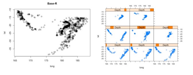 --- ## ggplot2 The ggplot2 package was created by Hadley Wickham to provide an intuitive plotting system to rapidly generate publication quality graphics. ggplot2 builds on the concept of the "Grammar of Graphics" (Wilkinson 2005, Bertin 1983) which describes a consistent syntax for the construction of a wide range of complex graphics by a concise description of their components. ggplot2 is a core part of the Tidyverse, a group of packages designed to make data science easy and functional in R. To get an introduction to the core concepts of Tidyverse check out our training materials [here](https://rockefelleruniversity.github.io/RU_tidyverse_core/). --- ## Why use ggplot2 The structured syntax and high level of abstraction used by ggplot2 should allow for the user to concentrate on the visualizations instead of creating the underlying code. On top of this central philosophy ggplot2 has: - Increased flexible over many plotting systems. - An advanced theme system for professional/publication level graphics. - Large developer base -- Many libraries extending its flexibility. - Large user base -- Great documentation and active mailing list. --- class: inverse, center, middle # Grammar of Graphics <html><div style='float:left'></div><hr color='#EB811B' size=1px width=720px></html> --- ## How ggplot2 builds a plot <!-- 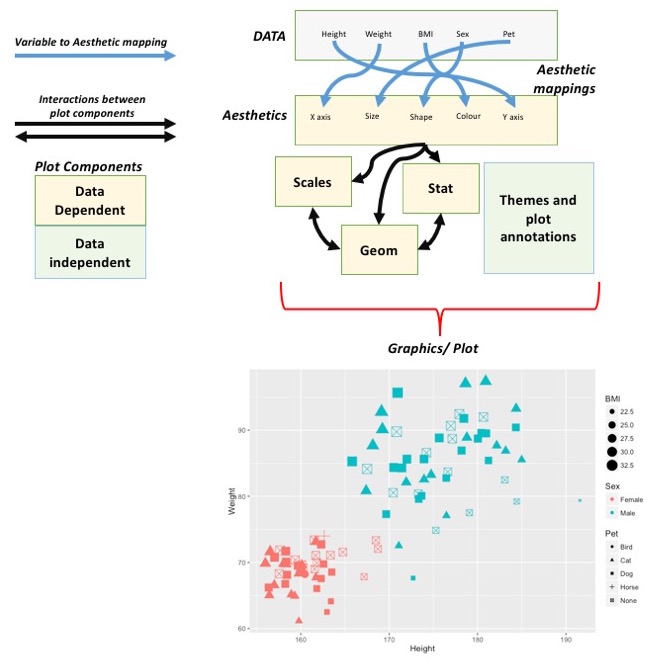 --> <div align="center"> <img src="imgs/Slide2.jpg" alt="igv" height="500" width="550"> </div> --- ## Example scatter plot Overview of example code for the ggplot2 scatter plot. ``` r ggplot(data = <default data set>, aes(x = <default x axis variable>, y = <default y axis variable>, ... <other default aesthetic mappings>), ... <other plot defaults>) + geom_scatter(aes(size = <size variable for this geom>, ... <other aesthetic mappings>), data = <data for this point geom>, stat = <statistic string or function>, position = <position string or function>, color = <"fixed color specification">, <other arguments, possibly passed to the _stat_ function) + scale_<aesthetic>_<type>(name = <"scale label">, breaks = <where to put tick marks>, labels = <labels for tick marks>, ... <other options for the scale>) + ggtitle("Graphics/Plot")+ xlab("Weight")+ ylab("Height")+ theme(plot.title = element_text(color = "gray"), ... <other theme elements>) ``` --- ## What users are required to specify <!-- 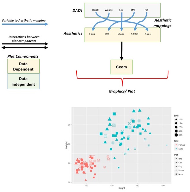 --> <div align="center"> <img src="imgs/Slide3.jpg" alt="igv" height="500" width="550"> </div> --- ## Actual example scatter plot ``` r ggplot(data = patients_clean, aes(y = Weight, x = Height, color = Sex, size = BMI, shape = Pet)) + geom_point() ``` 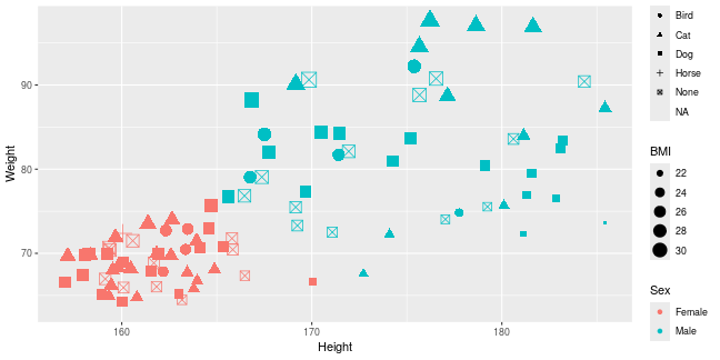<!-- --> --- class: inverse, center, middle # Getting Started With ggplot2 <html><div style='float:left'></div><hr color='#EB811B' size=1px width=720px></html> --- ## Setting the Working directory First we need a dataset. If you downloaded the course material you we have some data in there. Your current working directory is typically your *HOME* directory. We want to set our working directory to be in the downloaded course material, so everyone is in the same place. **Session -> Set Working Directory -> Choose Directory** or in the console. ``` r setwd("/PathToMyDownload/Plotting_In_R-master/r_course") # e.g. setwd('/Users/mattpaul/Downloads/Intro_To_R_1Day/r_course') ``` --- ## Getting our data Now lets get our data set. Here we read some data from the *data* directory using the **read.delim()** function. We can use the **class()** function to get the data.type of our table and **dim()** function to get the numbers of row and column. ``` r library(ggplot2) patients_clean <- read.delim("data/patient-data-cleaned.txt", sep = "\t") class(patients_clean) ``` ``` ## [1] "data.frame" ``` ``` r dim(patients_clean) ``` ``` ## [1] 100 17 ``` --- # Review the data We can just review the first two rows to get an idea of the content of data ``` r patients_clean[1:2, ] ``` ``` ## ID Name Race Sex Smokes Height Weight Birth State Pet ## 1 AC/AH/001 Michael White Male Non-Smoker 182.87 76.57 1972-02-06 Georgia Dog ## 2 AC/AH/017 Derek White Male Non-Smoker 179.12 80.43 1972-06-15 Missouri Dog ## Grade Died Count Date.Entered.Study Age BMI Overweight ## 1 2 FALSE 0.01 2015-12-01 44 22.90 FALSE ## 2 2 FALSE -1.31 2015-12-01 43 25.07 TRUE ``` --- # Review the data.frame By default, R's read.delim function has read in the data as a data.frame. Data.frames are essential for ggplot2 as we can have mixes of numerical, character and catergorical data in one table. ``` r patients_clean$Smokes[1:5] ``` ``` ## [1] "Non-Smoker" "Non-Smoker" "Non-Smoker" "Non-Smoker" "Non-Smoker" ``` ``` r patients_clean$Height[1:5] ``` ``` ## [1] 182.87 179.12 169.15 175.66 164.47 ``` --- # Review the data.frame with summary We can get an overview of the data in all columns of data.frame using the **summary()** function ``` r summary(patients_clean) ``` ``` ## ID Name Race Sex ## Length:100 Length:100 Length:100 Length:100 ## Class :character Class :character Class :character Class :character ## Mode :character Mode :character Mode :character Mode :character ## ## ## ## ## Smokes Height Weight Birth ## Length:100 Min. :157.0 Min. :63.54 Length:100 ## Class :character 1st Qu.:161.5 1st Qu.:68.17 Class :character ## Mode :character Median :165.7 Median :72.27 Mode :character ## Mean :167.9 Mean :74.89 ## 3rd Qu.:174.5 3rd Qu.:80.56 ## Max. :185.4 Max. :97.67 ## ## State Pet Grade Died ## Length:100 Length:100 Min. :1.000 Mode :logical ## Class :character Class :character 1st Qu.:1.000 FALSE:46 ## Mode :character Mode :character Median :2.000 TRUE :54 ## Mean :2.054 ## 3rd Qu.:3.000 ## Max. :3.000 ## NA's :7 ## Count Date.Entered.Study Age BMI ## Min. :-3.1400 Length:100 Min. :42.00 Min. :21.41 ## 1st Qu.:-0.8100 Class :character 1st Qu.:42.75 1st Qu.:25.07 ## Median :-0.0550 Mode :character Median :43.00 Median :26.51 ## Mean :-0.1066 Mean :43.09 Mean :26.54 ## 3rd Qu.: 0.6150 3rd Qu.:44.00 3rd Qu.:27.90 ## Max. : 1.7900 Max. :44.00 Max. :31.70 ## ## Overweight ## Mode :logical ## FALSE:23 ## TRUE :77 ## ## ## ## ``` --- ## Our first ggplot2 graph As seen above, in order to produce a ggplot2 graph we need a minimum of: - Data to be used in graph - Mappings of data to the graph (*aesthetic* mapping) - What type of graph we want to use (The *geom* to use). --- ## Our first ggplot2 graph In the code below we define the data as our cleaned patients data frame. ``` r pcPlot <- ggplot(data = patients_clean) class(pcPlot) ``` ``` ## [1] "gg" "ggplot" ``` Now we can see that we have gg/ggplot object (pcPlot). --- ## Our first ggplot2 graph Within this gg/ggplot object the data has been defined. ``` r pcPlot$data[1:4, ] ``` ``` ## ID Name Race Sex Smokes Height Weight Birth State ## 1 AC/AH/001 Michael White Male Non-Smoker 182.87 76.57 1972-02-06 Georgia ## 2 AC/AH/017 Derek White Male Non-Smoker 179.12 80.43 1972-06-15 Missouri ## 3 AC/AH/020 Todd Black Male Non-Smoker 169.15 75.48 1972-07-09 Pennsylvania ## 4 AC/AH/022 Ronald White Male Non-Smoker 175.66 94.54 1972-08-17 Florida ## Pet Grade Died Count Date.Entered.Study Age BMI Overweight ## 1 Dog 2 FALSE 0.01 2015-12-01 44 22.90 FALSE ## 2 Dog 2 FALSE -1.31 2015-12-01 43 25.07 TRUE ## 3 None 2 FALSE -0.17 2015-12-01 43 26.38 TRUE ## 4 Cat 1 FALSE -1.10 2015-12-01 43 30.64 TRUE ``` --- ## Our first ggplot2 graph Important information on how to map the data to the visual properties (aesthetics) of the plot as well as what type of plot to use (geom) have however yet to specified. ``` r pcPlot$mapping ``` ``` ## Aesthetic mapping: ## <empty> ``` ``` r pcPlot$theme ``` ``` ## list() ``` ``` r pcPlot$layers ``` ``` ## list() ``` --- ## Our first ggplot2 graph The information to map the data to the plot can be added now using the aes() function. ``` r pcPlot <- ggplot(data = patients_clean) pcPlot <- pcPlot + aes(x = Height, y = Weight) pcPlot$mapping ``` ``` ## Aesthetic mapping: ## * `x` -> `Height` ## * `y` -> `Weight` ``` ``` r pcPlot$theme ``` ``` ## list() ``` ``` r pcPlot$layers ``` ``` ## list() ``` But we are still missing the final component of our plot, the type of plot to use (geom). --- ## Our first ggplot2 graph Below the geom_point function is used to specify a point plot, a scatter plot of Height values on the x-axis versus Weight values on the y values. ``` r pcPlot <- ggplot(data = patients_clean) pcPlot <- pcPlot + aes(x = Height, y = Weight) pcPlot <- pcPlot + geom_point() ``` --- ## Our first ggplot2 graph ``` r pcPlot$mapping ``` ``` ## Aesthetic mapping: ## * `x` -> `Height` ## * `y` -> `Weight` ``` ``` r pcPlot$theme ``` ``` ## list() ``` ``` r pcPlot$layers ``` ``` ## [[1]] ## geom_point: na.rm = FALSE ## stat_identity: na.rm = FALSE ## position_identity ``` --- ## Our first ggplot2 graph Now we have all the components of our plot, we need we can display the results. ``` r pcPlot ``` 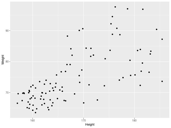<!-- --> --- class: inverse, center, middle # Geoms <html><div style='float:left'></div><hr color='#EB811B' size=1px width=720px></html> --- ## Our first ggplot2 graph More typically, the data and aesthetics are defined within ggplot function and geoms applied afterwards. This makes it easier to switch between plot types to find the best way to visualize your data. ``` r pcPlot <- ggplot(data = patients_clean, mapping = aes(x = Height, y = Weight)) pcPlot + geom_point() ``` 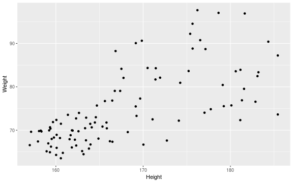<!-- --> ## Plot types There are many geoms available in ggplot2: * geom_point() - Scatter plots * geom_line() - Line plots * geom_smooth() - Fitted line plots * geom_bar() - Bar plots * geom_boxplot() - Boxplots * geom_jitter() - Jitter to plots * geom_histogram() - Histogram plots * geom_density() - Density plots * geom_text() - Text to plots * geom_errorbar() - Errorbars to plots * geom_violin() - Violin plots --- ## Line plots ``` r pcPlot <- ggplot(data = patients_clean, mapping = aes(x = Height, y = Weight)) pcPlot_line <- pcPlot + geom_line() pcPlot_line ``` 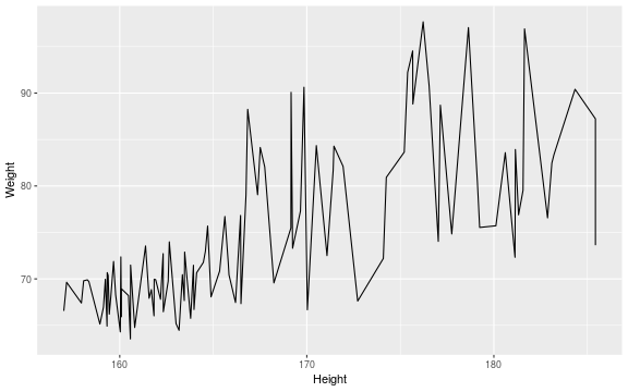<!-- --> --- ## Smoothed line plots ``` r pcPlot <- ggplot(data = patients_clean, mapping = aes(x = Height, y = Weight)) pcPlot_smooth <- pcPlot + geom_smooth() pcPlot_smooth ``` ``` ## `geom_smooth()` using method = 'loess' and formula = 'y ~ x' ``` 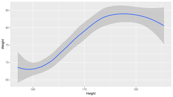<!-- --> --- ## Bar plots ``` r pcPlot <- ggplot(data = patients_clean, mapping = aes(x = Sex)) pcPlot_bar <- pcPlot + geom_bar() pcPlot_bar ``` 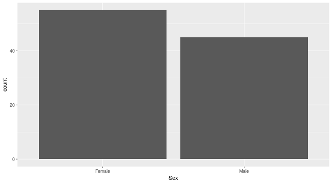<!-- --> --- ## Histograms ``` r pcPlot <- ggplot(data = patients_clean, mapping = aes(x = Height)) pcPlot_hist <- pcPlot + geom_histogram() pcPlot_hist ``` ``` ## `stat_bin()` using `bins = 30`. Pick better value with `binwidth`. ``` 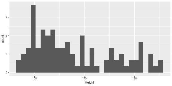<!-- --> --- ## Density plots ``` r pcPlot <- ggplot(data = patients_clean, mapping = aes(x = Height)) pcPlot_density <- pcPlot + geom_density() pcPlot_density ``` 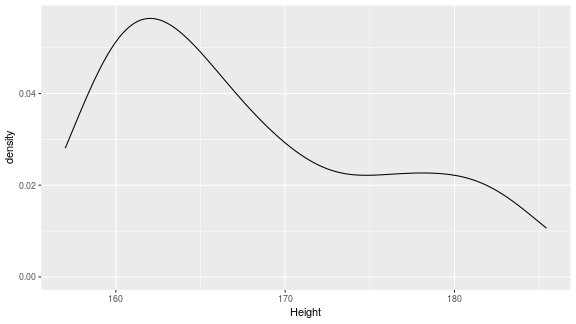<!-- --> --- ## Box plots ``` r pcPlot <- ggplot(data = patients_clean, mapping = aes(x = Sex, y = Height)) pcPlot_boxplot <- pcPlot + geom_boxplot() pcPlot_boxplot ``` 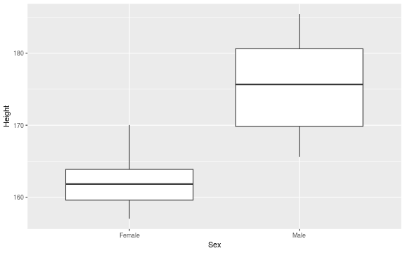<!-- --> --- ## Violin plots ``` r pcPlot <- ggplot(data = patients_clean, mapping = aes(x = Sex, y = Height)) pcPlot_violin <- pcPlot + geom_violin() pcPlot_violin ``` 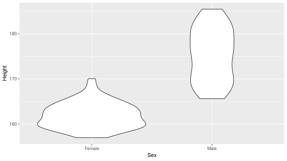<!-- --> --- ## Multiple Geoms We can also provide multiple geoms. Often we may want to do this to add complexity to our plot. In this case we often may like to see the data points driving our violin plot. So we also add a jitter on top. ``` r ggplot(data = patients_clean, mapping = aes(x = Sex, y = Height)) + geom_violin() + geom_jitter() ``` 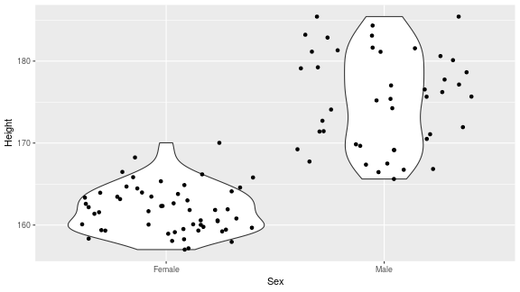<!-- --> --- ## There are a world of geoms An overview of geoms and their arguments can be found in the ggplot2 documentation or within the ggplot2 quick reference guides. - [ggplot2 documentation](https://ggplot2.tidyverse.org/) - [ggplot2 guide](http://sape.inf.usi.ch/quick-reference/ggplot2/geom) --- class: inverse, center, middle # Aesthetics <html><div style='float:left'></div><hr color='#EB811B' size=1px width=720px></html> --- ## Aesthetics In order to change the property on an aesthetic of a plot into a *constant* value (e.g. set color of all points to red) we can supply the color argument to the geom_point() function. ``` r pcPlot <- ggplot(data = patients_clean, mapping = aes(x = Height, y = Weight)) pcPlot + geom_point(color = "red") ``` 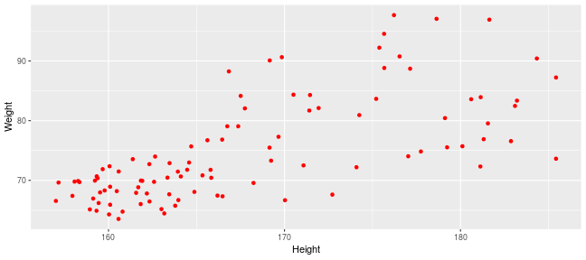<!-- --> --- ## Plot properties .pull-left[ As we discussed earlier however, ggplot2 makes use of aesthetic mappings to assign variables in the data to the properties/aesthetics of the plot. This allows the properties of the plot to reflect variables in the data *dynamically*. In these examples we supply additional information to the aes() function to define what information to display and how it is represented in the plot. ] .pull-right[ First we can recreate the plot we saw earlier. ``` r pcPlot <- ggplot(data=patients_clean, mapping=aes(x=Height, y=Weight)) pcPlot+geom_point() ``` <!-- --> ] --- ## Color Now we can adjust the aes mapping by supplying an argument to the color parameter in the aes function. (Note that ggplot2 accepts "color" or "color" as parameter name) This simple adjustment allows for identification of the separation between male and female measurements for height and weight. ``` r pcPlot <- ggplot(data = patients_clean, mapping = aes(x = Height, y = Weight, color = Sex)) pcPlot + geom_point() ``` 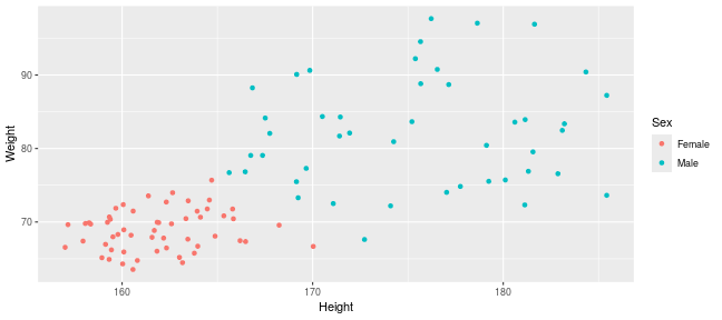<!-- --> --- ## Point shape Similarly the shape of points may be adjusted. ``` r pcPlot <- ggplot(data = patients_clean, mapping = aes(x = Height, y = Weight, shape = Sex)) pcPlot + geom_point() ``` 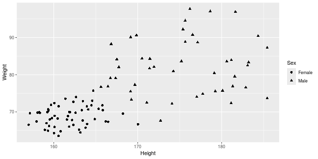<!-- --> --- ## Aesthetics in geom The aesthetic mappings may be set directly in the geom_points() function as previously when specifying red. This can allow the same ggplot object to be used by different aesthetic mappings and varying geoms. ``` r pcPlot <- ggplot(data = patients_clean) ``` --- ## Aesthetics in geom ``` r pcPlot + geom_point(aes(x = Height, y = Weight, color = Sex)) ``` 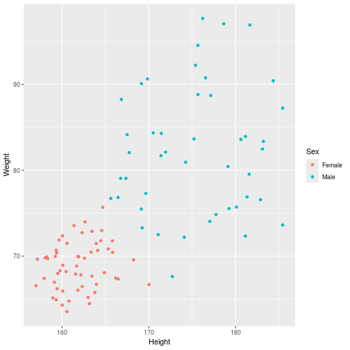<!-- --> --- ## Aesthetics in geom ``` r pcPlot + geom_point(aes(x = Height, y = Weight, color = Smokes)) ``` 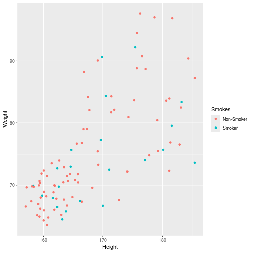<!-- --> --- ## Aesthetics in geom ``` r pcPlot + geom_point(aes(x = Height, y = Weight, color = Smokes, shape = Sex)) ``` 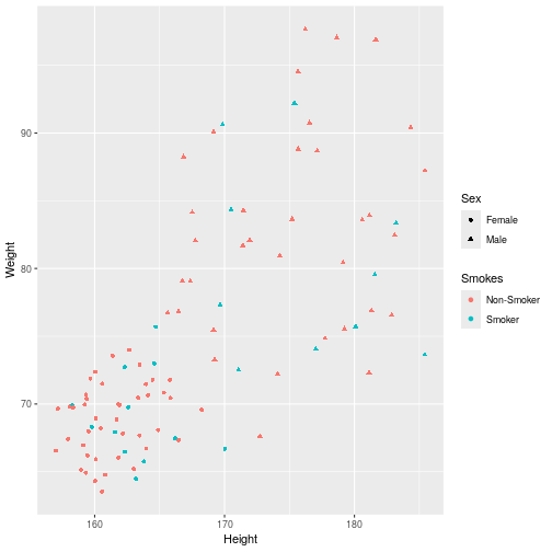<!-- --> --- ## Aesthetics in geom ``` r pcPlot + geom_violin(aes(x = Sex, y = Height, fill = Smokes)) ``` 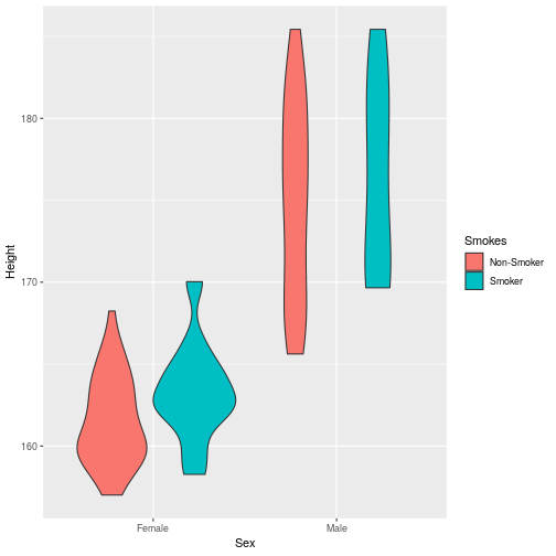<!-- --> --- ## Geom paramters Many Geoms will have some specific aesthetics for that plot type. In this case we may want to adjust the width of our jitter to make it a bit more narrow and focused. ``` r ggplot(data = patients_clean, mapping = aes(x = Sex, y = Height, fill = Sex)) + geom_violin() + geom_jitter(width = 0.2) ``` 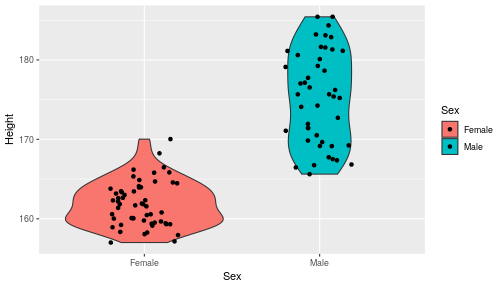<!-- --> --- ## Aesthetics in geom Again, for a comprehensive list of parameters and aesthetic mappings used in geom_*type* functions see the ggplot2 documentation for individual geoms by using ?geom_*type* ``` r `?`(geom_point) ``` or visit the ggplot2 documentations pages and quick reference: - [ggplot2 documentation](http://docs.ggplot2.org/current/) - [Quick Reference](http://sape.inf.usi.ch/quick-reference/ggplot2/geom) --- Exercise on the principles of ggplot can be found [here](../../exercises/exercises/ggplot2_1_exercise.html) --- Answers for the principles of ggplot can be found [here](../../exercises/answers/ggplot2_1_answers.html) --- class: inverse, center, middle # Facets <html><div style='float:left'></div><hr color='#EB811B' size=1px width=720px></html> --- ## Facets One very useful feature of ggplot is faceting. This allows you to produce several plots that subset by variables in your data. To facet our data into multiple plots we can use the *facet_wrap* or *facet_grid* function specifying the variable we split by. The *facet_grid* function is well suited to splitting the data by two factors while *facet_wrap* simply wraps the data in a 2d format based on factor levels. <img src="imgs/facet_wrap_vs_grid.png" width="350"> (https://ggplot2-book.org/) --- ## Split by 2 factors Here we can plot the data with the Smokes variable as rows and Sex variable as columns. <div align="center"> facet_grid(Rows~Columns) </div> ``` r pcPlot <- ggplot(data = patients_clean, aes(x = Height, y = Weight, color = Sex)) + geom_point() pcPlot + facet_grid(Smokes ~ Sex) ``` 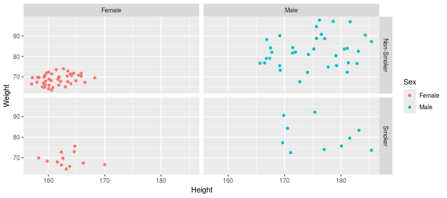<!-- --> --- ## Split by 1 factor To split by one factor we use the the facet_grid() function again, but omit the variable before the "~". This will facet along columns in plot. <div align="center"> facet_grid(~Columns) </div> ``` r pcPlot <- ggplot(data = patients_clean, aes(x = Height, y = Weight, color = Sex)) + geom_point() pcPlot + facet_grid(~Sex) ``` 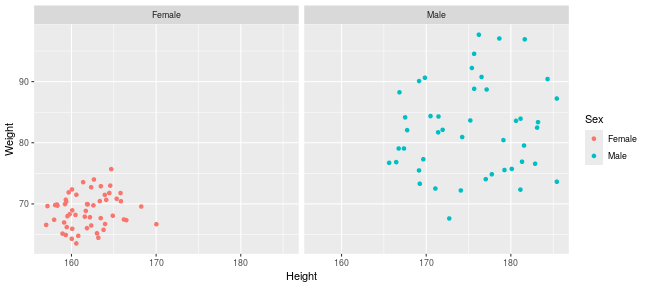<!-- --> --- ## Split by 1 factor Similarly, to split along rows in plot, the variable is placed before the "~.". <div align="center"> facet_grid(Rows~.) </div> ``` r pcPlot <- ggplot(data = patients_clean, aes(x = Height, y = Weight, color = Sex)) + geom_point() pcPlot + facet_grid(Sex ~ .) ``` 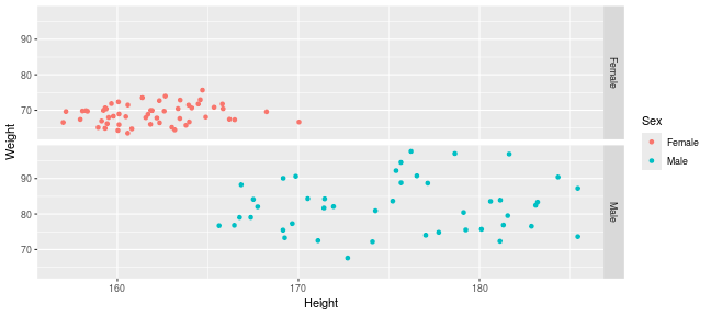<!-- --> --- ## facet_wrap() The *facet_wrap()* function offers a less grid-based structure but is well suited to faceting data by one variable. For *facet_wrap()* we follow as similar syntax to *facet_grid()*. ``` r pcPlot <- ggplot(data = patients_clean, aes(x = Height, y = Weight, color = Sex)) + geom_point() pcPlot + facet_wrap(~Smokes) ``` 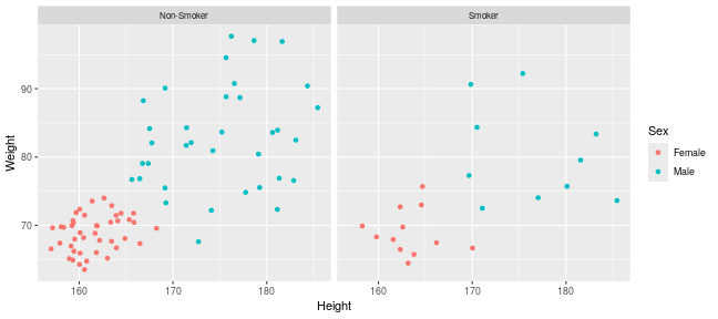<!-- --> --- ## Multiple variables For more complex faceting both *facet_grid* and *facet_wrap* can accept combinations of variables. Here we use *facet_wrap*. ``` r pcPlot <- ggplot(data = patients_clean, aes(x = Height, y = Weight, color = Sex)) + geom_point() pcPlot + facet_wrap(~Pet + Smokes + Sex) ``` 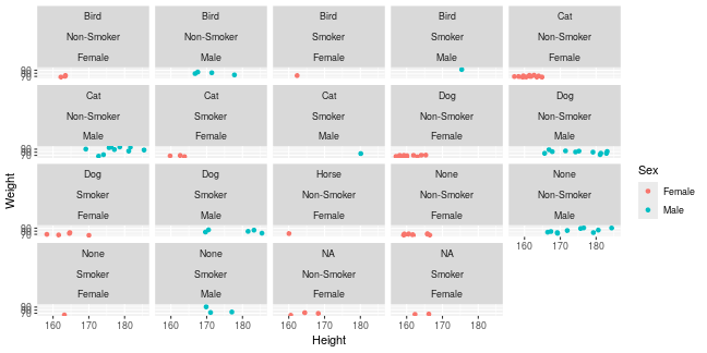<!-- --> --- ## Multiple variables Or in a nice grid format using facet_grid() and the Smokes variable against a combination of Gender and Pet. ``` r pcPlot + facet_grid(Smokes ~ Sex + Pet) ``` 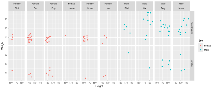<!-- --> --- class: inverse, center, middle # Plotting Order <html><div style='float:left'></div><hr color='#EB811B' size=1px width=720px></html> --- ## Plotting order in ggplot We will shortly discuss how to change various aspects of the plot layout and appearance. However, a common-asked question is how to change the order in which R plots a categorical variable. Consider the boxplot to compare weights of males and females: ``` r ggplot(patients_clean, aes(x = Sex, y = Weight)) + geom_boxplot() ``` 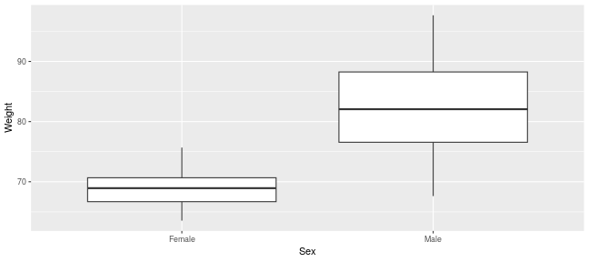<!-- --> --- ## Plotting order and factors Here, R decides the order to arrange the boxes according to the `levels` of the categorical variable. If there are no levels or the levels are not ordered it defaults to the alphabetical order. i.e. Female before Male. ``` r levels(patients_clean$Sex) ``` ``` ## NULL ``` --- ## Plotting order and factors Depending on the message we want the plot to convey, we might want control over the order of boxes. The `factor` functions allows us to explicitly change the order of the levels. ``` r patients_clean$Sex <- factor(patients_clean$Sex, levels = c("Male", "Female")) ggplot(patients_clean, aes(x = Sex, y = Weight)) + geom_boxplot() ``` 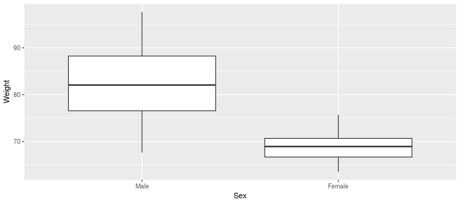<!-- --> --- class: inverse, center, middle # Scales <html><div style='float:left'></div><hr color='#EB811B' size=1px width=720px></html> --- ## Scales Scales and their legends have so far been handled using ggplot2 defaults. ggplot2 offers functionality to have finer control over scales and legends using the *scale* methods. Scale methods are divided into functions by combinations of * the aesthetics they control. * the type of data mapped to scale. scale_aesthetic_type Try typing in scale_ then *tab* to autocomplete. This will provide some examples of the scale functions available in ggplot2. --- ## Arguments Although different *scale* functions accept some variety in their arguments, common arguments to scale functions include: - name - The axis or legend title - limits - Minimum and maximum of the scale - breaks - Label/tick positions along an axis - labels - Label names at each break --- ## Controlling the X and Y scale. Both continuous and discrete X/Y scales can be controlled in ggplot2 using: scale\_**(x/y)**\_**(continuous/discrete)** --- ## Continuous axes scales In this example we control the continuous scale on the x-axis by providing a name, x-axis limits, the positions of breaks (ticks/labels) and the labels to place at breaks. ``` r pcPlot <- ggplot(data = patients_clean, mapping = aes(x = Height, y = Weight, color = Sex)) + geom_point() pcPlot + geom_point() + scale_x_continuous(name = "height ('cm')", limits = c(150, 200), breaks = c(160, 180), labels = c("Short", "Tall")) ``` 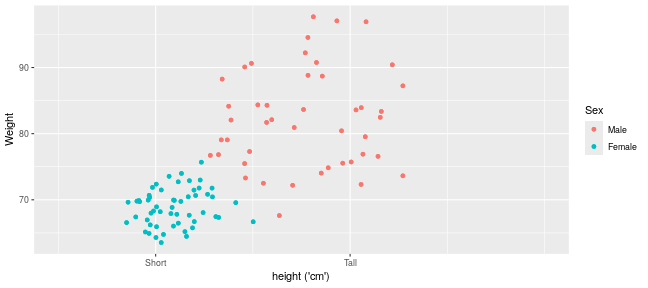<!-- --> --- ## Discrete axes scales Similarly control over discrete scales is shown below. ``` r pcPlot <- ggplot(data = patients_clean, aes(x = Sex, y = Height)) pcPlot + geom_violin(aes(x = Sex, y = Height)) + scale_x_discrete(labels = c("Men", "Women")) ``` 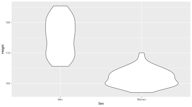<!-- --> --- ## Combining axes scales Multiple X/Y scales can be combined to give full control of axis marks. ``` r pcPlot <- ggplot(data = patients_clean, aes(x = Sex, y = Height, fill = Smokes)) pcPlot + geom_violin(aes(x = Sex, y = Height)) + scale_x_discrete(labels = c("Men", "Women")) + scale_y_continuous(breaks = c(160, 180), labels = c("Short", "Tall")) ``` 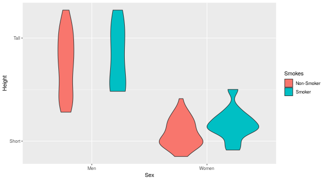<!-- --> --- ## Controlling other scales When using fill, color, linetype, shape, size or alpha aesthetic mappings the scales are automatically selected for you and the appropriate legends created. ``` r pcPlot <- ggplot(data = patients_clean, aes(x = Height, y = Weight, color = Sex)) pcPlot + geom_point(size = 4) ``` 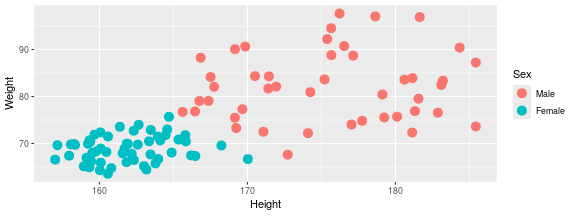<!-- --> In the above example the discrete colors for the Sex variable was selected by default. --- ## Manual discrete color scale Manual control of discrete variables can be performed using scale\_*aes_Of_Interest*\_**manual** with the *values* parameter. Additionally in this example an updated name for the legend is provided. ``` r pcPlot <- ggplot(data = patients_clean, aes(x = Height, y = Weight, color = Sex)) pcPlot + geom_point(size = 4) + scale_color_manual(values = c("Green", "Purple"), name = "Gender") ``` 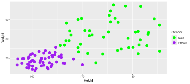<!-- --> --- ## Named Colors and hex codes Most colors can simply be defined by writing them in as a character vector i.e. "green". There are a wide variety of named colors available in R. From "darkgoldenrod" to "bisque". And 100 different shades of gray. You can find an extensive list of R colors [here](http://www.stat.columbia.edu/~tzheng/files/Rcolor.pdf). You can also use hex codes: a hexadecimal format for identifying colors. This gives greater variety of options as they use the full color spectrum. Each pair of characters corresponds to the Red, Green and Blue content for the color i.e. #ffe4c4 (also known as Bisque) is composed of 100% red, 89.4% green and 76.9% blue. Resources like this [color picker](https://htmlcolorcodes.com/color-picker/) can be used to help you find specific shades, and even create complementary palettes. --- ## Packages for color scales Here we have specified the colors to be used (hence the scale\_color\_**manual**) but when the number of levels to a variable are high this may be impractical and often we would like ggplot2 to choose colors from a scale of our choice. There are a number of collections of in-built and installable package palettes in ggplot2, namely [colorbrewer](https://r-graph-gallery.com/38-rcolorbrewers-palettes.html), [paleteer](https://r-graph-gallery.com/color-palette-finder) and [viridis](https://cran.r-project.org/web/packages/viridis/vignettes/intro-to-viridis.html). Palettes are prebuilt collections of colors. They can consist of a various numbers of colors and can have different properties i.e. continuous/discrete or divergent --- ## scale_color_brewer Colorbrewer comes with ggplot ``` r pcPlot <- ggplot(data = patients_clean, aes(x = Height, y = Weight, color = Pet)) pcPlot + geom_point(size = 4) + scale_color_brewer(palette = "Set2") ``` 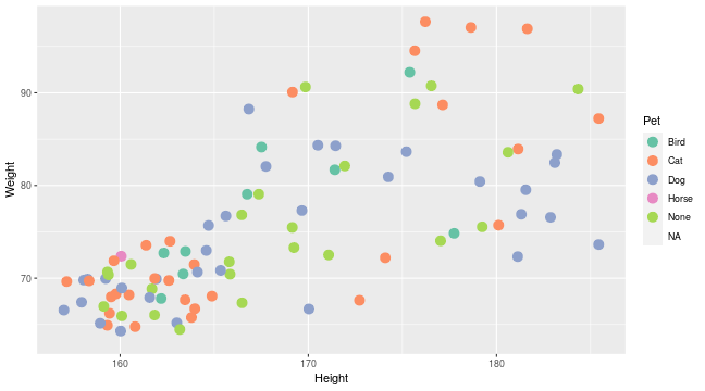<!-- --> --- ## scale_color_paletteer_d Paletteer is a collection of user-defined palettes that have been collated. They have wildly different rationales including famous artworks, Wes Anderson movies and Birds. ``` r library(paletteer) pcPlot <- ggplot(data = patients_clean, aes(x = Height, y = Weight, color = Pet)) pcPlot + geom_point(size = 4) + scale_color_paletteer_d(palette = "wesanderson::Zissou1") ``` 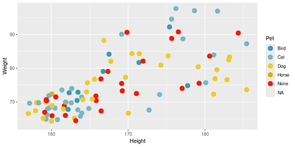<!-- --> --- ## scale_color_viridis_d Viridis is a collection scientifically designed color palette to help with color blindness and to accurately show the dynamic range in data sets. ``` r pcPlot <- ggplot(data = patients_clean, aes(x = Height, y = Weight, color = Pet)) pcPlot + geom_point(size = 4) + scale_color_viridis_d() ``` 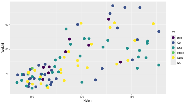<!-- --> --- ## Color blindness + Uniform Perception Using custom colors is great and can really help a make a piece of work cohesive and stand out. But you have to be careful. ~4% of people are color blind. In white males this number raises to ~10%. Considering the demographics in science, there will likely be someone with color blindness in your meeting. Furthermore, when we pick gradients the ability to see patterns in the data varies depending on the color scales used, even in sighted people. --- ## Color blindness + Uniform Perception 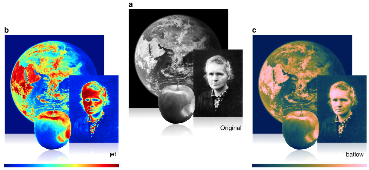 (Crameri et al, 2020) --- ## Color blindness and ggplot2 defaults <img src="imgs/example_ggplot_defulats.jpg" width="550"> ([@dichromat-chloe.bsky.social](https://bsky.app/profile/dichromat-chloe.bsky.social/post/3lbrtas6luc2r)) --- ## Picking Colors Sticking with default colors maybe easy, but it is important to switch things up before you present the data in any way for multiple reasons. There's no singular correct answer but remember the aim: * Visually faithful to the dynamic scale of the underlying data * Translates well to greyscale (printing) * Is accessible to those with color blindness. --- ## Palettes For more details on palette sizes and styles visit the colorbrewer website and ggplot2 reference page. - [Colorbrewer](https://r-graph-gallery.com/38-rcolorbrewers-palettes.html) - [Paleteer](https://r-graph-gallery.com/color-palette-finder) - [Viridis](https://cran.r-project.org/web/packages/viridis/vignettes/intro-to-viridis.html) - [ggplot2 color scales](https://ggplot2.tidyverse.org/reference/scale_brewer.html) --- class: inverse, center, middle # Continuous Scales <html><div style='float:left'></div><hr color='#EB811B' size=1px width=720px></html> --- ## Continuous scales So far we have looked a qualitative scales but ggplot2 offers much functionality for continuous scales such as for size, alpha (transparency), color and fill. - scale_alpha_continuous() - For transparency - scale_size_continuous() - For control of size. --- ## Alpha Both these functions accept the range of alpha/size to be used in plotting. Below the range of alpha to be used in plot is limited to between 0.5 and 1. ``` r pcPlot <- ggplot(data = patients_clean, aes(x = Height, y = Weight, alpha = BMI)) pcPlot + geom_point(size = 4) + scale_alpha_continuous(range = c(0.5, 1)) ``` 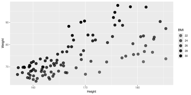<!-- --> --- ## Size Below the range of sizes to be used in plot is limited to between 3 and 6. ``` r pcPlot <- ggplot(data = patients_clean, aes(x = Height, y = Weight, size = BMI)) pcPlot + geom_point(alpha = 0.8) + scale_size_continuous(range = c(3, 6)) ``` 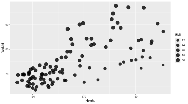<!-- --> --- ## Limits The limits of the scale can also be controlled but it is important to note data outside of scale is removed from plot. ``` r pcPlot <- ggplot(data = patients_clean, aes(x = Height, y = Weight, size = BMI)) pcPlot + geom_point() + scale_size_continuous(range = c(3, 6), limits = c(25, 40)) ``` 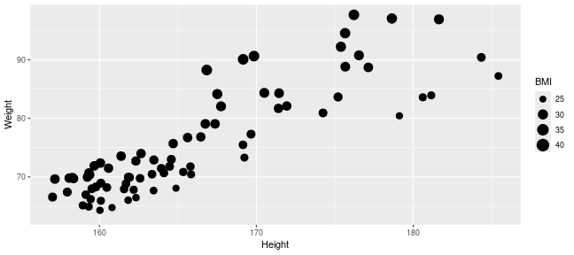<!-- --> --- ## Labels What points of scale to be labeled and labels text can also be controlled. ``` r pcPlot <- ggplot(data = patients_clean, aes(x = Height, y = Weight, size = BMI)) pcPlot + geom_point() + scale_size_continuous(range = c(3, 6), breaks = c(25, 30), labels = c("Good", "Good but not 25")) ``` 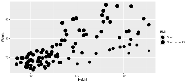<!-- --> --- ## Color Control of color/fill scales can be best achieved through the **gradient** subfunctions of scale. - scale\_(color/fill)\_*gradient* - 2 color gradient (eg. low to high BMI) - scale\_(color/fill)\_*gradient2* - Diverging color scale with a midpoint color (e.g. Down, No Change, Up) Both functions take a common set of arguments:- - low - color for low end of gradient scale - high - color for high end of gradient scale. - na.value - color for any NA values. --- ## Color An example using scale\_color\_gradient below sets the low and high end colors to White and Red respectively ``` r pcPlot <- ggplot(data = patients_clean, aes(x = Height, y = Weight, color = BMI)) pcPlot + geom_point(size = 4, alpha = 0.8) + scale_color_gradient(low = "White", high = "Red") ``` 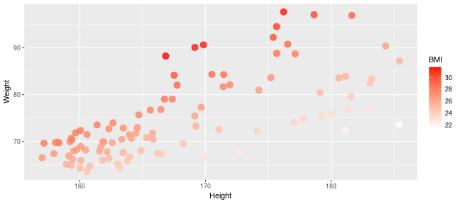<!-- --> --- ## Color Similarly we can use the scale_color_gradient2 function which allows for the specification of a midpoint value and its associated color. ``` r pcPlot <- ggplot(data = patients_clean, aes(x = Height, y = Weight, color = BMI)) pcPlot + geom_point(size = 4, alpha = 0.8) + scale_color_gradient2(low = "Blue", mid = "Black", high = "Red", midpoint = median(patients_clean$BMI)) ``` 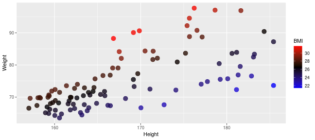<!-- --> --- ## Labels As with previous continuous scales, limits and custom labels in scale legend can be added. ``` r pcPlot <- ggplot(data = patients_clean, aes(x = Height, y = Weight, color = BMI)) pcPlot + geom_point(size = 4, alpha = 0.8) + scale_color_gradient2(low = "Blue", mid = "Black", high = "Red", midpoint = median(patients_clean$BMI), breaks = c(25, 30), labels = c("Low", "High"), name = "Body Mass Index") ``` 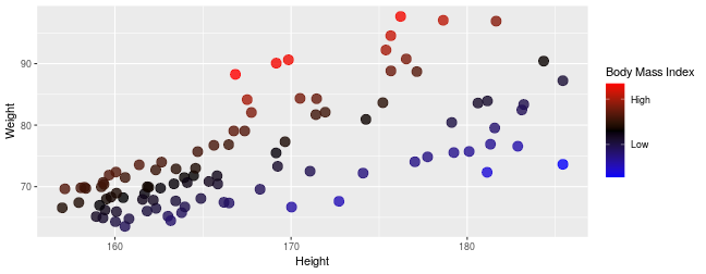<!-- --> --- ## Scales are very customizable Multiple scales may be combined to create high customizable plots and scales ``` r pcPlot <- ggplot(data = patients_clean, aes(x = Height, y = Weight, color = BMI, shape = Sex)) pcPlot + geom_point(size = 4, alpha = 0.8) + scale_shape_discrete(name = "Gender") + scale_color_gradient2(low = "Blue", mid = "Black", high = "Red", midpoint = median(patients_clean$BMI), breaks = c(25, 30), labels = c("Low", "High"), name = "Body Mass Index") ``` 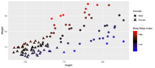<!-- --> --- ## Conditional scales and colors We can also use an ifelse conditional statement to apply discrete color cutoffs for groups of data points that aren't represented by categorical variables in the data set. ``` r pcPlot <- ggplot(data = patients_clean, aes(x = Height, y = Weight, shape = Sex, color = ifelse(BMI > 30, "High", ifelse(BMI < 25, "Low", "Middle")))) pcPlot + geom_point(size = 4, alpha = 0.8) + scale_shape_discrete(name = "Gender") + scale_color_manual(name = "BMI category", values = c("red", "blue", "grey")) ``` 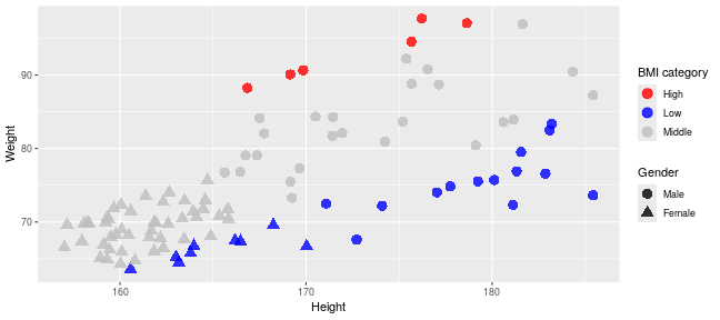<!-- --> --- ## Continuous scales and palettes There are similar continuous palettes to use with ggplot2. You can just modify the palette function to end with *_c* for paletteer and viridis. .pull-left[ ``` r pcPlot <- ggplot(data = patients_clean, aes(x = Height, y = Weight, color = BMI)) pcPlot + geom_point(size = 4, alpha = 0.8) + scale_color_viridis_c() ``` 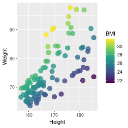<!-- --> ] .pull-right[ ``` r pcPlot <- ggplot(data = patients_clean, aes(x = Height, y = Weight, color = BMI)) pcPlot + geom_point(size = 4, alpha = 0.8) + scale_color_paletteer_c(palette = "grDevices::Temps") ``` 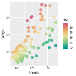<!-- --> ] --- class: inverse, center, middle # Transformations <html><div style='float:left'></div><hr color='#EB811B' size=1px width=720px></html> --- ## Statistical transformations In ggplot2, many of the statistical transformations are performed without any direct specification e.g. *geom_histogram* will use *stat_bin* function to generate bin counts to be used in plot. An example of statistical methods in ggplot2 which are very useful include the *stat_smooth* and *stat_summary* functions. --- ## Fitting lines The *stat_smooth* function can be used to fit a line to the data being displayed. ``` r pcPlot <- ggplot(data = patients_clean, mapping = aes(x = Height, y = Weight)) pcPlot + geom_point() + stat_smooth() ``` ``` ## `geom_smooth()` using method = 'loess' and formula = 'y ~ x' ``` 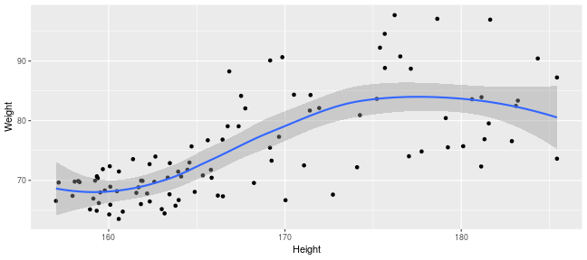<!-- --> --- ## Loess and more By default a "loess" smooth line is plotted by *stat_smooth*. Other methods available include lm, glm, gam, rlm. ``` r pcPlot <- ggplot(data = patients_clean, mapping = aes(x = Height, y = Weight)) pcPlot + geom_point() + stat_smooth(method = "lm") ``` ``` ## `geom_smooth()` using formula = 'y ~ x' ``` 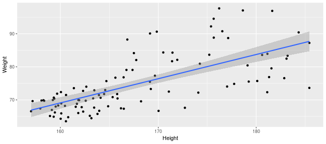<!-- --> --- ## Fitting lines in groups A useful feature of ggplot2 is that it uses previously defined grouping when performing smoothing. If coloring by Sex is an aesthetic mapping then two smooth lines are drawn, one for each sex. ``` r pcPlot <- ggplot(data = patients_clean, mapping = aes(x = Height, y = Weight, color = Sex)) pcPlot + geom_point() + stat_smooth(method = "lm") ``` ``` ## `geom_smooth()` using formula = 'y ~ x' ``` 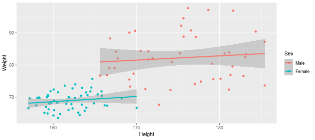<!-- --> --- ## Fitting lines in groups This behavior can be overridden by specifying an aes within the *stat_smooth* function and setting inherit.aes to FALSE. ``` r pcPlot <- ggplot(data = patients_clean, mapping = aes(x = Height, y = Weight, color = Sex)) pcPlot + geom_point() + stat_smooth(aes(x = Height, y = Weight), method = "lm", inherit.aes = F) ``` ``` ## `geom_smooth()` using formula = 'y ~ x' ``` 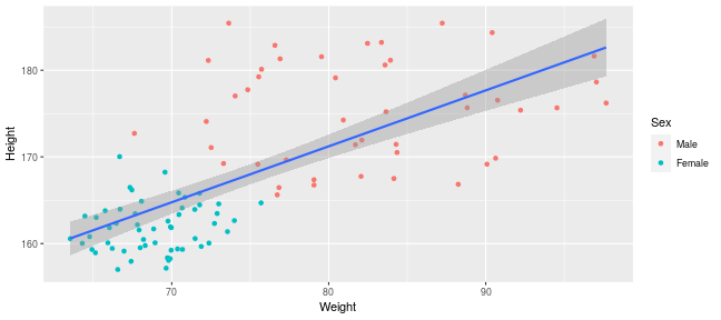<!-- --> --- ## Displaying fitted line statistics The ggpubr package contains functions to help display statistics on the plot. Here we add the equation for the line of best fit using the *stat_regline_equation* function. The *after_stat* function is required to tell ggplot to map the aesthetics after a function has computed the relevant statistics. ``` r library(ggpubr) pcPlot <- ggplot(data = patients_clean, mapping = aes(x = Height, y = Weight)) + geom_point() + stat_smooth(method = "lm", formula = y ~ x) pcPlot + stat_regline_equation(aes(label = after_stat(eq.label))) ``` 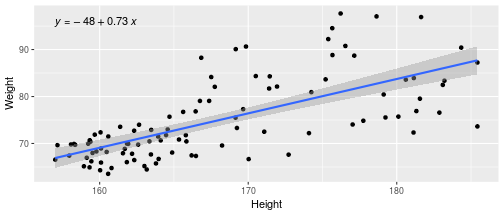<!-- --> --- ## Displaying fitted line statistics We can also get the R-squared value from the *stat_regline_equation* transformation ``` r pcPlot + stat_regline_equation(label.y = 94, aes(label = after_stat(eq.label))) + stat_regline_equation(label.y = 91, aes(label = after_stat(rr.label))) ``` 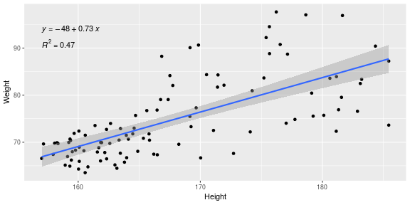<!-- --> --- ## Displaying fitted line statistics By giving subsets of the data to the *stat_regline_equation* function, we can display statistics for each group that we make a line of best fit. ``` r pcPlot <- ggplot(data = patients_clean, mapping = aes(x = Height, y = Weight, color = Sex)) + geom_point() + stat_smooth(aes(x = Height, y = Weight), method = "lm", formula = y ~ x) pcPlot + stat_regline_equation(data = patients_clean[patients_clean$Sex == "Male", ], label.y = 90, aes(label = after_stat(rr.label))) + stat_regline_equation(data = patients_clean[patients_clean$Sex == "Female", ], label.x = 175, label.y = 65, aes(label = after_stat(rr.label))) ``` 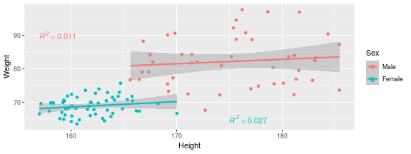<!-- --> --- ## Displaying stats on the plot The ggpubr package also has useful functions that allows the display p-values on plots when combined with the rstatix package. Here we use rstatix to create an object with relevant statistics for our desired comparison, and then we add x and y position information. [Check out](https://rpkgs.datanovia.com/rstatix/) the the many other functions rstatix has to add information to this object (adjusted p, other stats tests, etc.) ``` r library(rstatix) # https://rpkgs.datanovia.com/rstatix/ stat_test <- t_test(patients_clean, Height ~ Sex) stat_test <- add_xy_position(stat_test, x = "Sex", dodge = 0.8) data.frame(stat_test) # show object as dataframe ``` ``` ## .y. group1 group2 n1 n2 statistic df p y.position ## 1 Height Male Female 45 55 14.01073 60.55786 1.16e-20 187.278 ## groups xmin xmax ## 1 Male, Female 1 2 ``` --- ## Displaying stats on the plot The output from the rstatix functions can then be used in the *stat_pvalue_manual* function from ggpubr to add the pvalue. ``` r pcPlot <- ggplot(data = patients_clean, mapping = aes(x = Sex, y = Height)) + geom_boxplot() pcPlot + stat_pvalue_manual(stat_test, label = "p") ``` 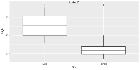<!-- --> --- ## Displaying stats for grouped data By grouping the initial dataframe, we can look for differences between smokers within sex. We also add an adjusted p-value. ``` r grouped_data <- group_by(patients_clean, Sex) stat_test_grp <- t_test(grouped_data, formula = Height ~ Smokes) stat_test_grp <- adjust_pvalue(stat_test_grp, method = "BH") stat_test_grp <- add_xy_position(stat_test_grp, x = "Sex", dodge = 0.8) data.frame(stat_test_grp) ``` ``` ## Sex .y. group1 group2 n1 n2 statistic df p p.adj ## 1 Male Height Non-Smoker Smoker 35 10 -0.6542605 14.42848 0.5230 0.5230 ## 2 Female Height Non-Smoker Smoker 43 12 -1.8289039 16.20010 0.0859 0.1718 ## y.position groups x xmin xmax ## 1 187.4928 Non-Smok.... 1 0.8 1.2 ## 2 172.0928 Non-Smok.... 2 1.8 2.2 ``` --- ## Displaying stats for grouped data We can also modify the label of the p-values by putting the column used for the p-value inside curly brackets {} within a string. ``` r pcPlot <- ggplot(data = patients_clean, mapping = aes(x = Sex, y = Height, fill = Smokes)) + geom_boxplot() # don't inherit aesthetic to make this work pcPlot + stat_pvalue_manual(stat_test_grp, label = "p = {p.adj}", inherit.aes = F) ``` 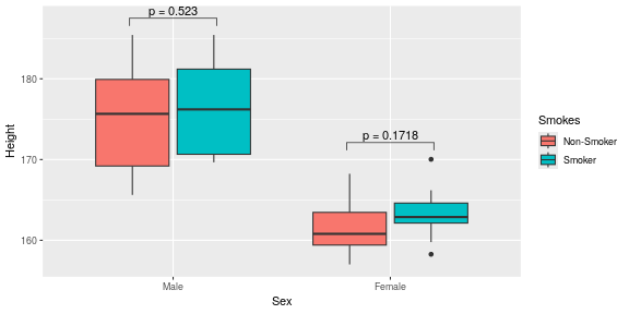<!-- --> --- ## Summary statistics Another useful method is *stat_summary* which allows for a custom statistical function to be performed and then visualized. The fun parameter specifies a function to apply to the y variables for every value of x. In this example we use it to plot the quantiles of the Female and Male Height data ``` r pcPlot <- ggplot(data = patients_clean, mapping = aes(x = Sex, y = Height)) + geom_jitter() pcPlot + stat_summary(fun = quantile, geom = "point", color = "purple", size = 8) ``` 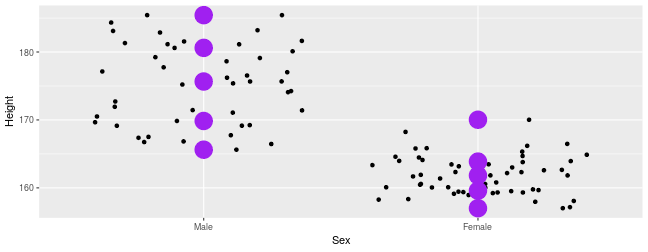<!-- --> --- ## Marginal plots with ggExtra Another way to highlight differences between groups is with a marginal plot for the the X or Y axis variables. By default this is a line and the groupcolor and groupFill arguments carry over the color aesthetic of the main plot. ``` r library(ggExtra) pcPlot <- ggplot(data = patients_clean, mapping = aes(x = Height, y = Weight, color = Sex)) + geom_point() ggMarginal(pcPlot, groupColor = TRUE, groupFill = TRUE) ``` 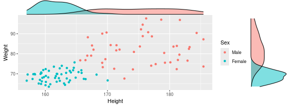<!-- --> --- ## Marginal plots with ggExtra We can easily turn this into a histogram and only display either X or Y axis. ``` r pcPlot <- ggplot(data = patients_clean, mapping = aes(x = Height, y = Weight, color = Sex)) + geom_point() ggMarginal(pcPlot, groupColor = TRUE, groupFill = TRUE, type = "histogram", margins = "x") ``` 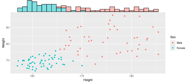<!-- --> --- Exercise on scales and transformations in ggplot can be found [here](../../exercises/exercises/ggplot2_2_exercise.html) --- Exercise on scales and transformations in ggplot can be found [here](../../exercises/answers/ggplot2_2_answers.html) --- class: inverse, center, middle # Themes <html><div style='float:left'></div><hr color='#EB811B' size=1px width=720px></html> --- ## Themes Themes specify the details of data independent elements of the plot. This includes titles, background color, text fonts etc. The graphs created so far have all used the default themes, `theme_grey()`, but ggplot2 allows for the specification of theme used. --- ## Predefined themes Predefined themes can be applied to a ggplot2 object using a family of functions theme_*style*() .pull-left[ Here is a scatter with the default theme... ``` r pcPlot <- ggplot(data = patients_clean, mapping = aes(x = Height, y = Weight)) + geom_point() pcPlot ``` 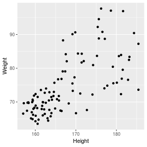<!-- --> ] .pull-right[ ...and the same scatter plot with the minimal theme. ``` r pcPlot+theme_minimal() ``` 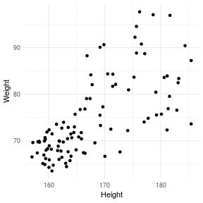<!-- --> ] --- ## Predefined themes Several predefined themes are available within ggplot2 including: - theme_bw - theme_classic - theme_dark - theme_gray - theme_light - theme_linedraw - theme_minimal You can review them [here](https://ggplot2.tidyverse.org/reference/ggtheme.html) --- ## Theme packages There are many themes you can gain access to through installing additional packages. Packages such as [ggthemes](https://github.com/jrnold/ggthemes) also contain many useful collections of predefined theme_*style* functions. Other alternatives include: * [hrbrthemes](https://github.com/hrbrmstr/hrbrthemes) - focuses on controlling typography * [ggthemr](https://github.com/Mikata-Project/ggthemr) - A large collection of themes - includes dark options * [ggpomologica](https://www.garrickadenbuie.com/project/ggpomological/) - Hand drawn plots * [tvthemes](https://ryo-n7.github.io/tvthemes/) - TV shows --- ## ggthemes After we have loaded in the ggthemes packages we can then simply use the new themes available to using the theme_*style* convention of function. .pull-left[ Here is a scatter with the default theme... ``` r pcPlot <- ggplot(data = patients_clean, mapping = aes(x = Height, y = Weight)) + geom_point() pcPlot ``` <!-- --> ] .pull-right[ ...and the same scatter plot with the Wall Street Journal theme. ``` r install.packages("ggthemes") library(ggthemes) pcPlot+theme_wsj() ``` 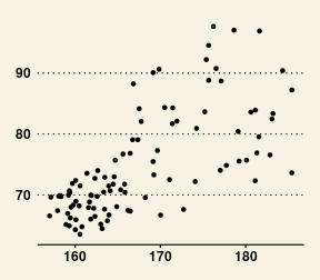<!-- --> ] --- ## Custom themes As well as making use of predefined theme styles, ggplot2 allows for control over the attributes and elements within a plot through a collection of related functions and attributes. **theme()** is the global function used to set attributes for the collections of elements/components making up the current plot. .pull-left[ Within the theme functions there are 4 general graphic elements which may be controlled... - rect - line - text - title ] .pull-right[ ...and 5 groups of related elements: - axis - legend - strip - panel (plot panel) - plot (Global plot parameters) ] --- ## Custom themes These elements may be specified by the use of their appropriate element functions including: - element_line() - element_text() - element_rect() and additionally element_blank() to set an element to "blank". --- ## Custom themes A detailed description of controlling elements within a theme can be seen at the ggplot2 vignette and by typing *?theme* into the console. - [ggplot2 themes](https://ggplot2.tidyverse.org/reference/index.html#section-themes) --- ## Customizing your theme .pull-left[ To demonstrate customizing a theme, in the example below we alter one element of theme. Here we will change the text color for the plot. - Note because we are changing a *text* element we use the *element_text()* function. A detailed description of which elements are available and their associated element functions can be found by typing *?theme*. ] .pull-right[ ``` r pcPlot <- ggplot(data=patients_clean, mapping=aes(x=Height,y=Weight))+ geom_point() pcPlot+ theme( text = element_text(color="red") ) ``` 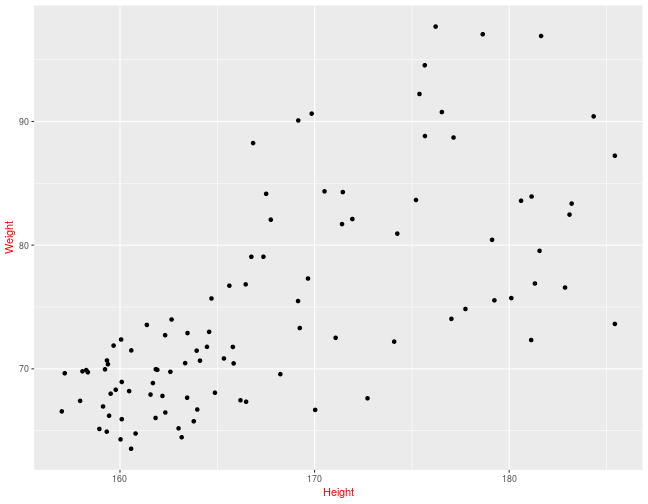<!-- --> ] --- ## Customizing your theme If we wished to set the y-axis label to be at an angle we can adjust that as well. ``` r pcPlot <- ggplot(data = patients_clean, mapping = aes(x = Height, y = Weight)) + geom_point() pcPlot + theme(text = element_text(color = "red"), axis.title.y = element_text(angle = 0)) ``` 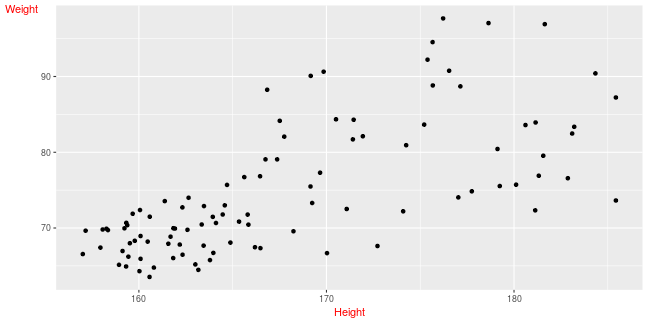<!-- --> --- ## Customizing your theme Finally we may wish to remove axis line, set the background of plot panels to be white and give the strips (title above facet) a cyan background color. ``` r pcPlot <- ggplot(data = patients_clean, mapping = aes(x = Height, y = Weight)) + geom_point() + facet_grid(Sex ~ Smokes) pcPlot + theme(text = element_text(color = "red"), axis.title.y = element_text(angle = 0), axis.line = element_line(linetype = 0), panel.background = element_rect(fill = "white"), strip.background = element_rect(fill = "cyan")) ``` --- ## Customizing your theme Finally we may wish to remove axis line, set the background of plot panels to be white and give the strips (title above facet) a cyan background color. 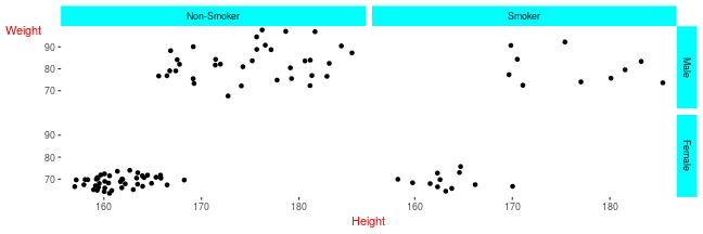<!-- --> --- ## Useful example for legend A useful example of using the theme can be seen in controlling the legend. By default the legend is in right of plot. ``` r pcPlot <- ggplot(data = patients_clean, aes(x = Height, y = Weight, color = Sex)) + geom_point() pcPlot ``` 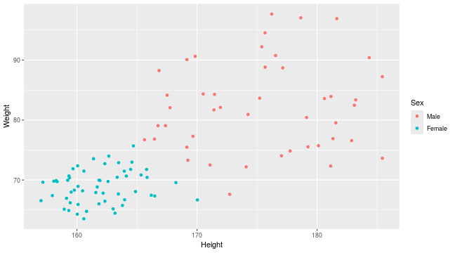<!-- --> --- ## Useful example for legend By modifying the theme we can control the legend positioning. ``` r pcPlot <- ggplot(data = patients_clean, aes(x = Height, y = Weight, color = Sex)) + geom_point() pcPlot + theme(legend.position = "left") ``` 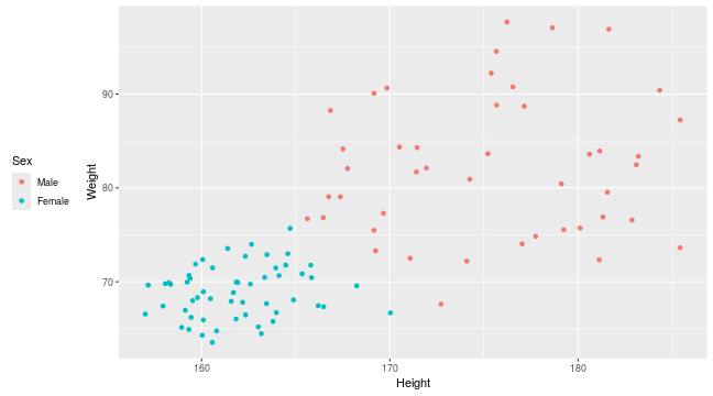<!-- --> --- ## Useful example for legend We can control all aspects of a legend as we can for other theme elements. ``` r pcPlot <- ggplot(data = patients_clean, aes(x = Height, y = Weight, color = Sex)) + geom_point() pcPlot + theme(legend.text = element_text(color = "darkred"), legend.title = element_text(size = 20), legend.position = "bottom") ``` 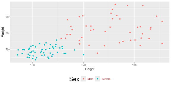<!-- --> --- ## + and %+replace% When altering themes we have been using the **+** operator to add themes as we would adding geoms,scales and stats. When using the **+** operator - Themes elements specified in new scheme replace elements in old theme - Theme elements in the old theme which have not been specified in new theme are maintained. This makes the **+** operator useful for building up from old themes. --- ## The **+** operator In the example below, we maintain all elements set by theme_bw() but overwrite the theme element attribute of the color of text. ``` r pcPlot <- ggplot(data = patients_clean, mapping = aes(x = Height, y = Weight)) + geom_point() + theme_bw() pcPlot + theme(text = element_text(color = "red")) ``` 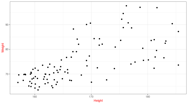<!-- --> --- ## **%+replace%** In contrast **%+replace%** replaces all elements within a theme regardless of whether they have been previously specfied in old theme. When using the **%+replace%** operator: - Theme elements specified in new scheme replace elements in old theme - Theme elements in the old theme which have not been specified in new theme are also replaced by blank theme elements. ``` r oldTheme <- theme_bw() newTheme_Plus <- theme_bw() + theme(text = element_text(color = "red")) newTheme_Replace <- theme_bw() %+replace% theme(text = element_text(color = "red")) ``` --- ## + and %+replace% ### Original theme ``` r oldTheme$text ``` ``` ## List of 11 ## $ family : chr "" ## $ face : chr "plain" ## $ colour : chr "black" ## $ size : num 11 ## $ hjust : num 0.5 ## $ vjust : num 0.5 ## $ angle : num 0 ## $ lineheight : num 0.9 ## $ margin : 'margin' num [1:4] 0points 0points 0points 0points ## ..- attr(*, "unit")= int 8 ## $ debug : logi FALSE ## $ inherit.blank: logi TRUE ## - attr(*, "class")= chr [1:2] "element_text" "element" ``` --- ## + and %+replace% ### Theme modified with **+** ``` r newTheme_Plus$text ``` ``` ## List of 11 ## $ family : chr "" ## $ face : chr "plain" ## $ colour : chr "red" ## $ size : num 11 ## $ hjust : num 0.5 ## $ vjust : num 0.5 ## $ angle : num 0 ## $ lineheight : num 0.9 ## $ margin : 'margin' num [1:4] 0points 0points 0points 0points ## ..- attr(*, "unit")= int 8 ## $ debug : logi FALSE ## $ inherit.blank: logi FALSE ## - attr(*, "class")= chr [1:2] "element_text" "element" ``` --- ## + and %+replace% ### Theme modified with %+replace% ``` r newTheme_Replace$text ``` ``` ## List of 11 ## $ family : NULL ## $ face : NULL ## $ colour : chr "red" ## $ size : NULL ## $ hjust : NULL ## $ vjust : NULL ## $ angle : NULL ## $ lineheight : NULL ## $ margin : NULL ## $ debug : NULL ## $ inherit.blank: logi FALSE ## - attr(*, "class")= chr [1:2] "element_text" "element" ``` This means that %+replace% is most useful when creating new themes. --- ## theme_get and theme_set In the examples we have shown you we have been modifying the theme for a specific plot. But once you have a theme that you really like you may want it to apply to every plot you draw. The active theme is automatically applied to every plot you draw. Use theme_get to get the current theme, and theme_set to completely override it. ``` r newTheme <- theme_bw() theme_set(newTheme) myTheme <- theme_get() ``` --- class: inverse, center, middle # Titles and Labels <html><div style='float:left'></div><hr color='#EB811B' size=1px width=720px></html> --- ## Adding titles for plot and labels So far no plot titles have been specified. Plot titles can be specified using the labs functions. ``` r pcPlot <- ggplot(data = patients_clean, mapping = aes(x = Height, y = Weight)) + geom_point() pcPlot + labs(title = "Weight vs Height", y = "Height (cm)") ``` <!-- --> --- ## Adding titles for plot and labels You can also specify titles using the ggtitle and xlab/ylab functions. ``` r pcPlot <- ggplot(data = patients_clean, mapping = aes(x = Height, y = Weight)) + geom_point() pcPlot + ggtitle("Weight vs Height") + ylab("Height (cm)") ``` 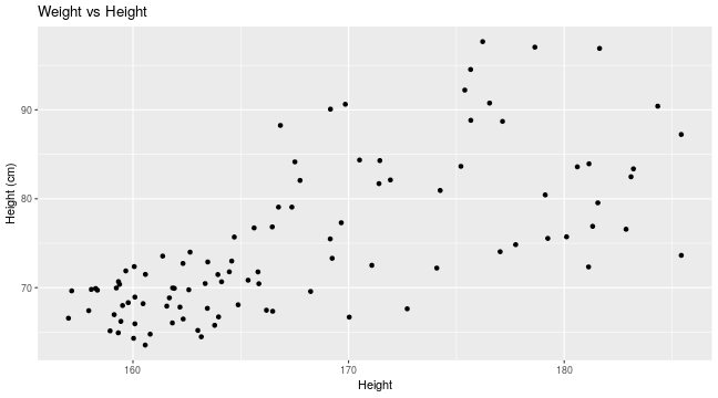<!-- --> --- class: inverse, center, middle # Saving Plots <html><div style='float:left'></div><hr color='#EB811B' size=1px width=720px></html> --- ## Saving plots Plots produced by ggplot can be saved in the same way as [base plots](../singlepage/basePlotting.html#saving-your-plots) The ggsave() function allows for additional arguments to be specified including the type, resolution and size of plot. By default ggsave() will use the size of your current graphics window when saving plots so it may be important to specify width and height arguments desired. ``` r pcPlot <- ggplot(data = patients_clean, mapping = aes(x = Height, y = Weight)) + geom_point() ggsave(pcPlot, filename = "anExampleplot.png", width = 15, height = 15, units = "cm") ``` --- ## Saving in pdf format PDFs are maybe the most useful format to export into. PDFs are vector-based so each part of the plot is saved as scalable cooridnates as opposed to specific pixels. PDFs can then be opened in imaging software like illustrator or [inkscape](https://inkscape.org/) (this is a open source and free equivalent). When you open a PDF in these programs you can fully customize the plots to your aesthetic with a graphic user interface. Furthermore as they are vector-based, they can be easily assembled into publication quality figures without resolution issues and pixelation. ``` r pdf(file = "anExampleplot.pdf", paper = "A4") plot(control) dev.off() ``` --- class: inverse, center, middle # Other external packages <html><div style='float:left'></div><hr color='#EB811B' size=1px width=720px></html> --- ## Extending ggplot We have introduced you to several packages that extend the capabilities of ggplot2 either by adding additional plotting capabilities or providing pre-built color/theme options. There are also several packages that specialize in creating specific plots or additional geoms not included within ggplot2 i.e. [UpSet](https://github.com/hms-dbmi/UpSetR), [ggbeeswarm](https://github.com/eclarke/ggbeeswarm), [ggridges](https://wilkelab.org/ggridges/) We will quickly review UpSet plots. --- ## Upset Plots Upset plots are used for looking at overlaps between sets. They are considered to be a better way to visualize data then the more traditionally used Venn Diagram. We can use the package demo data which is presence absence of mutants in different clones. ``` r library(UpSetR) mutations <- read.csv(system.file("extdata", "mutations.csv", package = "UpSetR"), header = T, sep = ",") mutations[1:10, 1:10] ``` ``` ## Identifier TTN PTEN TP53 EGFR MUC16 FLG RYR2 PCLO PIK3R1 ## 1 02-0003 0 0 1 1 0 0 0 0 1 ## 2 02-0033 0 0 1 0 0 0 0 0 0 ## 3 02-0047 0 0 0 0 0 0 1 0 0 ## 4 02-0055 1 1 1 0 0 0 0 0 0 ## 5 02-2470 0 1 0 0 0 0 1 0 0 ## 6 02-2483 0 0 1 0 0 0 0 1 0 ## 7 02-2485 0 0 1 1 1 1 0 0 0 ## 8 02-2486 0 0 0 0 0 0 0 0 0 ## 9 06-0119 1 0 0 0 0 0 0 0 0 ## 10 06-0122 1 0 0 0 0 0 1 1 0 ``` --- ## Upset Plots The Upset Plot will show us the number of intersections between different groups. For example EGFR and TTN only are present in 12 clones. The size of the set is also shown on the left to give additional context. This gives a good quantitative basis from which to understand set intersections. ``` r upset(mutations) ``` 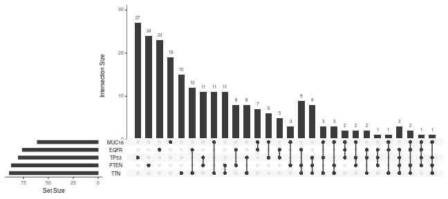<!-- --> --- ## Upset Plots customization You may have noticed that only a few genes are present. This is because by default only the top 5 biggest sets are included. We can increase this number easily or directly specify which sets to include using the *nsets* parameter. ``` r upset(mutations, nsets = 10) ``` 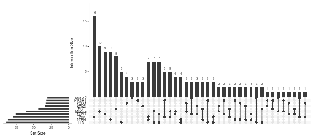<!-- --> --- ## UpsetR and ggplot2 Though ggplot2 is being used under the hood, the ggplot identity is lost in the final plot. Instead we have made an *upset* object. Unfortunately this means we cannot modify our upset plots using what we have learnt. Luckily the upset function has lots of arguments to allow for customization. ``` r myupset <- upset(mutations) class(myupset) ``` ``` ## [1] "upset" ``` --- ## Modifying plots from other packages As with UpsetR, most packages make plots using ggplot2. There are >2000 packages on CRAN that use ggplot2 and many more on Bioconductor. If a package is using ggplot2 most of the time the ggplot identity is maintained. This means that you can interact and modify that plot just as if you made the ggobject yourself. Lets look at some examples. We will look at the popular package: Seurat. --- ## Seurat Seurat is one of the most popular packages for analyzing scRNAseq data. Often we look at the dimension reduction (tSNE or UMAP typically). ``` r library(Seurat) data("pbmc_small") DimPlot(object = pbmc_small) ``` 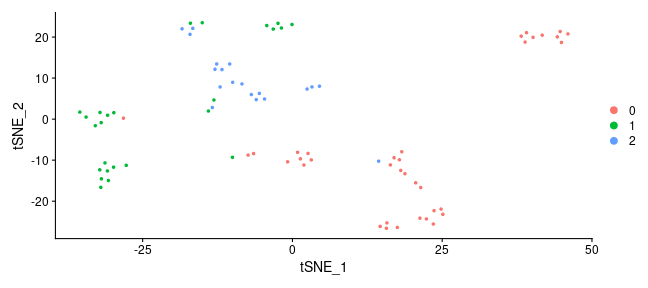<!-- --> --- ## Seurat We created this using the DimPlot() function. This is specific plotting function for Seurat, but it is using ggplot under the hood. ``` r mydimplot <- DimPlot(object = pbmc_small) class(mydimplot) ``` ``` ## [1] "patchwork" "gg" "ggplot" ``` --- ## Seurat As it is a ggplot object, we can customize it. Here we can change the theme, title and colors. ``` r mydimplot + ggtitle("tSNE of scRNAseq - PBMC") + scale_color_viridis_d() + theme_bw() ``` 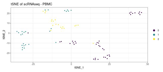<!-- --> --- ## Seurat You can typically only modify the scale of variables that you have aesthetic mappings. So if the function is not specifying that aesthetic i.e. size we cannot modify it. Instead we can go back and redefine our ggplot. The information regarding setup can be found in the layout slot ggplot ``` r mydimplot$layers ``` ``` ## [[1]] ## mapping: colour = ~ident, shape = NULL, alpha = NULL, x = ~tSNE_1, y = ~tSNE_2 ## geom_point: na.rm = FALSE ## stat_identity: na.rm = FALSE ## position_identity ``` --- ## Seurat We can use the layout information to recreate the original ggplot, and then add some modifications i.e. add a size argument. We must also remove the original plot stored in the layers slot first. ``` r mydimplot$layers <- NULL mydimplot + geom_point(aes(x = tSNE_1, y = tSNE_2, color = ident, size = 2)) + ggtitle("tSNE of scRNAseq - PBMC") + scale_color_viridis_d() + theme_bw() ``` 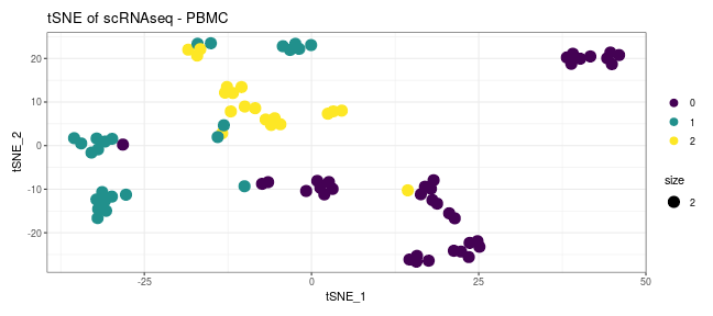<!-- --> --- class: inverse, center, middle # Interactive Plots <html><div style='float:left'></div><hr color='#EB811B' size=1px width=720px></html> --- ## Interactive Plots Most of the time when we are drawing plots the aim is to generate a saved file we can use for figures later. Sometimes though we may want to generate a interactive plot. This can be really useful to help parse our data, or if we want to generate dynamic reports to share our work. ``` r library(plotly) ``` --- ## Interactive Plots ``` r pcPlot <- ggplot(data = patients_clean, mapping = aes(x = Height, y = Weight)) + geom_point() ggplotly(pcPlot) ``` <div class="plotly html-widget html-fill-item" id="htmlwidget-2571350d67dd8eaa99bc" style="width:648px;height:288px;"></div> <script type="application/json" data-for="htmlwidget-2571350d67dd8eaa99bc">{"x":{"data":[{"x":[182.87,179.12,169.15000000000001,175.66,164.47,158.27000000000001,161.69,165.84,181.31999999999999,167.37,160.06,166.47999999999999,175.38999999999999,164.69999999999999,163.78999999999999,181.13,169.24000000000001,176.22,174.09,180.11000000000001,179.24000000000001,161.91999999999999,169.84999999999999,160.56999999999999,168.24000000000001,177.75,183.21000000000001,167.75,181.15000000000001,181.56,160.03,165.62,181.63999999999999,159.66999999999999,177.03,163.34999999999999,175.21000000000001,160.80000000000001,166.46000000000001,157.94999999999999,180.61000000000001,159.52000000000001,163.00999999999999,165.80000000000001,170.03,157.16,164.58000000000001,163.47,185.43000000000001,165.34,163.44999999999999,163.97,161.38,160.09,178.63999999999999,159.78,161.56999999999999,161.83000000000001,169.66,166.84,159.31999999999999,170.50999999999999,161.84,171.41,166.75,166.19,169.16,157.00999999999999,167.50999999999999,160.47,162.33000000000001,175.66999999999999,174.25,158.94,172.72,159.22999999999999,176.53999999999999,184.34,163.94,160.09,162.31999999999999,162.59,171.94,158.06999999999999,158.34999999999999,162.18000000000001,159.38,171.44999999999999,163.16999999999999,183.09999999999999,177.13999999999999,171.08000000000001,159.33000000000001,185.43000000000001,162.65000000000001,159.44,164.11000000000001,159.13,160.58000000000001,164.88],"y":[76.569999999999993,80.430000000000007,75.480000000000004,94.540000000000006,71.780000000000001,69.900000000000006,68.849999999999994,70.439999999999998,76.900000000000006,79.060000000000002,72.370000000000005,67.340000000000003,92.219999999999999,75.689999999999998,65.760000000000005,72.329999999999998,73.299999999999997,97.670000000000002,72.200000000000003,75.719999999999999,75.540000000000006,69.920000000000002,90.629999999999995,63.539999999999999,69.569999999999993,74.840000000000003,83.359999999999999,82.060000000000002,83.930000000000007,79.540000000000006,64.299999999999997,76.719999999999999,96.909999999999997,71.879999999999995,74.040000000000006,70.459999999999994,83.650000000000006,64.769999999999996,76.829999999999998,67.409999999999997,83.590000000000003,67.989999999999995,65.189999999999998,71.769999999999996,66.680000000000007,69.640000000000001,72.989999999999995,72.890000000000001,87.230000000000004,70.840000000000003,67.670000000000002,66.709999999999994,73.549999999999997,65.930000000000007,97.049999999999997,68.310000000000002,67.920000000000002,66.030000000000001,77.299999999999997,88.25,64.920000000000002,84.349999999999994,69.969999999999999,81.700000000000003,79.060000000000002,67.459999999999994,90.079999999999998,66.560000000000002,84.150000000000006,68.200000000000003,66.469999999999999,88.819999999999993,80.930000000000007,65.140000000000001,67.620000000000005,69.959999999999994,90.760000000000005,90.409999999999997,71.469999999999999,68.939999999999998,72.719999999999999,69.760000000000005,82.109999999999999,69.799999999999997,69.719999999999999,67.810000000000002,70.370000000000005,84.290000000000006,64.469999999999999,82.469999999999999,88.700000000000003,72.510000000000005,70.680000000000007,73.629999999999995,73.989999999999995,66.209999999999994,70.659999999999997,66.959999999999994,71.489999999999995,68.069999999999993],"text":["Height: 182.87<br />Weight: 76.57","Height: 179.12<br />Weight: 80.43","Height: 169.15<br />Weight: 75.48","Height: 175.66<br />Weight: 94.54","Height: 164.47<br />Weight: 71.78","Height: 158.27<br />Weight: 69.90","Height: 161.69<br />Weight: 68.85","Height: 165.84<br />Weight: 70.44","Height: 181.32<br />Weight: 76.90","Height: 167.37<br />Weight: 79.06","Height: 160.06<br />Weight: 72.37","Height: 166.48<br />Weight: 67.34","Height: 175.39<br />Weight: 92.22","Height: 164.70<br />Weight: 75.69","Height: 163.79<br />Weight: 65.76","Height: 181.13<br />Weight: 72.33","Height: 169.24<br />Weight: 73.30","Height: 176.22<br />Weight: 97.67","Height: 174.09<br />Weight: 72.20","Height: 180.11<br />Weight: 75.72","Height: 179.24<br />Weight: 75.54","Height: 161.92<br />Weight: 69.92","Height: 169.85<br />Weight: 90.63","Height: 160.57<br />Weight: 63.54","Height: 168.24<br />Weight: 69.57","Height: 177.75<br />Weight: 74.84","Height: 183.21<br />Weight: 83.36","Height: 167.75<br />Weight: 82.06","Height: 181.15<br />Weight: 83.93","Height: 181.56<br />Weight: 79.54","Height: 160.03<br />Weight: 64.30","Height: 165.62<br />Weight: 76.72","Height: 181.64<br />Weight: 96.91","Height: 159.67<br />Weight: 71.88","Height: 177.03<br />Weight: 74.04","Height: 163.35<br />Weight: 70.46","Height: 175.21<br />Weight: 83.65","Height: 160.80<br />Weight: 64.77","Height: 166.46<br />Weight: 76.83","Height: 157.95<br />Weight: 67.41","Height: 180.61<br />Weight: 83.59","Height: 159.52<br />Weight: 67.99","Height: 163.01<br />Weight: 65.19","Height: 165.80<br />Weight: 71.77","Height: 170.03<br />Weight: 66.68","Height: 157.16<br />Weight: 69.64","Height: 164.58<br />Weight: 72.99","Height: 163.47<br />Weight: 72.89","Height: 185.43<br />Weight: 87.23","Height: 165.34<br />Weight: 70.84","Height: 163.45<br />Weight: 67.67","Height: 163.97<br />Weight: 66.71","Height: 161.38<br />Weight: 73.55","Height: 160.09<br />Weight: 65.93","Height: 178.64<br />Weight: 97.05","Height: 159.78<br />Weight: 68.31","Height: 161.57<br />Weight: 67.92","Height: 161.83<br />Weight: 66.03","Height: 169.66<br />Weight: 77.30","Height: 166.84<br />Weight: 88.25","Height: 159.32<br />Weight: 64.92","Height: 170.51<br />Weight: 84.35","Height: 161.84<br />Weight: 69.97","Height: 171.41<br />Weight: 81.70","Height: 166.75<br />Weight: 79.06","Height: 166.19<br />Weight: 67.46","Height: 169.16<br />Weight: 90.08","Height: 157.01<br />Weight: 66.56","Height: 167.51<br />Weight: 84.15","Height: 160.47<br />Weight: 68.20","Height: 162.33<br />Weight: 66.47","Height: 175.67<br />Weight: 88.82","Height: 174.25<br />Weight: 80.93","Height: 158.94<br />Weight: 65.14","Height: 172.72<br />Weight: 67.62","Height: 159.23<br />Weight: 69.96","Height: 176.54<br />Weight: 90.76","Height: 184.34<br />Weight: 90.41","Height: 163.94<br />Weight: 71.47","Height: 160.09<br />Weight: 68.94","Height: 162.32<br />Weight: 72.72","Height: 162.59<br />Weight: 69.76","Height: 171.94<br />Weight: 82.11","Height: 158.07<br />Weight: 69.80","Height: 158.35<br />Weight: 69.72","Height: 162.18<br />Weight: 67.81","Height: 159.38<br />Weight: 70.37","Height: 171.45<br />Weight: 84.29","Height: 163.17<br />Weight: 64.47","Height: 183.10<br />Weight: 82.47","Height: 177.14<br />Weight: 88.70","Height: 171.08<br />Weight: 72.51","Height: 159.33<br />Weight: 70.68","Height: 185.43<br />Weight: 73.63","Height: 162.65<br />Weight: 73.99","Height: 159.44<br />Weight: 66.21","Height: 164.11<br />Weight: 70.66","Height: 159.13<br />Weight: 66.96","Height: 160.58<br />Weight: 71.49","Height: 164.88<br />Weight: 68.07"],"type":"scatter","mode":"markers","marker":{"autocolorscale":false,"color":"rgba(0,0,0,1)","opacity":1,"size":5.6692913385826778,"symbol":"circle","line":{"width":1.8897637795275593,"color":"rgba(0,0,0,1)"}},"hoveron":"points","showlegend":false,"xaxis":"x","yaxis":"y","hoverinfo":"text","frame":null}],"layout":{"margin":{"t":32.438356164383563,"r":7.3059360730593621,"b":46.392694063926953,"l":37.260273972602747},"plot_bgcolor":"rgba(235,235,235,1)","paper_bgcolor":"rgba(255,255,255,1)","font":{"color":"rgba(0,0,0,1)","family":"","size":14.611872146118724},"xaxis":{"domain":[0,1],"automargin":true,"type":"linear","autorange":false,"range":[155.589,186.851],"tickmode":"array","ticktext":["160","170","180"],"tickvals":[160,170,180],"categoryorder":"array","categoryarray":["160","170","180"],"nticks":null,"ticks":"outside","tickcolor":"rgba(51,51,51,1)","ticklen":3.6529680365296811,"tickwidth":0.66417600664176002,"showticklabels":true,"tickfont":{"color":"rgba(77,77,77,1)","family":"","size":11.68949771689498},"tickangle":-0,"showline":false,"linecolor":null,"linewidth":0,"showgrid":true,"gridcolor":"rgba(255,255,255,1)","gridwidth":0.66417600664176002,"zeroline":false,"anchor":"y","title":{"text":"Height","font":{"color":"rgba(0,0,0,1)","family":"","size":14.611872146118724}},"hoverformat":".2f"},"yaxis":{"domain":[0,1],"automargin":true,"type":"linear","autorange":false,"range":[61.833500000000001,99.376500000000007],"tickmode":"array","ticktext":["70","80","90"],"tickvals":[70,80,90],"categoryorder":"array","categoryarray":["70","80","90"],"nticks":null,"ticks":"outside","tickcolor":"rgba(51,51,51,1)","ticklen":3.6529680365296811,"tickwidth":0.66417600664176002,"showticklabels":true,"tickfont":{"color":"rgba(77,77,77,1)","family":"","size":11.68949771689498},"tickangle":-0,"showline":false,"linecolor":null,"linewidth":0,"showgrid":true,"gridcolor":"rgba(255,255,255,1)","gridwidth":0.66417600664176002,"zeroline":false,"anchor":"x","title":{"text":"Weight","font":{"color":"rgba(0,0,0,1)","family":"","size":14.611872146118724}},"hoverformat":".2f"},"shapes":[{"type":"rect","fillcolor":null,"line":{"color":null,"width":0,"linetype":[]},"yref":"paper","xref":"paper","x0":0,"x1":1,"y0":0,"y1":1}],"showlegend":false,"legend":{"bgcolor":"rgba(255,255,255,1)","bordercolor":"transparent","borderwidth":1.8897637795275593,"font":{"color":"rgba(0,0,0,1)","family":"","size":11.68949771689498}},"hovermode":"closest","barmode":"relative"},"config":{"doubleClick":"reset","modeBarButtonsToAdd":["hoverclosest","hovercompare"],"showSendToCloud":false},"source":"A","attrs":{"16b9361ea8ca":{"x":{},"y":{},"type":"scatter"}},"cur_data":"16b9361ea8ca","visdat":{"16b9361ea8ca":["function (y) ","x"]},"highlight":{"on":"plotly_click","persistent":false,"dynamic":false,"selectize":false,"opacityDim":0.20000000000000001,"selected":{"opacity":1},"debounce":0},"shinyEvents":["plotly_hover","plotly_click","plotly_selected","plotly_relayout","plotly_brushed","plotly_brushing","plotly_clickannotation","plotly_doubleclick","plotly_deselect","plotly_afterplot","plotly_sunburstclick"],"base_url":"https://plot.ly"},"evals":[],"jsHooks":[]}</script> --- ## Adding Annotation To show off how we add additional annotation or work with more complex examples we have a ggplot object to load in. You can use the *load()* function with to read in this object: *data/pcPlot.RData* ``` r load("data/pcPlot.RData") ``` --- ## Review the data We can quickly check what is in the data. ``` r head(pcPlot$data) ``` ``` ## PC1 PC2 PC3 PC4 PC5 PC6 Sample ## A_1 0.6367280 0.6163906 0.08484202 -0.2844121 0.07083379 -0.5845692 A_1 ## A_2 0.6090663 0.5384380 0.51330734 -0.4480145 -0.36444039 0.4824065 A_2 ## B_1 0.4596307 0.5424412 -0.20859717 0.1143239 0.67195612 0.5775545 B_1 ## B_2 0.4190463 0.4812430 0.49898282 0.7603890 0.04205184 -0.2294964 B_2 ## C_1 0.3220796 0.5434719 -0.59606139 0.2760484 -0.64316800 0.1058694 C_1 ## C_2 0.3130591 0.4426442 -0.31284107 -0.3514908 0.21796029 -0.3125952 C_2 ## Time Rep ## A_1 0hr 1 ## A_2 0hr 2 ## B_1 2hr 1 ## B_2 2hr 2 ## C_1 12hr 1 ## C_2 12hr 2 ``` --- ## Review the data We can also check the aesthetics mapping, and any plots already in the ggplot object. ``` r pcPlot$mapping ``` ``` ## Aesthetic mapping: ## * `x` -> `PC1` ## * `y` -> `PC2` ## * `colour` -> `Time` ## * `shape` -> `Rep` ``` ``` r pcPlot$layers ``` ``` ## [[1]] ## geom_point: na.rm = FALSE ## stat_identity: na.rm = FALSE ## position_identity ``` --- ## Lets make a plot The aesthetic mappings are naturally inherited as labels. If we want to add custom labels we can specify it in our plot. ``` r ggplotly(pcPlot) ``` <div class="plotly html-widget html-fill-item" id="htmlwidget-ac02ba48969a287c5772" style="width:864px;height:432px;"></div> <script type="application/json" data-for="htmlwidget-ac02ba48969a287c5772">{"x":{"data":[{"x":[0.63672798475643777],"y":[0.61639057522774621],"text":"PC1: 0.6367280<br />PC2: 0.6163906<br />Time: 0hr<br />Rep: 1","type":"scatter","mode":"markers","marker":{"autocolorscale":false,"color":"rgba(248,118,109,1)","opacity":1,"size":5.6692913385826778,"symbol":"circle","line":{"width":1.8897637795275593,"color":"rgba(248,118,109,1)"}},"hoveron":"points","name":"(0hr,1)","legendgroup":"(0hr,1)","showlegend":true,"xaxis":"x","yaxis":"y","hoverinfo":"text","frame":null},{"x":[0.60906629999999995],"y":[0.53843799999999997],"text":"PC1: 0.6090663<br />PC2: 0.5384380<br />Time: 0hr<br />Rep: 2","type":"scatter","mode":"markers","marker":{"autocolorscale":false,"color":"rgba(248,118,109,1)","opacity":1,"size":5.6692913385826778,"symbol":"triangle-up","line":{"width":1.8897637795275593,"color":"rgba(248,118,109,1)"}},"hoveron":"points","name":"(0hr,2)","legendgroup":"(0hr,2)","showlegend":true,"xaxis":"x","yaxis":"y","hoverinfo":"text","frame":null},{"x":[0.4596307],"y":[0.54244119999999996],"text":"PC1: 0.4596307<br />PC2: 0.5424412<br />Time: 2hr<br />Rep: 1","type":"scatter","mode":"markers","marker":{"autocolorscale":false,"color":"rgba(0,186,56,1)","opacity":1,"size":5.6692913385826778,"symbol":"circle","line":{"width":1.8897637795275593,"color":"rgba(0,186,56,1)"}},"hoveron":"points","name":"(2hr,1)","legendgroup":"(2hr,1)","showlegend":true,"xaxis":"x","yaxis":"y","hoverinfo":"text","frame":null},{"x":[0.41904629999999998],"y":[0.48124299999999998],"text":"PC1: 0.4190463<br />PC2: 0.4812430<br />Time: 2hr<br />Rep: 2","type":"scatter","mode":"markers","marker":{"autocolorscale":false,"color":"rgba(0,186,56,1)","opacity":1,"size":5.6692913385826778,"symbol":"triangle-up","line":{"width":1.8897637795275593,"color":"rgba(0,186,56,1)"}},"hoveron":"points","name":"(2hr,2)","legendgroup":"(2hr,2)","showlegend":true,"xaxis":"x","yaxis":"y","hoverinfo":"text","frame":null},{"x":[0.32207960000000002],"y":[0.54347190000000001],"text":"PC1: 0.3220796<br />PC2: 0.5434719<br />Time: 12hr<br />Rep: 1","type":"scatter","mode":"markers","marker":{"autocolorscale":false,"color":"rgba(97,156,255,1)","opacity":1,"size":5.6692913385826778,"symbol":"circle","line":{"width":1.8897637795275593,"color":"rgba(97,156,255,1)"}},"hoveron":"points","name":"(12hr,1)","legendgroup":"(12hr,1)","showlegend":true,"xaxis":"x","yaxis":"y","hoverinfo":"text","frame":null},{"x":[0.31305909999999998],"y":[0.44264419999999999],"text":"PC1: 0.3130591<br />PC2: 0.4426442<br />Time: 12hr<br />Rep: 2","type":"scatter","mode":"markers","marker":{"autocolorscale":false,"color":"rgba(97,156,255,1)","opacity":1,"size":5.6692913385826778,"symbol":"triangle-up","line":{"width":1.8897637795275593,"color":"rgba(97,156,255,1)"}},"hoveron":"points","name":"(12hr,2)","legendgroup":"(12hr,2)","showlegend":true,"xaxis":"x","yaxis":"y","hoverinfo":"text","frame":null}],"layout":{"margin":{"t":30.611872146118724,"r":7.3059360730593621,"b":44.56621004566211,"l":48.949771689497723},"plot_bgcolor":"rgba(235,235,235,1)","paper_bgcolor":"rgba(255,255,255,1)","font":{"color":"rgba(0,0,0,1)","family":"","size":14.611872146118724},"xaxis":{"domain":[0,1],"automargin":true,"type":"linear","autorange":false,"range":[0.29687565576217811,0.65291142899425969],"tickmode":"array","ticktext":["0.3","0.4","0.5","0.6"],"tickvals":[0.30000000000000004,0.40000000000000002,0.5,0.60000000000000009],"categoryorder":"array","categoryarray":["0.3","0.4","0.5","0.6"],"nticks":null,"ticks":"outside","tickcolor":"rgba(51,51,51,1)","ticklen":3.6529680365296811,"tickwidth":0.66417600664176002,"showticklabels":true,"tickfont":{"color":"rgba(77,77,77,1)","family":"","size":11.68949771689498},"tickangle":-0,"showline":false,"linecolor":null,"linewidth":0,"showgrid":true,"gridcolor":"rgba(255,255,255,1)","gridwidth":0.66417600664176002,"zeroline":false,"anchor":"y","title":{"text":"PC1","font":{"color":"rgba(0,0,0,1)","family":"","size":14.611872146118724}},"hoverformat":".2f"},"yaxis":{"domain":[0,1],"automargin":true,"type":"linear","autorange":false,"range":[0.4339568812386127,0.62507789398913349],"tickmode":"array","ticktext":["0.45","0.50","0.55","0.60"],"tickvals":[0.45000000000000001,0.5,0.55000000000000004,0.60000000000000009],"categoryorder":"array","categoryarray":["0.45","0.50","0.55","0.60"],"nticks":null,"ticks":"outside","tickcolor":"rgba(51,51,51,1)","ticklen":3.6529680365296811,"tickwidth":0.66417600664176002,"showticklabels":true,"tickfont":{"color":"rgba(77,77,77,1)","family":"","size":11.68949771689498},"tickangle":-0,"showline":false,"linecolor":null,"linewidth":0,"showgrid":true,"gridcolor":"rgba(255,255,255,1)","gridwidth":0.66417600664176002,"zeroline":false,"anchor":"x","title":{"text":"PC2","font":{"color":"rgba(0,0,0,1)","family":"","size":14.611872146118724}},"hoverformat":".2f"},"shapes":[{"type":"rect","fillcolor":null,"line":{"color":null,"width":0,"linetype":[]},"yref":"paper","xref":"paper","x0":0,"x1":1,"y0":0,"y1":1}],"showlegend":true,"legend":{"bgcolor":"rgba(255,255,255,1)","bordercolor":"transparent","borderwidth":1.8897637795275593,"font":{"color":"rgba(0,0,0,1)","family":"","size":11.68949771689498},"title":{"text":"Time<br />Rep","font":{"color":"rgba(0,0,0,1)","family":"","size":14.611872146118724}}},"hovermode":"closest","barmode":"relative"},"config":{"doubleClick":"reset","modeBarButtonsToAdd":["hoverclosest","hovercompare"],"showSendToCloud":false},"source":"A","attrs":{"16b940271f0e":{"x":{},"y":{},"colour":{},"shape":{},"type":"scatter"}},"cur_data":"16b940271f0e","visdat":{"16b940271f0e":["function (y) ","x"]},"highlight":{"on":"plotly_click","persistent":false,"dynamic":false,"selectize":false,"opacityDim":0.20000000000000001,"selected":{"opacity":1},"debounce":0},"shinyEvents":["plotly_hover","plotly_click","plotly_selected","plotly_relayout","plotly_brushed","plotly_brushing","plotly_clickannotation","plotly_doubleclick","plotly_deselect","plotly_afterplot","plotly_sunburstclick"],"base_url":"https://plot.ly"},"evals":[],"jsHooks":[]}</script> --- ## Extra Annotation As the aesthetic mappings are naturally inherited as labels,we can just add an additional aesthetic. If we want to add custom labels we can specify it in our plot. ``` r ggplotly(pcPlot + geom_point(aes(label = Sample))) ``` ``` ## Warning in geom_point(aes(label = Sample)): Ignoring unknown aesthetics: label ``` <div class="plotly html-widget html-fill-item" id="htmlwidget-47fd8c9155eb22dd8d0c" style="width:864px;height:432px;"></div> <script type="application/json" data-for="htmlwidget-47fd8c9155eb22dd8d0c">{"x":{"data":[{"x":[0.63672798475643777],"y":[0.61639057522774621],"text":"PC1: 0.6367280<br />PC2: 0.6163906<br />Time: 0hr<br />Rep: 1","type":"scatter","mode":"markers","marker":{"autocolorscale":false,"color":"rgba(248,118,109,1)","opacity":1,"size":5.6692913385826778,"symbol":"circle","line":{"width":1.8897637795275593,"color":"rgba(248,118,109,1)"}},"hoveron":"points","name":"(0hr,1)","legendgroup":"(0hr,1)","showlegend":true,"xaxis":"x","yaxis":"y","hoverinfo":"text","frame":null},{"x":[0.60906629999999995],"y":[0.53843799999999997],"text":"PC1: 0.6090663<br />PC2: 0.5384380<br />Time: 0hr<br />Rep: 2","type":"scatter","mode":"markers","marker":{"autocolorscale":false,"color":"rgba(248,118,109,1)","opacity":1,"size":5.6692913385826778,"symbol":"triangle-up","line":{"width":1.8897637795275593,"color":"rgba(248,118,109,1)"}},"hoveron":"points","name":"(0hr,2)","legendgroup":"(0hr,2)","showlegend":true,"xaxis":"x","yaxis":"y","hoverinfo":"text","frame":null},{"x":[0.4596307],"y":[0.54244119999999996],"text":"PC1: 0.4596307<br />PC2: 0.5424412<br />Time: 2hr<br />Rep: 1","type":"scatter","mode":"markers","marker":{"autocolorscale":false,"color":"rgba(0,186,56,1)","opacity":1,"size":5.6692913385826778,"symbol":"circle","line":{"width":1.8897637795275593,"color":"rgba(0,186,56,1)"}},"hoveron":"points","name":"(2hr,1)","legendgroup":"(2hr,1)","showlegend":true,"xaxis":"x","yaxis":"y","hoverinfo":"text","frame":null},{"x":[0.41904629999999998],"y":[0.48124299999999998],"text":"PC1: 0.4190463<br />PC2: 0.4812430<br />Time: 2hr<br />Rep: 2","type":"scatter","mode":"markers","marker":{"autocolorscale":false,"color":"rgba(0,186,56,1)","opacity":1,"size":5.6692913385826778,"symbol":"triangle-up","line":{"width":1.8897637795275593,"color":"rgba(0,186,56,1)"}},"hoveron":"points","name":"(2hr,2)","legendgroup":"(2hr,2)","showlegend":true,"xaxis":"x","yaxis":"y","hoverinfo":"text","frame":null},{"x":[0.32207960000000002],"y":[0.54347190000000001],"text":"PC1: 0.3220796<br />PC2: 0.5434719<br />Time: 12hr<br />Rep: 1","type":"scatter","mode":"markers","marker":{"autocolorscale":false,"color":"rgba(97,156,255,1)","opacity":1,"size":5.6692913385826778,"symbol":"circle","line":{"width":1.8897637795275593,"color":"rgba(97,156,255,1)"}},"hoveron":"points","name":"(12hr,1)","legendgroup":"(12hr,1)","showlegend":true,"xaxis":"x","yaxis":"y","hoverinfo":"text","frame":null},{"x":[0.31305909999999998],"y":[0.44264419999999999],"text":"PC1: 0.3130591<br />PC2: 0.4426442<br />Time: 12hr<br />Rep: 2","type":"scatter","mode":"markers","marker":{"autocolorscale":false,"color":"rgba(97,156,255,1)","opacity":1,"size":5.6692913385826778,"symbol":"triangle-up","line":{"width":1.8897637795275593,"color":"rgba(97,156,255,1)"}},"hoveron":"points","name":"(12hr,2)","legendgroup":"(12hr,2)","showlegend":true,"xaxis":"x","yaxis":"y","hoverinfo":"text","frame":null},{"x":[0.63672798475643777],"y":[0.61639057522774621],"text":"PC1: 0.6367280<br />PC2: 0.6163906<br />Time: 0hr<br />Rep: 1<br />Sample: A_1","type":"scatter","mode":"markers","marker":{"autocolorscale":false,"color":"rgba(248,118,109,1)","opacity":1,"size":5.6692913385826778,"symbol":"circle","line":{"width":1.8897637795275593,"color":"rgba(248,118,109,1)"}},"hoveron":"points","name":"(0hr,1)","legendgroup":"(0hr,1)","showlegend":false,"xaxis":"x","yaxis":"y","hoverinfo":"text","frame":null},{"x":[0.60906629999999995],"y":[0.53843799999999997],"text":"PC1: 0.6090663<br />PC2: 0.5384380<br />Time: 0hr<br />Rep: 2<br />Sample: A_2","type":"scatter","mode":"markers","marker":{"autocolorscale":false,"color":"rgba(248,118,109,1)","opacity":1,"size":5.6692913385826778,"symbol":"triangle-up","line":{"width":1.8897637795275593,"color":"rgba(248,118,109,1)"}},"hoveron":"points","name":"(0hr,2)","legendgroup":"(0hr,2)","showlegend":false,"xaxis":"x","yaxis":"y","hoverinfo":"text","frame":null},{"x":[0.4596307],"y":[0.54244119999999996],"text":"PC1: 0.4596307<br />PC2: 0.5424412<br />Time: 2hr<br />Rep: 1<br />Sample: B_1","type":"scatter","mode":"markers","marker":{"autocolorscale":false,"color":"rgba(0,186,56,1)","opacity":1,"size":5.6692913385826778,"symbol":"circle","line":{"width":1.8897637795275593,"color":"rgba(0,186,56,1)"}},"hoveron":"points","name":"(2hr,1)","legendgroup":"(2hr,1)","showlegend":false,"xaxis":"x","yaxis":"y","hoverinfo":"text","frame":null},{"x":[0.41904629999999998],"y":[0.48124299999999998],"text":"PC1: 0.4190463<br />PC2: 0.4812430<br />Time: 2hr<br />Rep: 2<br />Sample: B_2","type":"scatter","mode":"markers","marker":{"autocolorscale":false,"color":"rgba(0,186,56,1)","opacity":1,"size":5.6692913385826778,"symbol":"triangle-up","line":{"width":1.8897637795275593,"color":"rgba(0,186,56,1)"}},"hoveron":"points","name":"(2hr,2)","legendgroup":"(2hr,2)","showlegend":false,"xaxis":"x","yaxis":"y","hoverinfo":"text","frame":null},{"x":[0.32207960000000002],"y":[0.54347190000000001],"text":"PC1: 0.3220796<br />PC2: 0.5434719<br />Time: 12hr<br />Rep: 1<br />Sample: C_1","type":"scatter","mode":"markers","marker":{"autocolorscale":false,"color":"rgba(97,156,255,1)","opacity":1,"size":5.6692913385826778,"symbol":"circle","line":{"width":1.8897637795275593,"color":"rgba(97,156,255,1)"}},"hoveron":"points","name":"(12hr,1)","legendgroup":"(12hr,1)","showlegend":false,"xaxis":"x","yaxis":"y","hoverinfo":"text","frame":null},{"x":[0.31305909999999998],"y":[0.44264419999999999],"text":"PC1: 0.3130591<br />PC2: 0.4426442<br />Time: 12hr<br />Rep: 2<br />Sample: C_2","type":"scatter","mode":"markers","marker":{"autocolorscale":false,"color":"rgba(97,156,255,1)","opacity":1,"size":5.6692913385826778,"symbol":"triangle-up","line":{"width":1.8897637795275593,"color":"rgba(97,156,255,1)"}},"hoveron":"points","name":"(12hr,2)","legendgroup":"(12hr,2)","showlegend":false,"xaxis":"x","yaxis":"y","hoverinfo":"text","frame":null}],"layout":{"margin":{"t":30.611872146118724,"r":7.3059360730593621,"b":44.56621004566211,"l":48.949771689497723},"plot_bgcolor":"rgba(235,235,235,1)","paper_bgcolor":"rgba(255,255,255,1)","font":{"color":"rgba(0,0,0,1)","family":"","size":14.611872146118724},"xaxis":{"domain":[0,1],"automargin":true,"type":"linear","autorange":false,"range":[0.29687565576217811,0.65291142899425969],"tickmode":"array","ticktext":["0.3","0.4","0.5","0.6"],"tickvals":[0.30000000000000004,0.40000000000000002,0.5,0.60000000000000009],"categoryorder":"array","categoryarray":["0.3","0.4","0.5","0.6"],"nticks":null,"ticks":"outside","tickcolor":"rgba(51,51,51,1)","ticklen":3.6529680365296811,"tickwidth":0.66417600664176002,"showticklabels":true,"tickfont":{"color":"rgba(77,77,77,1)","family":"","size":11.68949771689498},"tickangle":-0,"showline":false,"linecolor":null,"linewidth":0,"showgrid":true,"gridcolor":"rgba(255,255,255,1)","gridwidth":0.66417600664176002,"zeroline":false,"anchor":"y","title":{"text":"PC1","font":{"color":"rgba(0,0,0,1)","family":"","size":14.611872146118724}},"hoverformat":".2f"},"yaxis":{"domain":[0,1],"automargin":true,"type":"linear","autorange":false,"range":[0.4339568812386127,0.62507789398913349],"tickmode":"array","ticktext":["0.45","0.50","0.55","0.60"],"tickvals":[0.45000000000000001,0.5,0.55000000000000004,0.60000000000000009],"categoryorder":"array","categoryarray":["0.45","0.50","0.55","0.60"],"nticks":null,"ticks":"outside","tickcolor":"rgba(51,51,51,1)","ticklen":3.6529680365296811,"tickwidth":0.66417600664176002,"showticklabels":true,"tickfont":{"color":"rgba(77,77,77,1)","family":"","size":11.68949771689498},"tickangle":-0,"showline":false,"linecolor":null,"linewidth":0,"showgrid":true,"gridcolor":"rgba(255,255,255,1)","gridwidth":0.66417600664176002,"zeroline":false,"anchor":"x","title":{"text":"PC2","font":{"color":"rgba(0,0,0,1)","family":"","size":14.611872146118724}},"hoverformat":".2f"},"shapes":[{"type":"rect","fillcolor":null,"line":{"color":null,"width":0,"linetype":[]},"yref":"paper","xref":"paper","x0":0,"x1":1,"y0":0,"y1":1}],"showlegend":true,"legend":{"bgcolor":"rgba(255,255,255,1)","bordercolor":"transparent","borderwidth":1.8897637795275593,"font":{"color":"rgba(0,0,0,1)","family":"","size":11.68949771689498},"title":{"text":"Time<br />Rep","font":{"color":"rgba(0,0,0,1)","family":"","size":14.611872146118724}}},"hovermode":"closest","barmode":"relative"},"config":{"doubleClick":"reset","modeBarButtonsToAdd":["hoverclosest","hovercompare"],"showSendToCloud":false},"source":"A","attrs":{"16b920e0b904":{"x":{},"y":{},"colour":{},"shape":{},"type":"scatter"},"16b93772e8dd":{"x":{},"y":{},"colour":{},"shape":{},"label":{}}},"cur_data":"16b920e0b904","visdat":{"16b920e0b904":["function (y) ","x"],"16b93772e8dd":["function (y) ","x"]},"highlight":{"on":"plotly_click","persistent":false,"dynamic":false,"selectize":false,"opacityDim":0.20000000000000001,"selected":{"opacity":1},"debounce":0},"shinyEvents":["plotly_hover","plotly_click","plotly_selected","plotly_relayout","plotly_brushed","plotly_brushing","plotly_clickannotation","plotly_doubleclick","plotly_deselect","plotly_afterplot","plotly_sunburstclick"],"base_url":"https://plot.ly"},"evals":[],"jsHooks":[]}</script> --- ## Extra Annotation If we want full control over the labeling we can instead use the ggplotly function to take care of this for us by specifying when/what/where labels are shown. ``` r ggplotly(pcPlot + geom_point(aes(text = Sample)), source = "select", tooltip = c("Sample")) ``` ``` ## Warning in geom_point(aes(text = Sample)): Ignoring unknown aesthetics: text ``` <div class="plotly html-widget html-fill-item" id="htmlwidget-e4f18442ee96c751f53e" style="width:864px;height:432px;"></div> <script type="application/json" data-for="htmlwidget-e4f18442ee96c751f53e">{"x":{"data":[{"x":[0.63672798475643777],"y":[0.61639057522774621],"text":"","type":"scatter","mode":"markers","marker":{"autocolorscale":false,"color":"rgba(248,118,109,1)","opacity":1,"size":5.6692913385826778,"symbol":"circle","line":{"width":1.8897637795275593,"color":"rgba(248,118,109,1)"}},"hoveron":"points","name":"(0hr,1)","legendgroup":"(0hr,1)","showlegend":true,"xaxis":"x","yaxis":"y","hoverinfo":"text","frame":null},{"x":[0.60906629999999995],"y":[0.53843799999999997],"text":"","type":"scatter","mode":"markers","marker":{"autocolorscale":false,"color":"rgba(248,118,109,1)","opacity":1,"size":5.6692913385826778,"symbol":"triangle-up","line":{"width":1.8897637795275593,"color":"rgba(248,118,109,1)"}},"hoveron":"points","name":"(0hr,2)","legendgroup":"(0hr,2)","showlegend":true,"xaxis":"x","yaxis":"y","hoverinfo":"text","frame":null},{"x":[0.4596307],"y":[0.54244119999999996],"text":"","type":"scatter","mode":"markers","marker":{"autocolorscale":false,"color":"rgba(0,186,56,1)","opacity":1,"size":5.6692913385826778,"symbol":"circle","line":{"width":1.8897637795275593,"color":"rgba(0,186,56,1)"}},"hoveron":"points","name":"(2hr,1)","legendgroup":"(2hr,1)","showlegend":true,"xaxis":"x","yaxis":"y","hoverinfo":"text","frame":null},{"x":[0.41904629999999998],"y":[0.48124299999999998],"text":"","type":"scatter","mode":"markers","marker":{"autocolorscale":false,"color":"rgba(0,186,56,1)","opacity":1,"size":5.6692913385826778,"symbol":"triangle-up","line":{"width":1.8897637795275593,"color":"rgba(0,186,56,1)"}},"hoveron":"points","name":"(2hr,2)","legendgroup":"(2hr,2)","showlegend":true,"xaxis":"x","yaxis":"y","hoverinfo":"text","frame":null},{"x":[0.32207960000000002],"y":[0.54347190000000001],"text":"","type":"scatter","mode":"markers","marker":{"autocolorscale":false,"color":"rgba(97,156,255,1)","opacity":1,"size":5.6692913385826778,"symbol":"circle","line":{"width":1.8897637795275593,"color":"rgba(97,156,255,1)"}},"hoveron":"points","name":"(12hr,1)","legendgroup":"(12hr,1)","showlegend":true,"xaxis":"x","yaxis":"y","hoverinfo":"text","frame":null},{"x":[0.31305909999999998],"y":[0.44264419999999999],"text":"","type":"scatter","mode":"markers","marker":{"autocolorscale":false,"color":"rgba(97,156,255,1)","opacity":1,"size":5.6692913385826778,"symbol":"triangle-up","line":{"width":1.8897637795275593,"color":"rgba(97,156,255,1)"}},"hoveron":"points","name":"(12hr,2)","legendgroup":"(12hr,2)","showlegend":true,"xaxis":"x","yaxis":"y","hoverinfo":"text","frame":null},{"x":[0.63672798475643777],"y":[0.61639057522774621],"text":"A_1","type":"scatter","mode":"markers","marker":{"autocolorscale":false,"color":"rgba(248,118,109,1)","opacity":1,"size":5.6692913385826778,"symbol":"circle","line":{"width":1.8897637795275593,"color":"rgba(248,118,109,1)"}},"hoveron":"points","name":"(0hr,1)","legendgroup":"(0hr,1)","showlegend":false,"xaxis":"x","yaxis":"y","hoverinfo":"text","frame":null},{"x":[0.60906629999999995],"y":[0.53843799999999997],"text":"A_2","type":"scatter","mode":"markers","marker":{"autocolorscale":false,"color":"rgba(248,118,109,1)","opacity":1,"size":5.6692913385826778,"symbol":"triangle-up","line":{"width":1.8897637795275593,"color":"rgba(248,118,109,1)"}},"hoveron":"points","name":"(0hr,2)","legendgroup":"(0hr,2)","showlegend":false,"xaxis":"x","yaxis":"y","hoverinfo":"text","frame":null},{"x":[0.4596307],"y":[0.54244119999999996],"text":"B_1","type":"scatter","mode":"markers","marker":{"autocolorscale":false,"color":"rgba(0,186,56,1)","opacity":1,"size":5.6692913385826778,"symbol":"circle","line":{"width":1.8897637795275593,"color":"rgba(0,186,56,1)"}},"hoveron":"points","name":"(2hr,1)","legendgroup":"(2hr,1)","showlegend":false,"xaxis":"x","yaxis":"y","hoverinfo":"text","frame":null},{"x":[0.41904629999999998],"y":[0.48124299999999998],"text":"B_2","type":"scatter","mode":"markers","marker":{"autocolorscale":false,"color":"rgba(0,186,56,1)","opacity":1,"size":5.6692913385826778,"symbol":"triangle-up","line":{"width":1.8897637795275593,"color":"rgba(0,186,56,1)"}},"hoveron":"points","name":"(2hr,2)","legendgroup":"(2hr,2)","showlegend":false,"xaxis":"x","yaxis":"y","hoverinfo":"text","frame":null},{"x":[0.32207960000000002],"y":[0.54347190000000001],"text":"C_1","type":"scatter","mode":"markers","marker":{"autocolorscale":false,"color":"rgba(97,156,255,1)","opacity":1,"size":5.6692913385826778,"symbol":"circle","line":{"width":1.8897637795275593,"color":"rgba(97,156,255,1)"}},"hoveron":"points","name":"(12hr,1)","legendgroup":"(12hr,1)","showlegend":false,"xaxis":"x","yaxis":"y","hoverinfo":"text","frame":null},{"x":[0.31305909999999998],"y":[0.44264419999999999],"text":"C_2","type":"scatter","mode":"markers","marker":{"autocolorscale":false,"color":"rgba(97,156,255,1)","opacity":1,"size":5.6692913385826778,"symbol":"triangle-up","line":{"width":1.8897637795275593,"color":"rgba(97,156,255,1)"}},"hoveron":"points","name":"(12hr,2)","legendgroup":"(12hr,2)","showlegend":false,"xaxis":"x","yaxis":"y","hoverinfo":"text","frame":null}],"layout":{"margin":{"t":30.611872146118724,"r":7.3059360730593621,"b":44.56621004566211,"l":48.949771689497723},"plot_bgcolor":"rgba(235,235,235,1)","paper_bgcolor":"rgba(255,255,255,1)","font":{"color":"rgba(0,0,0,1)","family":"","size":14.611872146118724},"xaxis":{"domain":[0,1],"automargin":true,"type":"linear","autorange":false,"range":[0.29687565576217811,0.65291142899425969],"tickmode":"array","ticktext":["0.3","0.4","0.5","0.6"],"tickvals":[0.30000000000000004,0.40000000000000002,0.5,0.60000000000000009],"categoryorder":"array","categoryarray":["0.3","0.4","0.5","0.6"],"nticks":null,"ticks":"outside","tickcolor":"rgba(51,51,51,1)","ticklen":3.6529680365296811,"tickwidth":0.66417600664176002,"showticklabels":true,"tickfont":{"color":"rgba(77,77,77,1)","family":"","size":11.68949771689498},"tickangle":-0,"showline":false,"linecolor":null,"linewidth":0,"showgrid":true,"gridcolor":"rgba(255,255,255,1)","gridwidth":0.66417600664176002,"zeroline":false,"anchor":"y","title":{"text":"PC1","font":{"color":"rgba(0,0,0,1)","family":"","size":14.611872146118724}},"hoverformat":".2f"},"yaxis":{"domain":[0,1],"automargin":true,"type":"linear","autorange":false,"range":[0.4339568812386127,0.62507789398913349],"tickmode":"array","ticktext":["0.45","0.50","0.55","0.60"],"tickvals":[0.45000000000000001,0.5,0.55000000000000004,0.60000000000000009],"categoryorder":"array","categoryarray":["0.45","0.50","0.55","0.60"],"nticks":null,"ticks":"outside","tickcolor":"rgba(51,51,51,1)","ticklen":3.6529680365296811,"tickwidth":0.66417600664176002,"showticklabels":true,"tickfont":{"color":"rgba(77,77,77,1)","family":"","size":11.68949771689498},"tickangle":-0,"showline":false,"linecolor":null,"linewidth":0,"showgrid":true,"gridcolor":"rgba(255,255,255,1)","gridwidth":0.66417600664176002,"zeroline":false,"anchor":"x","title":{"text":"PC2","font":{"color":"rgba(0,0,0,1)","family":"","size":14.611872146118724}},"hoverformat":".2f"},"shapes":[{"type":"rect","fillcolor":null,"line":{"color":null,"width":0,"linetype":[]},"yref":"paper","xref":"paper","x0":0,"x1":1,"y0":0,"y1":1}],"showlegend":true,"legend":{"bgcolor":"rgba(255,255,255,1)","bordercolor":"transparent","borderwidth":1.8897637795275593,"font":{"color":"rgba(0,0,0,1)","family":"","size":11.68949771689498},"title":{"text":"Time<br />Rep","font":{"color":"rgba(0,0,0,1)","family":"","size":14.611872146118724}}},"hovermode":"closest","barmode":"relative"},"config":{"doubleClick":"reset","modeBarButtonsToAdd":["hoverclosest","hovercompare"],"showSendToCloud":false},"source":"select","attrs":{"16b955d7991e":{"x":{},"y":{},"colour":{},"shape":{},"type":"scatter"},"16b927c6f0be":{"x":{},"y":{},"colour":{},"shape":{},"text":{}}},"cur_data":"16b955d7991e","visdat":{"16b955d7991e":["function (y) ","x"],"16b927c6f0be":["function (y) ","x"]},"highlight":{"on":"plotly_click","persistent":false,"dynamic":false,"selectize":false,"opacityDim":0.20000000000000001,"selected":{"opacity":1},"debounce":0},"shinyEvents":["plotly_hover","plotly_click","plotly_selected","plotly_relayout","plotly_brushed","plotly_brushing","plotly_clickannotation","plotly_doubleclick","plotly_deselect","plotly_afterplot","plotly_sunburstclick"],"base_url":"https://plot.ly"},"evals":[],"jsHooks":[]}</script> --- Exercises on themes, saving and interactive plots in ggplot can be found [here](../../exercises/exercises/ggplot2_3_exercise.html) --- Answers on themes, saving and interactive plots in ggplot can be found [here](../../exercises/answers/ggplot2_3_answers.html) --- ## References - [Layered grammar of graphics](http://vita.had.co.nz/papers/layered-grammar.pdf) - [ggplot2 documentation](https://ggplot2.tidyverse.org/reference/) - [ggplot2 mailing list](http://groups.google.com/group/ggplot2) - [Cheatsheet](http://sape.inf.usi.ch/quick-reference/ggplot2/geom) - [Even more material](http://tutorials.iq.harvard.edu/R/Rgraphics/Rgraphics.html) - [R Graph Gallery](https://r-graph-gallery.com) - [Fundamentals of Data Visualization](https://clauswilke.com/dataviz/) by Claus O. Wilke is a good resource on the theory of making data visualizations the right way, though there is no R code. --- ## Contact Any suggestions, comments, edits or questions (about content or the slides themselves) please reach out to our [GitHub](https://github.com/RockefellerUniversity/Plotting_In_R/issues) and raise an issue.